Discover
accounting
software
Rebuilding sage.com around what visitors actually came to do
Make Sage more competitive: analyse the existing sage.com to understand why conversion was so low, then design a new site that's best in class on both usability and visual design.
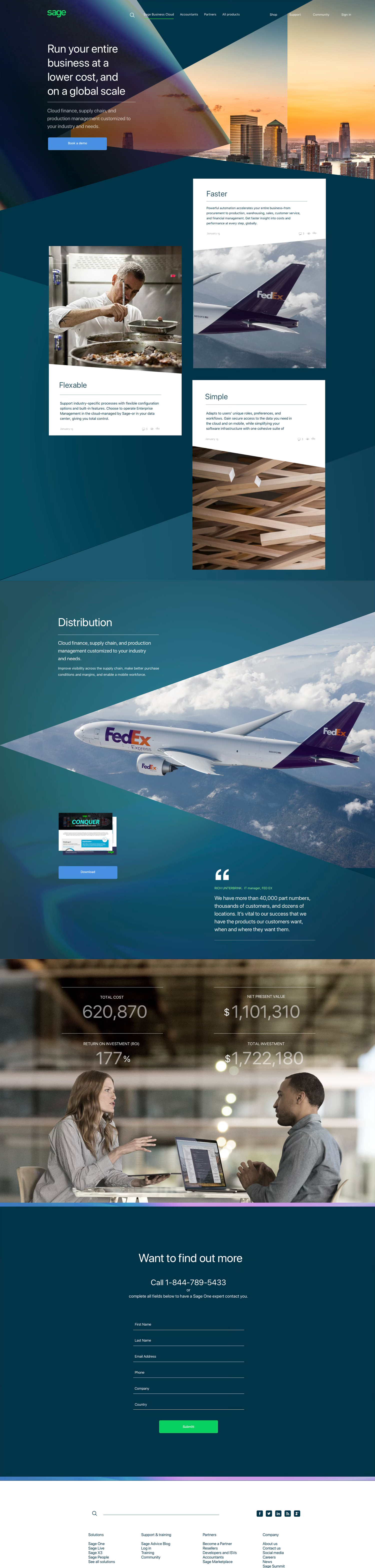
The problem
The analytics were blunt about it: people got lost on the global sage.com landing page and across the site in general, and the drop-off rate was very high. Visitors arrived with a job to do — find the right product, price it, get help — and left before they got to it.
The landing page tried to speak to every country, company size and lifecycle stage at once, so it spoke clearly to no one. Everything that follows — the behavioural analysis, the personas, the new information architecture, the testing — was in service of one aim: get people from landing to the thing they came for without losing them.
People can't find what they came for, so they leave — how do we get a global audience to the right product and the right help, fast?
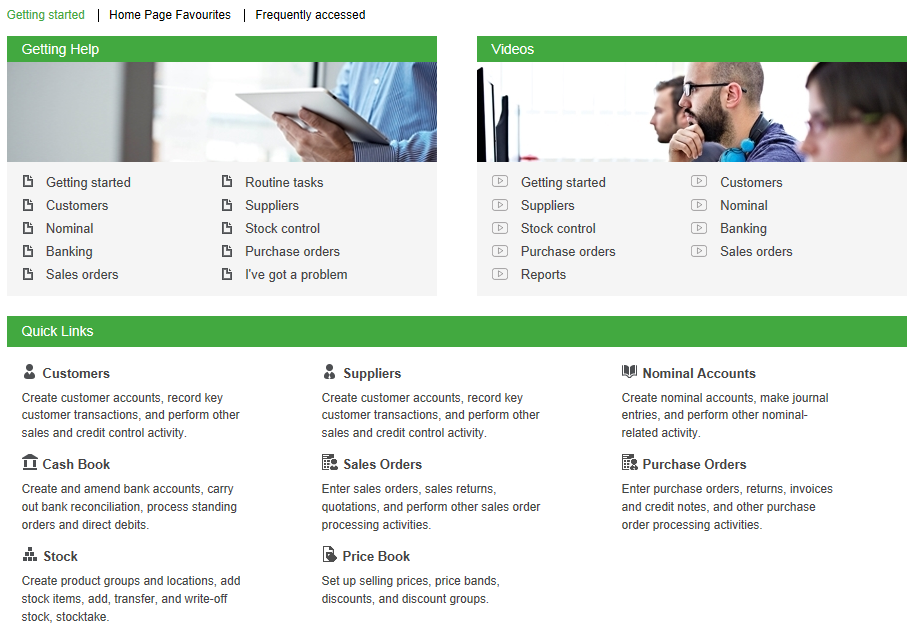
The site people actually landed on: green panel after green panel of undifferentiated text links, with no sense of which of them mattered or where to start.
User behaviour
To understand why people were dropping off, we ran a large project to gather and synthesise analytics on sage.com behaviour and satisfaction. Three findings reframed the whole brief.

When people actually used the site: a steady weekday plateau that drops away every weekend — the clearest evidence that visiting sage.com is a working-hours task, not leisure browsing.
Understanding the behaviour
Behaviour and satisfaction data together showed people had a tough time getting what they needed. The hardest parts were finding relevant software, buying it, and finding support afterwards.
"I can't figure out if I need to buy Accounting and Financials together. I think I do, but I can't tell for sure. Seems like it is a suite of products and I have to connect them all together to keep my books?"
"Confusing information — can't find an easy comparison between the different packages."
"You do a poor job clarifying what 'Sage Business Cloud' is. Not sure if it is one product, multiple products, or a concept."
What people came to do
We asked visitors their reason for coming. Support and access — people who already pay Sage — outweighed researching and buying combined, on a site organised almost entirely around selling.
Reason for visiting, self-reported. 41% of visitors came for support or to log in — existing customers doing admin, not prospects being sold to.
Building for our users
As the information came in I built personas and user journeys so the team really understood who we were designing for. That built empathy through their jobs to be done, their needs and frustrations, and the situation they're actually in when they use accounting software.
Seven personas in all — and the journey mapped end to end for the Freelancer, covering how they find, purchase, learn and use accounting software.
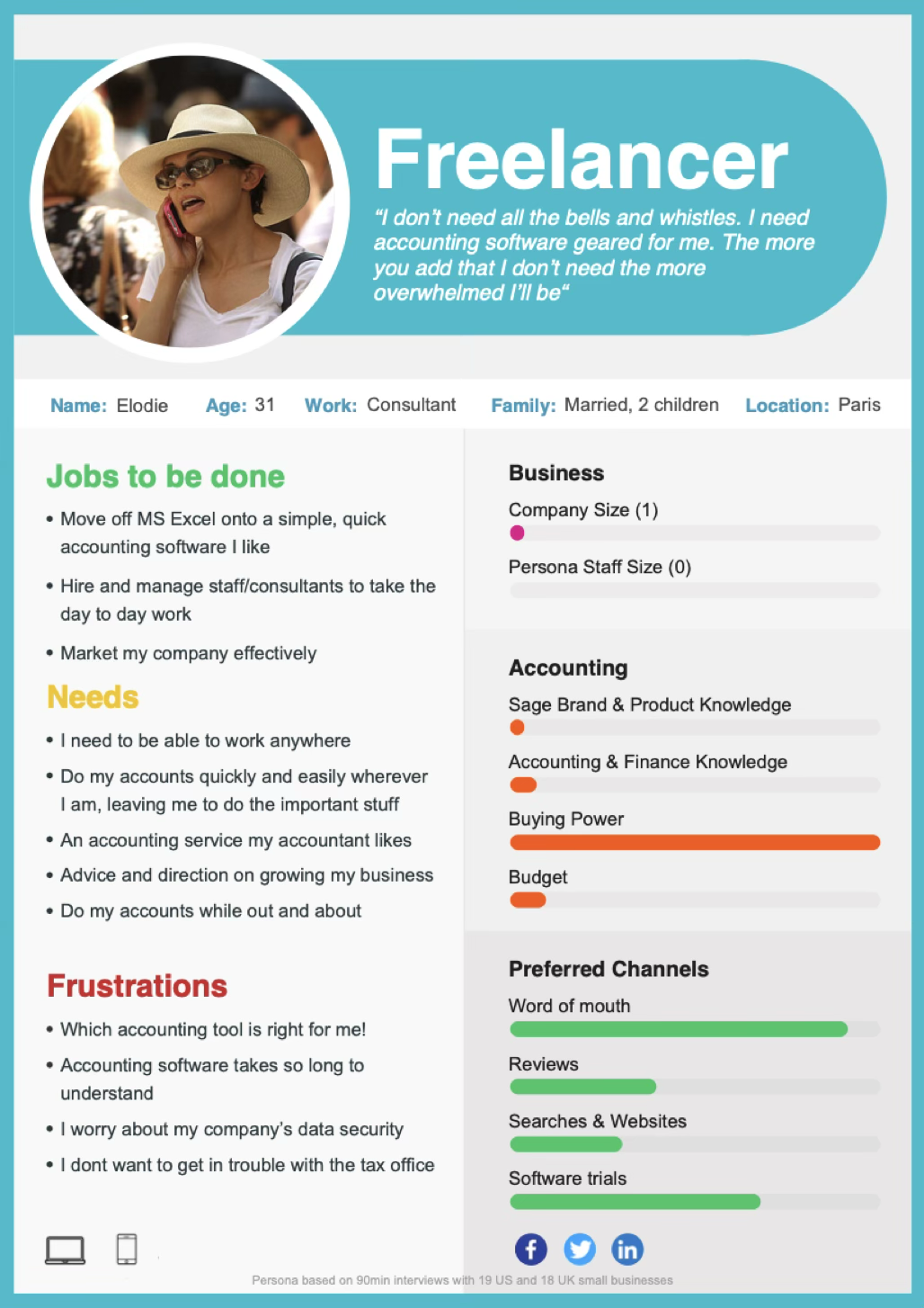
The Freelancer persona, built from 90-minute interviews with 19 US and 18 UK small businesses: jobs to be done, needs, frustrations, and how much Sage knowledge and buying power she actually has.
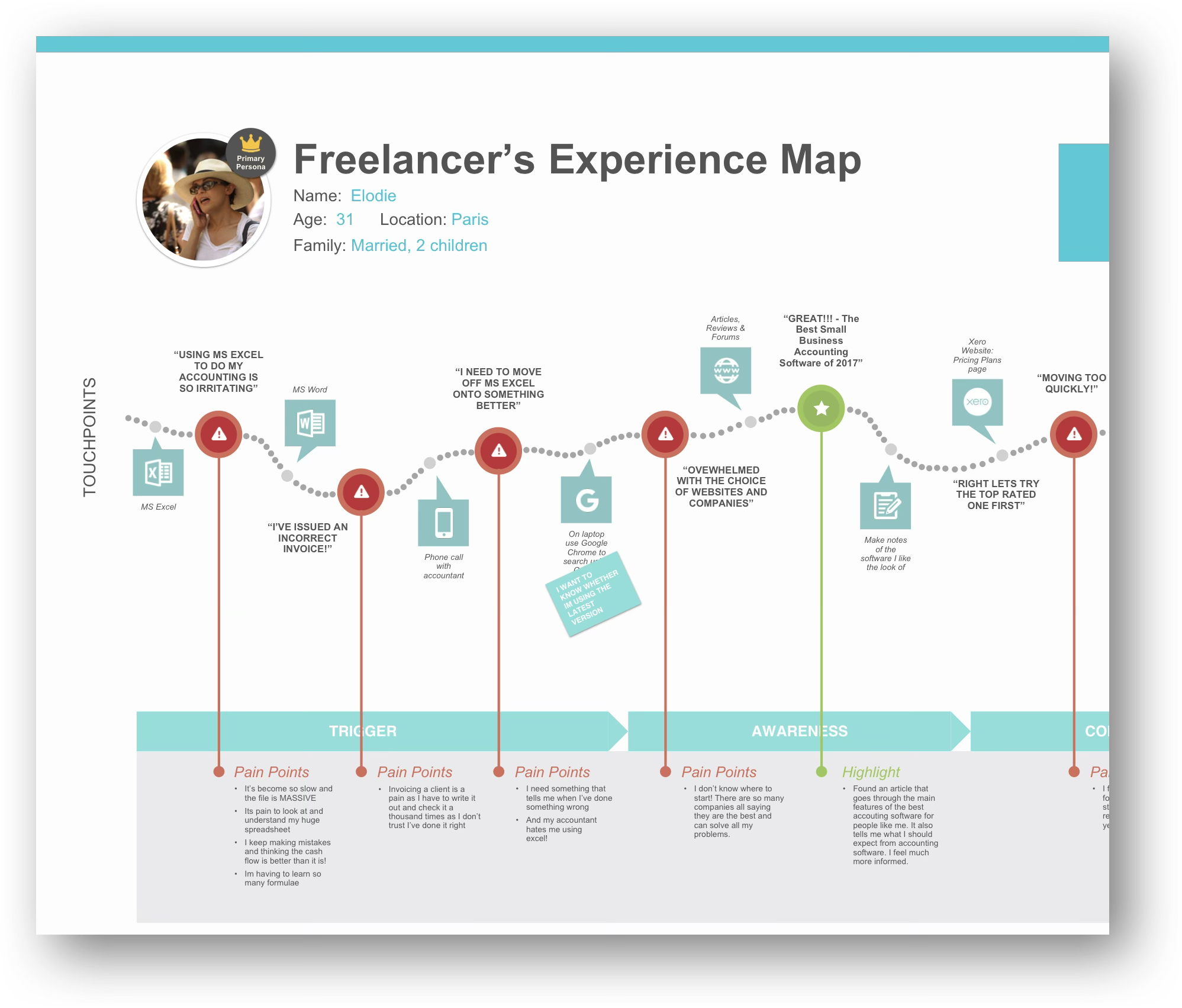
Part of the Freelancer experience map. Touchpoints plotted against emotion, every pain point evidenced with a verbatim. Sage only enters the story late, after she has already been overwhelmed by choice elsewhere.
Information architecture
As well as the personas, we had to cater for every stage of the customer lifecycle — prospective, newbie, existing, lapsed. The IA blueprint set the order information flows down the page, and the home page strategy was radically simplified in line with the feedback:
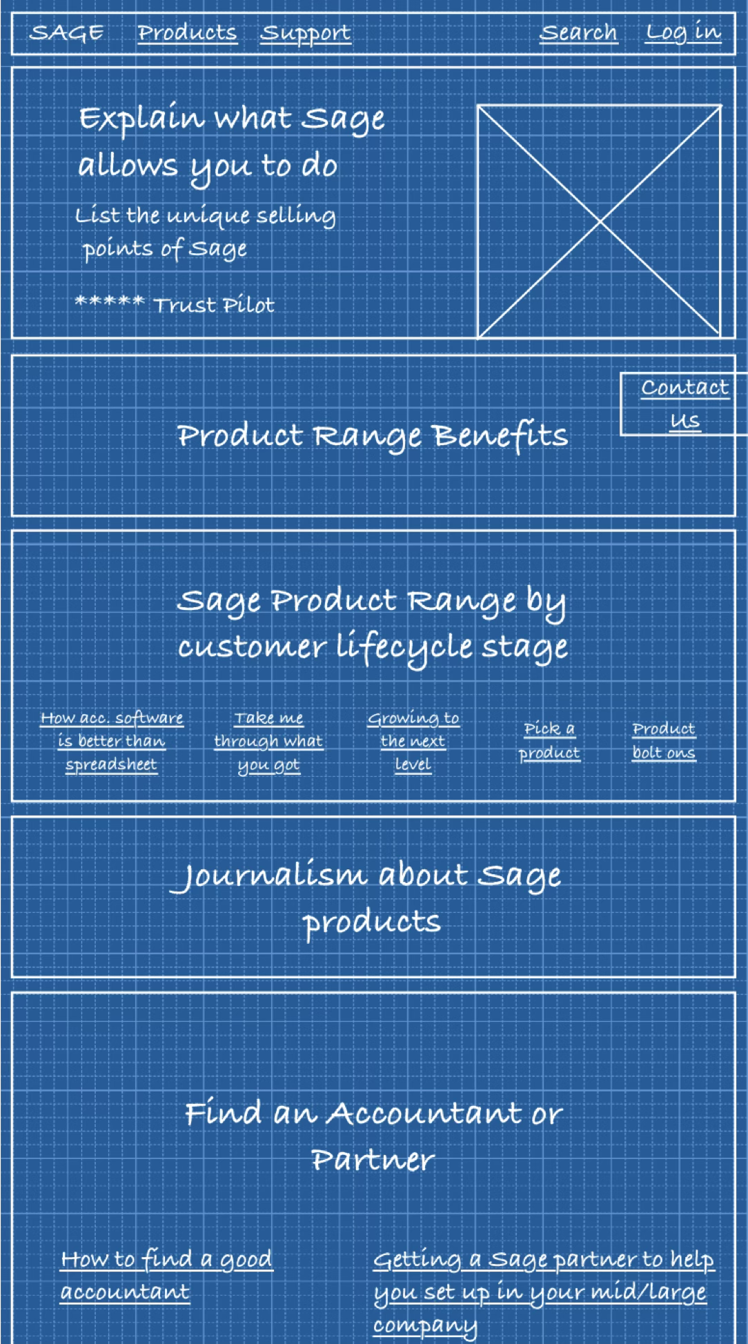
Early interaction design
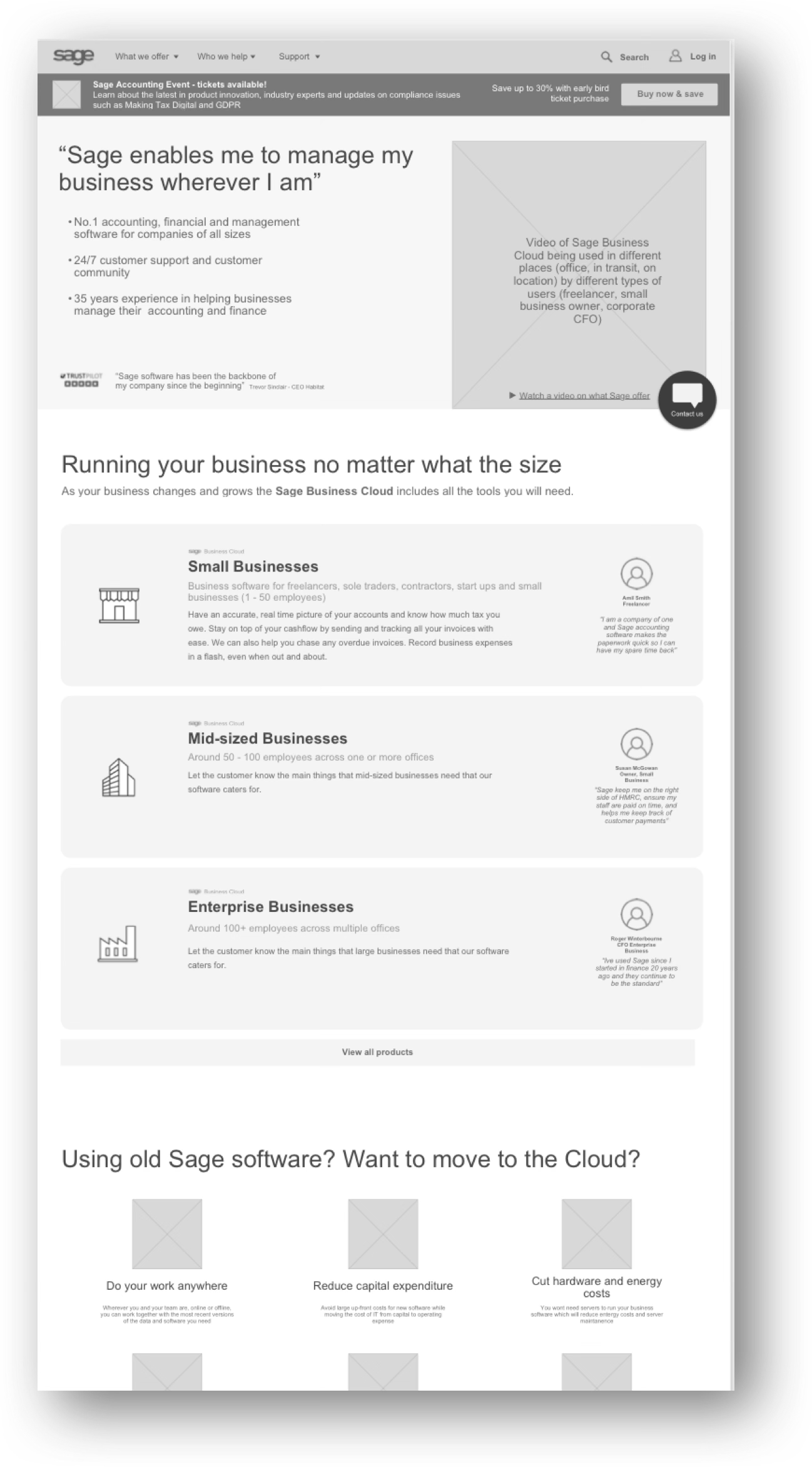
Sage has many products — some with confusingly generic names, some whose functionality overlaps, some that only work alongside another. The single biggest reason people couldn't find the software they needed was the question the home page asked them first. So I built two versions that asked a different one, and tested them head to head.
Visitors read through the product range and worked out for themselves which ones fitted. It assumes they already know Sage's vocabulary.
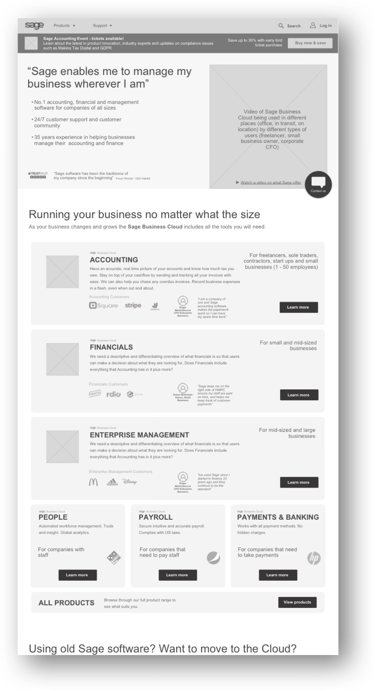
Visitors pick something they know for certain — their own size — and an intermediate step then shows only the products that suit a business like theirs.
Prototyping & user testing
Sage opted for a 'big bang' replacement of the whole website rather than Lean methods, so testing was the only way to be sure the designs worked before launch.
Participants couldn't tell the difference between Sage Accounting and Sage 50 Cloud — it wasn't obvious enough who should use which.
I added a features list so the two are easy to compare, plus badges on each product showing the main differences — 'For 1–10 staff', 'For multinational countries'.
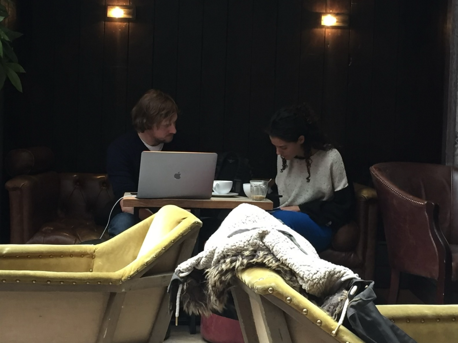
Nissa testing the prototype with a small business owner — how they interpret the pages, how easy it is to use, and what they expect when they tap a button.
How the design evolved
Every page was iterated as research came back. The All Products page — where customers who already know the Sage brand go to browse — went through four versions.
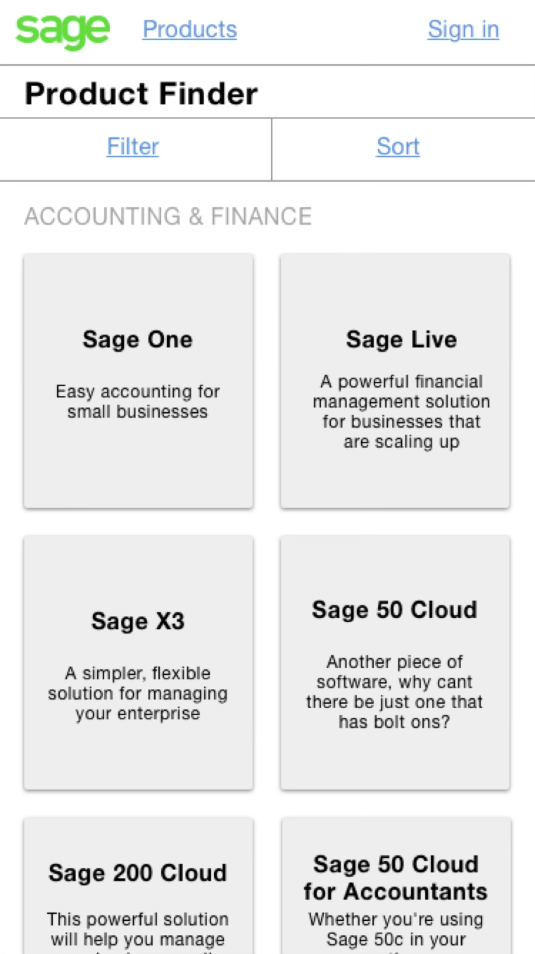
A simple two-column list of products and a way to filter them.

A more obvious filter system and far more information about each product.

Added a secondary navigation based on the software choice.

Stripped the secondary navigation back out — it wasn't necessary.
Visual design options
Participants from different sized companies reacted differently to each type of design.
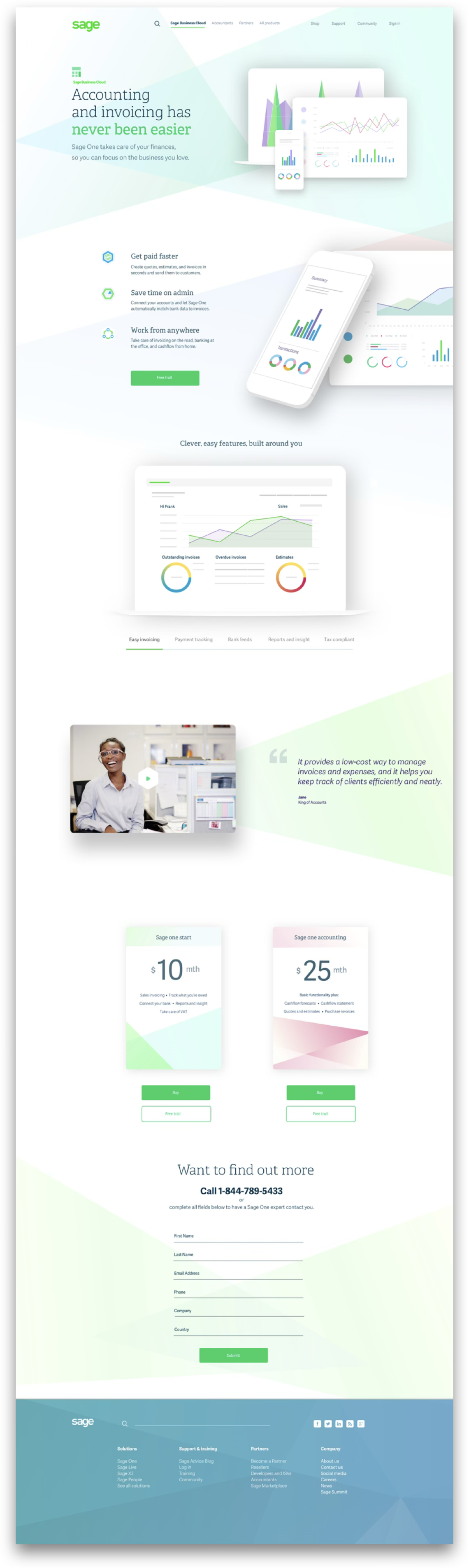
Open & Vibrant
Worked best with freelancers and small companies — it made the products look modern and easy to get to grips with.
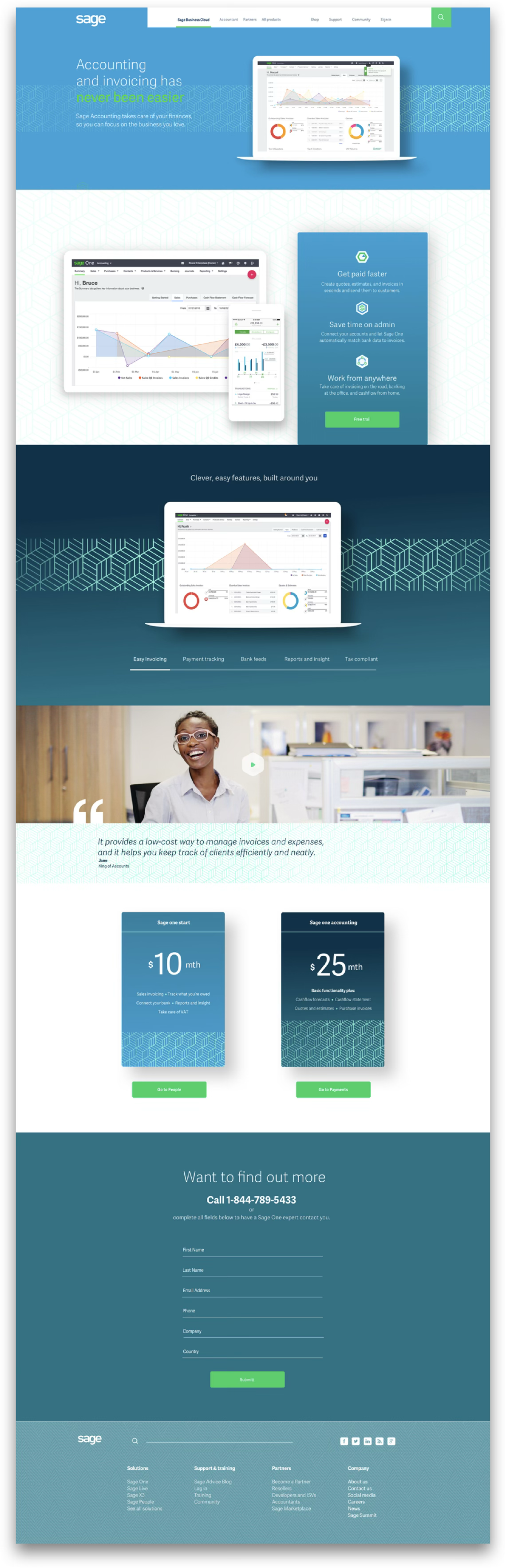
Constructive
Best for mid-sized companies, though only marginally ahead — still product-led, but more corporate, which instilled more trust, especially with US participants.
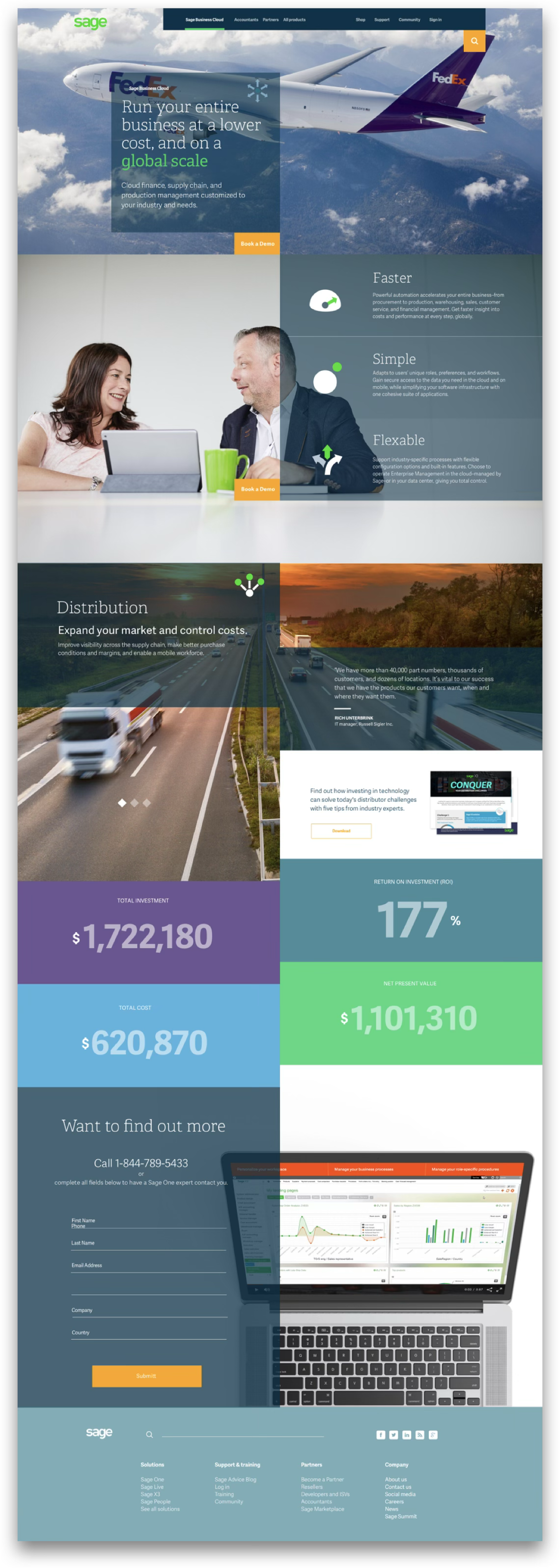
Warm
Best with enterprise businesses — they related to international connections and people, and to benefits rather than features, since they wouldn't be the ones using it.
Final visual design
After several rounds of testing we settled on two designs — judged on information architecture, proposition understanding, visual treatment and content.
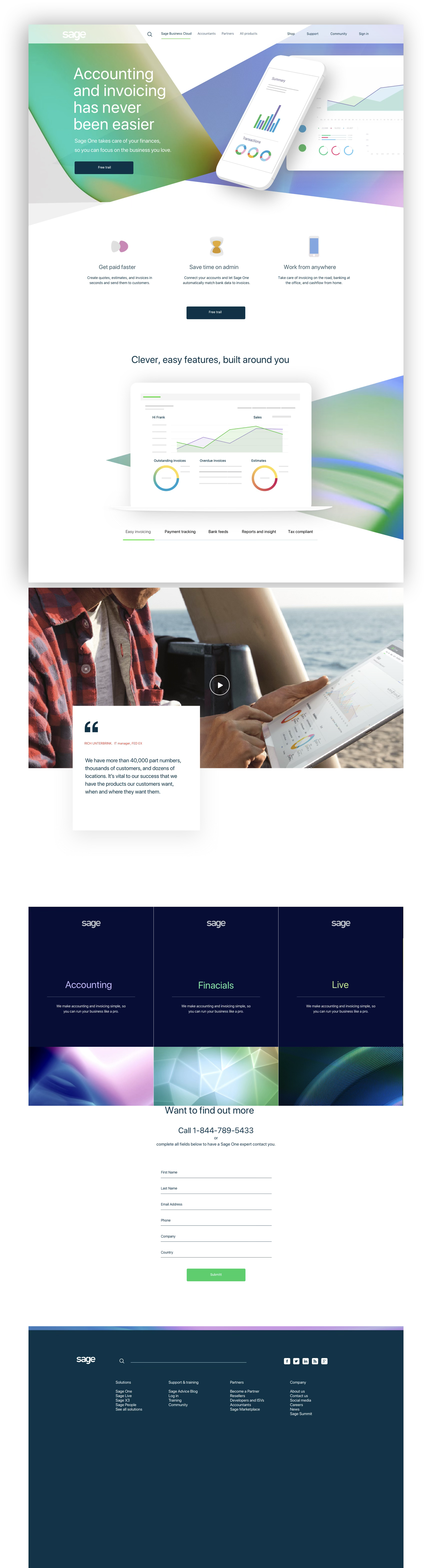
Small business and freelancer route.
Enterprise route.
The results
We re-ran the same measures we opened with in section 02 — the analytics, the intercept survey and the usability benchmark — three months after launch. Most moved in the right direction. The gains were real but modest — a first release, measured early, on a site where the hardest problems (product naming, the support estate) were only partly in scope.
Benchmark task, same script as the baseline: pick the product that fits your business. Asking what size you are helped, but product naming still tripped people up.
The 41% who came for support or to log in now have a route from the homepage rather than navigating a sales structure.
People leaving without a second page view. Better, but still the weakest number on the page.
A 19% relative lift in people starting a trial or requesting a demo — worth having, well short of a step change.
Post-task rating in the same benchmark sessions — up half a point; people still wanted plainer product names.
Median time on the same task. Shorter is better — the bar shows time taken against the baseline.
Benchmark figures from moderated sessions with 24 participants across the same four audiences as the baseline; analytics from the three months after launch against the equivalent period before, with the A/B result in section 07 held out separately.