Rebuilding the
hotel booking app
New iOS and Android apps, built in-house, with revenue up 31%
Premier Inn's app had been built by an agency. It was slow, hard to understand and looked dated. Premier Inn brought its digital products in-house and rebuilt both apps from scratch around what frequent guests actually need.
 {{ spinner }}

The problem
The old app was built by an agency on a third-party platform. It was slow and hard to understand: it wasn't clear what you were supposed to do, and it made you log in every time you opened it. It had a two-star rating on the App Store. Premier Inn wanted every digital product in-house, starting with new iOS and Android apps that cover what guests need.
I joined as lead UX designer for both apps. When development started I also took on Product Owner for both, as I'd done the role before.
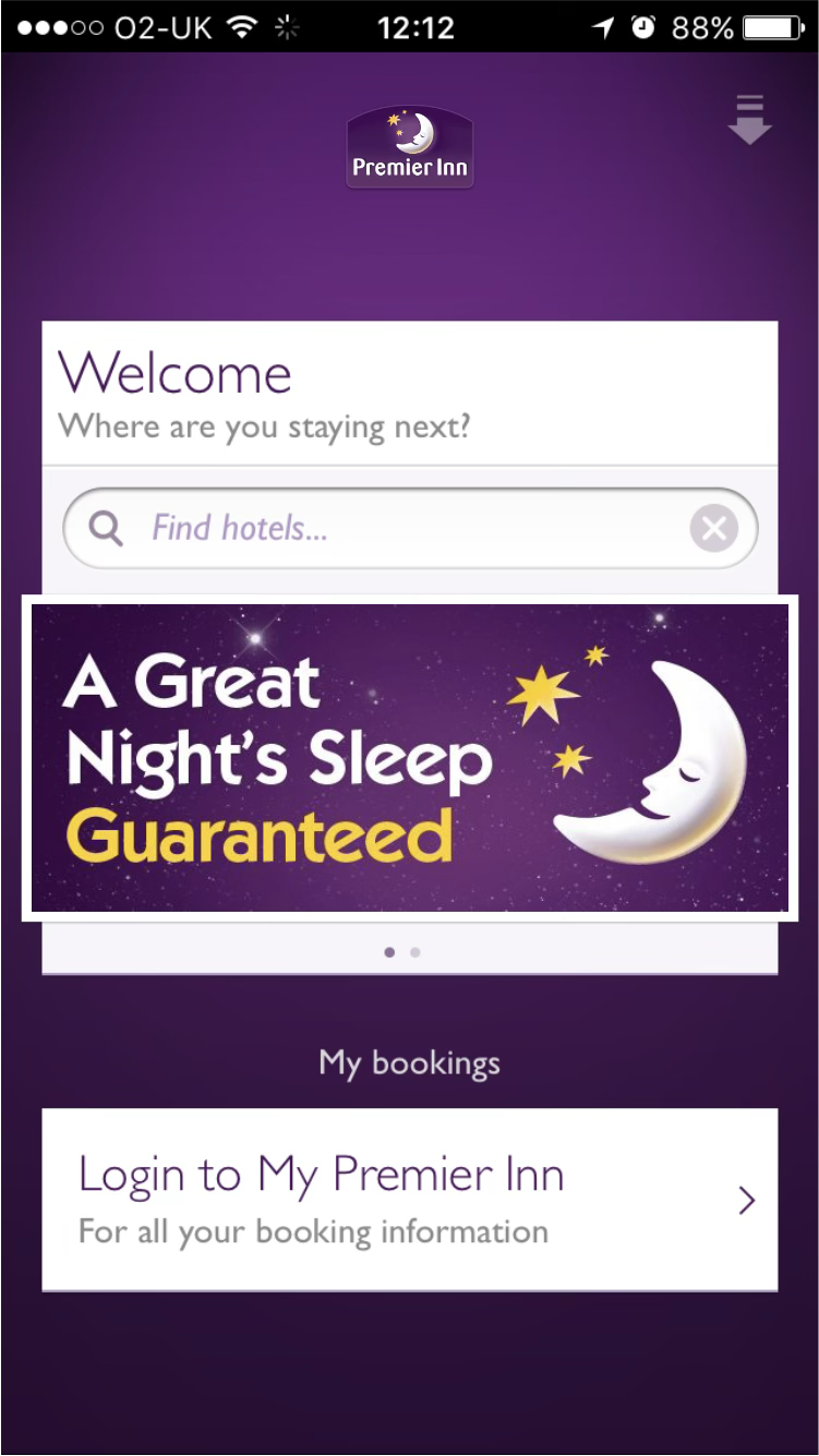
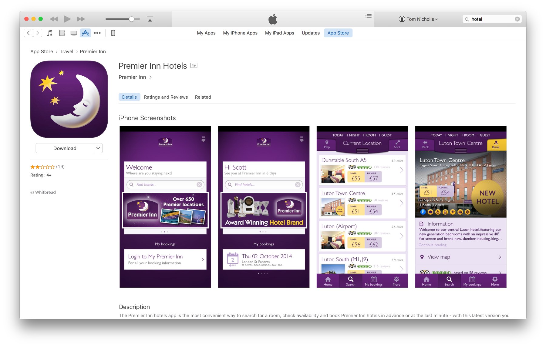
Over one month, more than 100,000 iPhones opened the app. People clearly wanted to book this way. The app just made them work for it.
Understanding the problem
There was a lot of data to work through: what was and wasn't working in the current app, what competitors were doing, and where the hotel industry was heading.
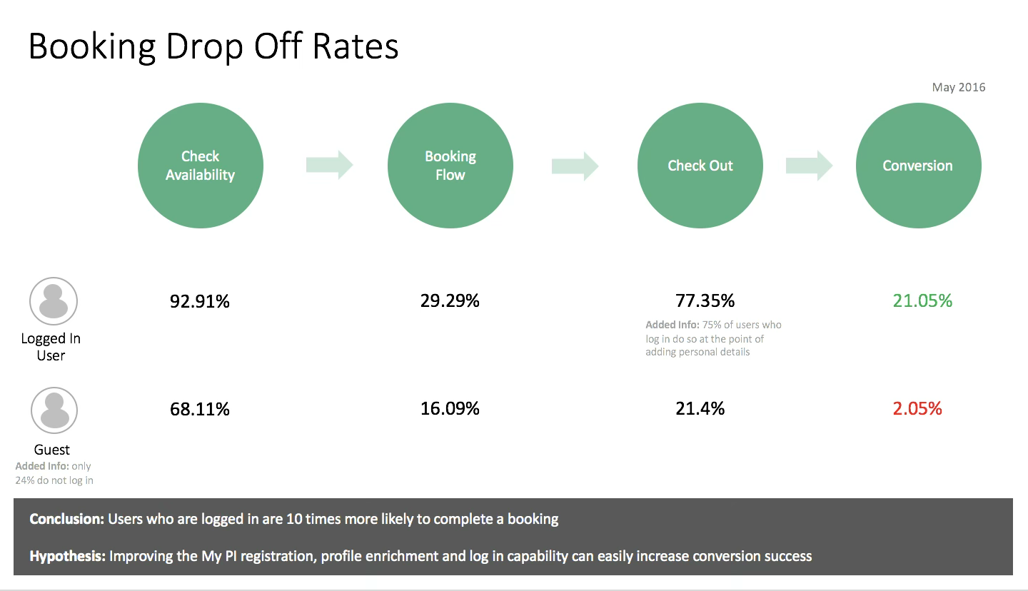
App usage
App users mostly booked for the same day or 2 to 7 days ahead, usually for one night. They were also more loyal, coming back far more often than website users.
Market trends
Guests were starting to expect technology as part of a hotel stay: opening the room door, switching on the lights and ordering room service from their phone.
Competitors
I reviewed the apps, websites, store listings, business models and marketing of Airbnb, Ebookers, Expedia, Hotel Tonight and Hotels.com. In interviews, people described Premier Inn as a trusted, friendly budget brand.
With the head of product, I started with the basic question: why should Premier Inn have an app at all, and where does it fit in a guest's journey? Concept testing, market trends and the analytics showed which parts of the old app were worth keeping and what was missing. I then planned the project with milestones, so stakeholders always knew where we were.
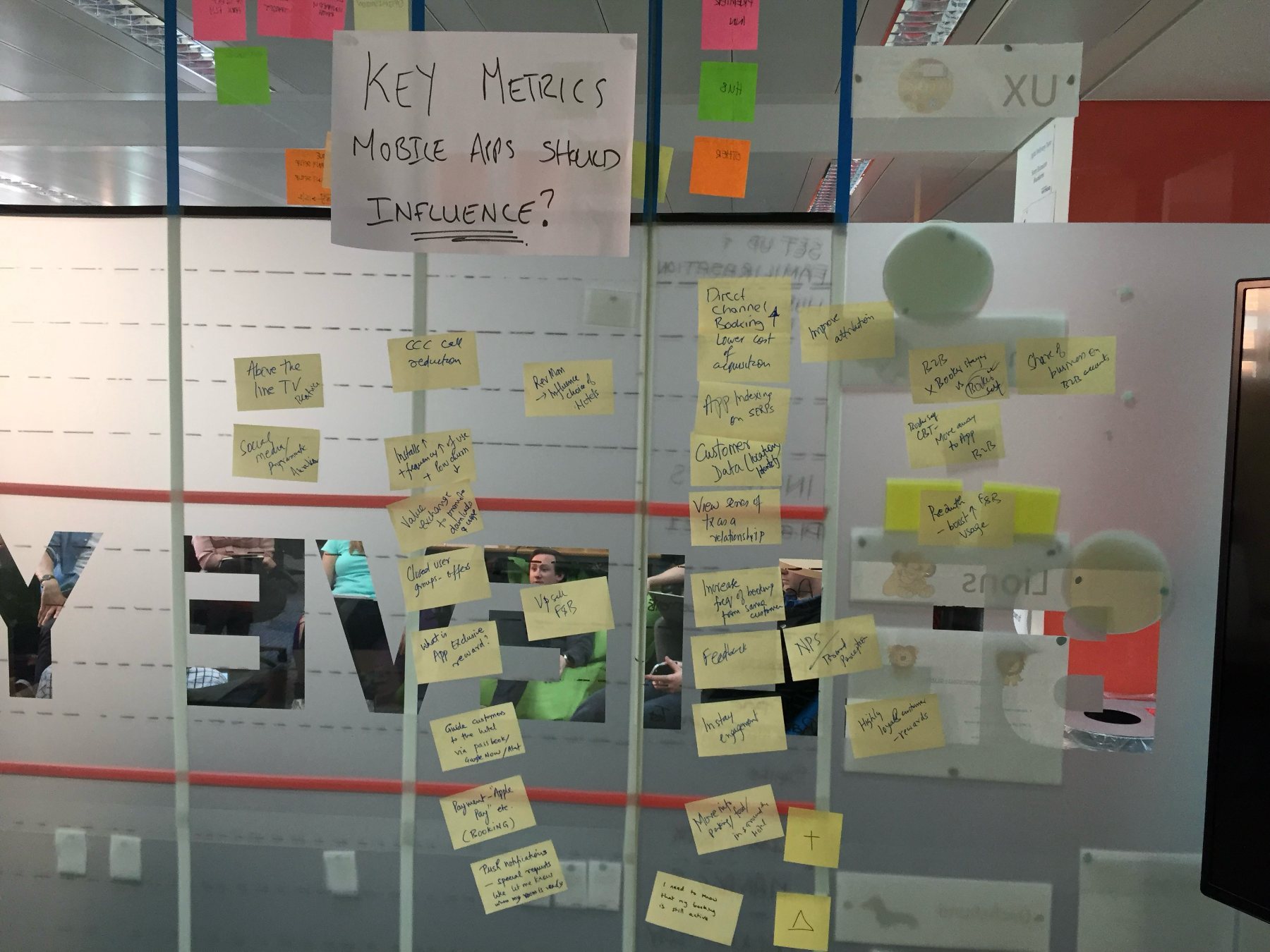
The research also turned up eleven opportunities for digital, beyond simply booking a room. They showed where the app could earn its place on a guest's phone.
User research
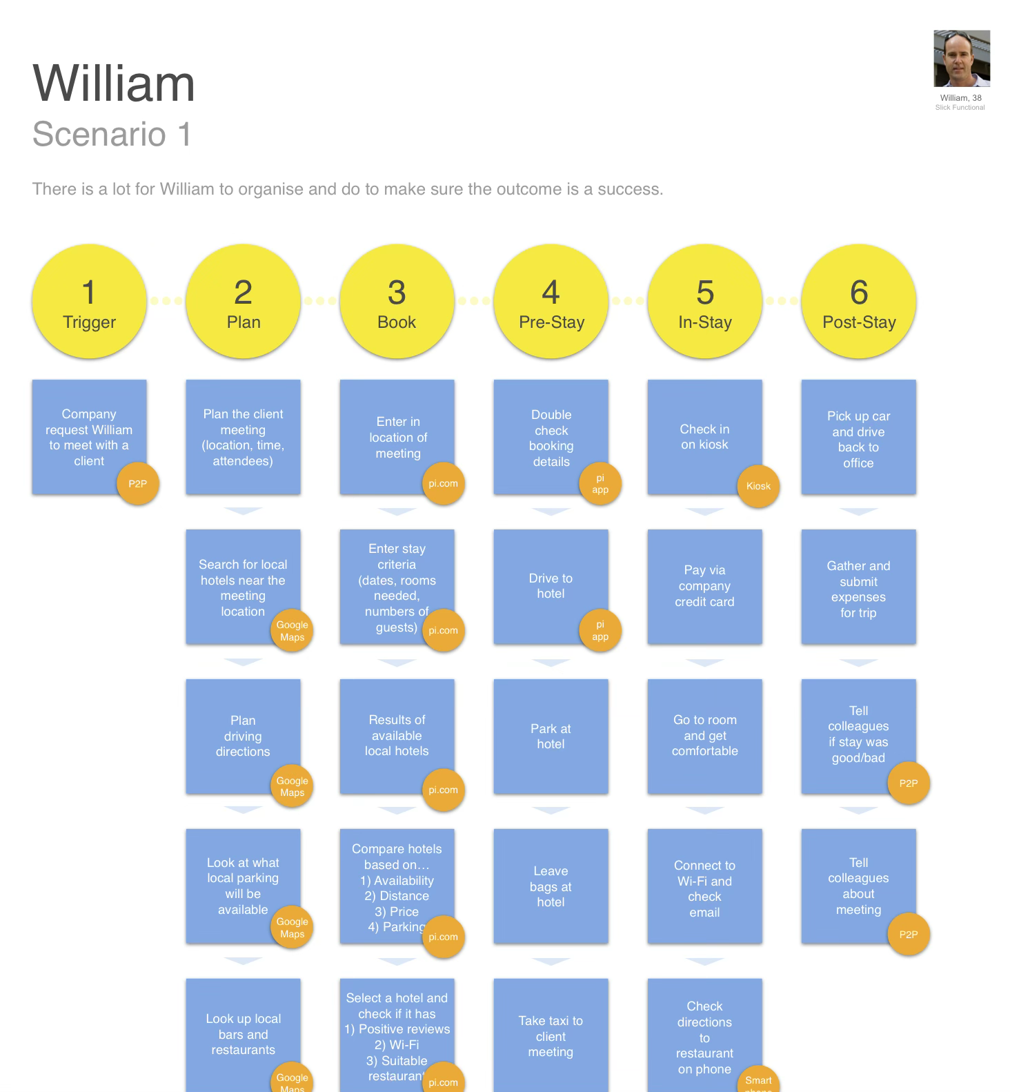
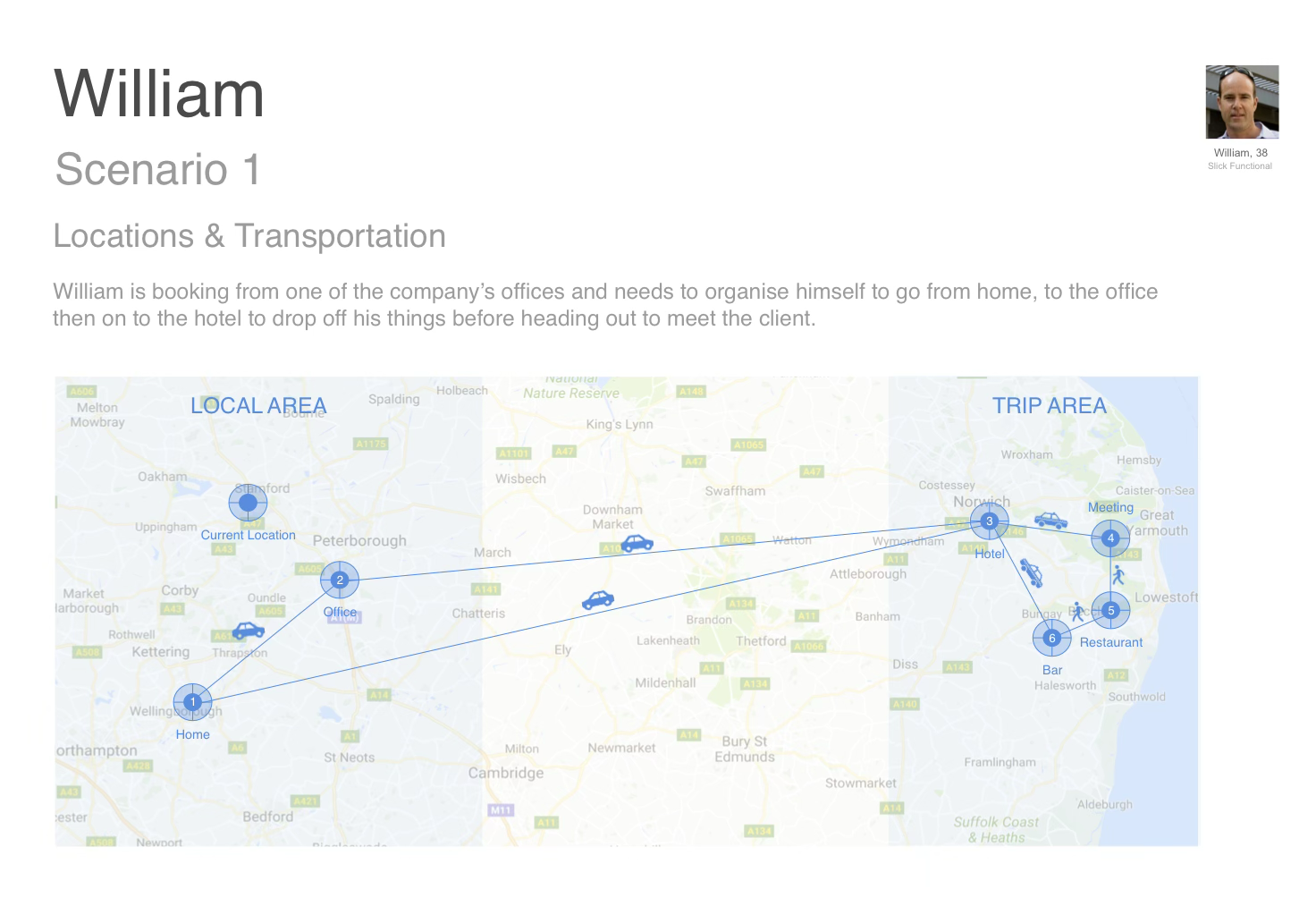
Premier Inn brought in the research agency LBi to find out who its guests are. Their work mapped how different kinds of guest go through a hotel stay, split into six stages from trigger to post-stay. We looked at every step for ways the app could help, then ranked the journeys by how often they happen. That ranking kept the project on course.
LBi grouped everyone they met by how they behave and what they care about, and six distinct types of guest came out. I used these personas to decide what the app should do, and who each screen was for.
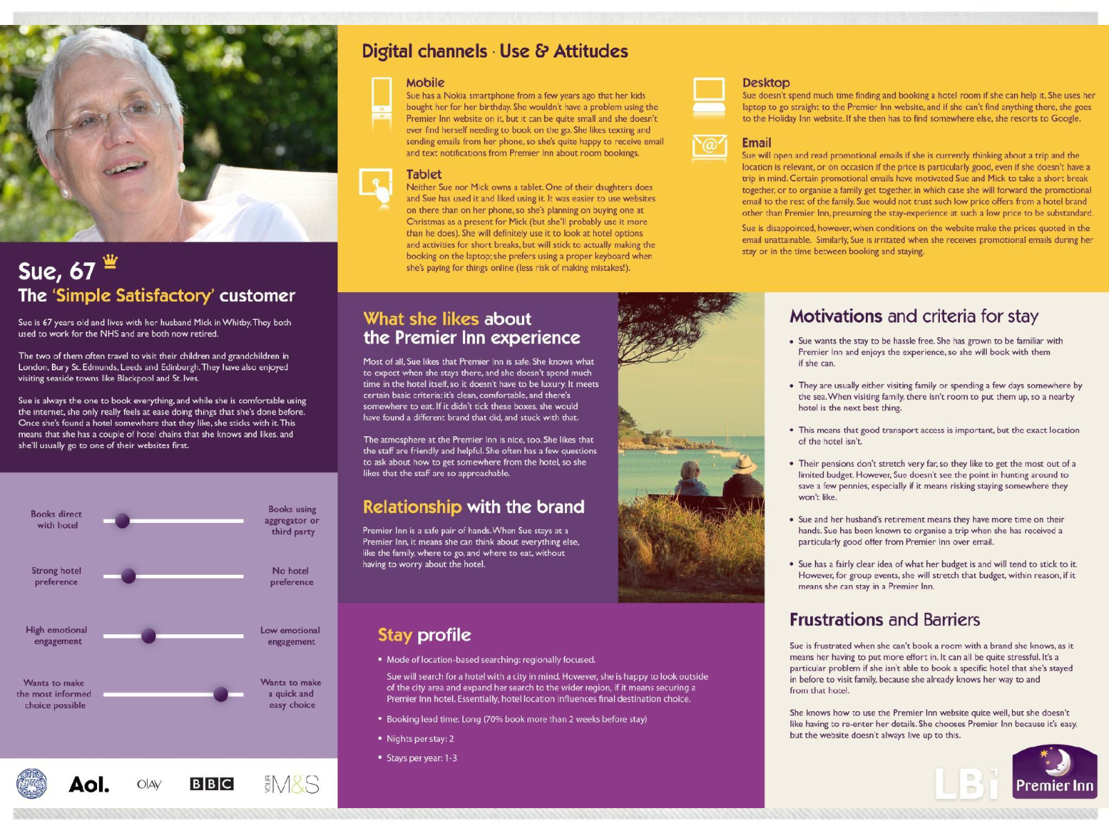
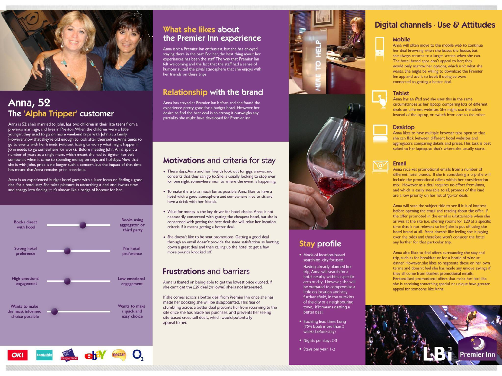
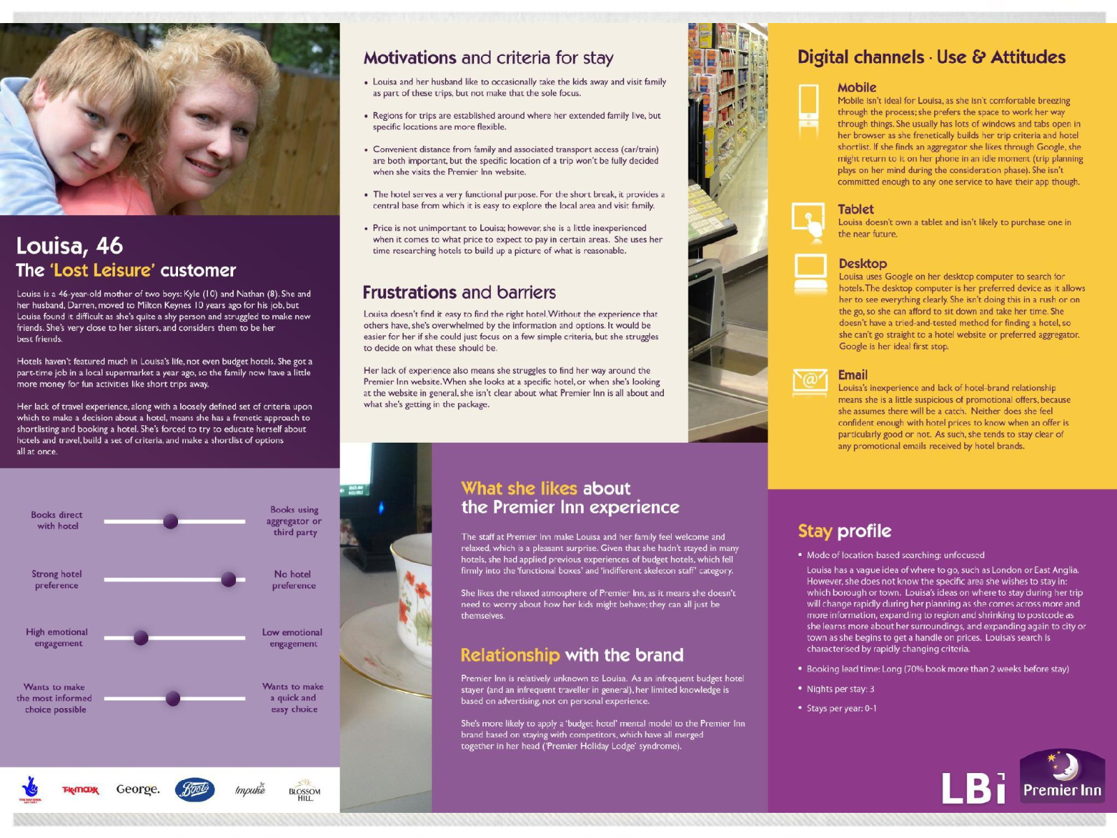
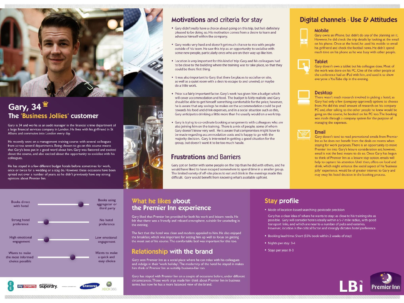
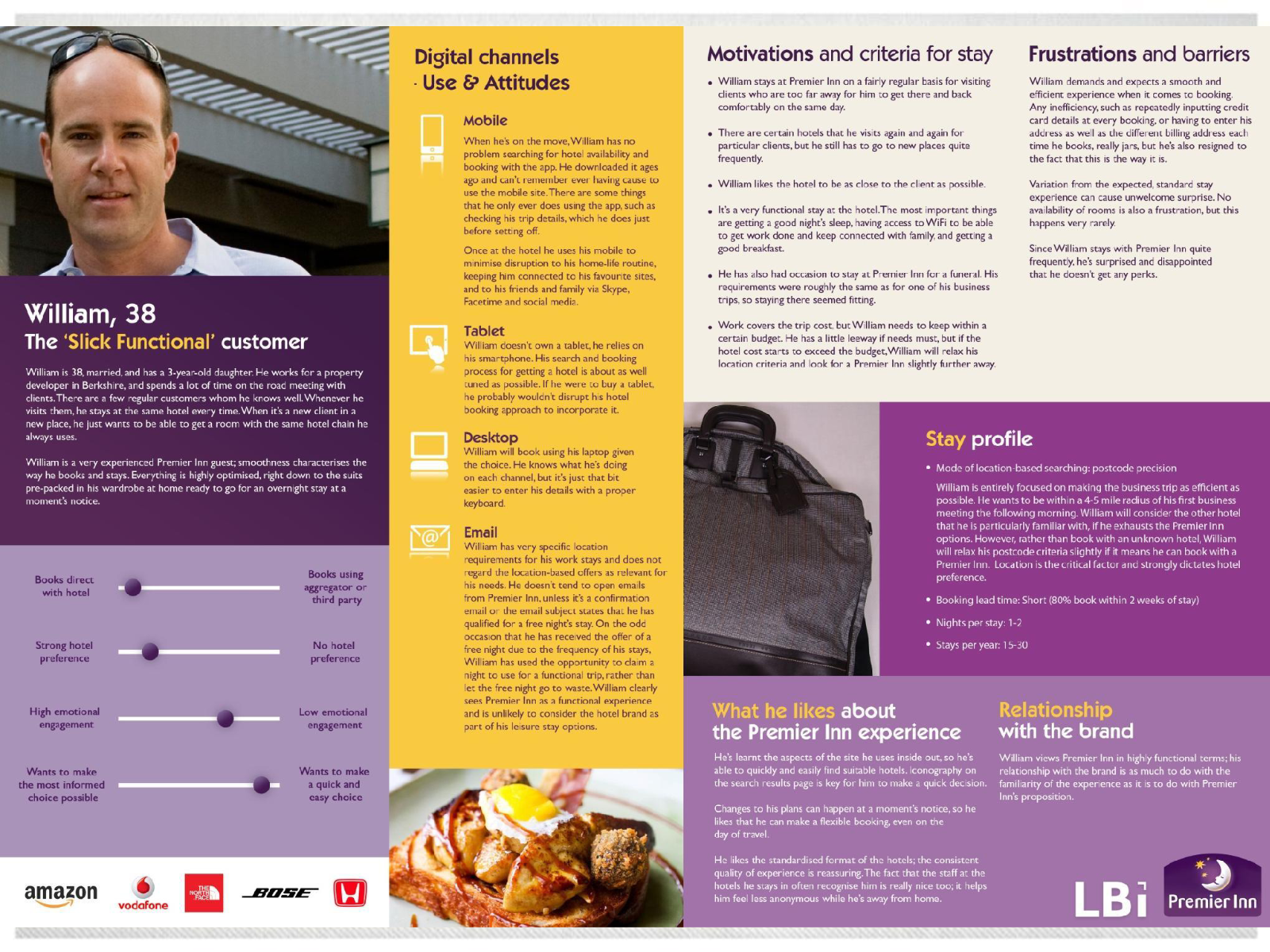
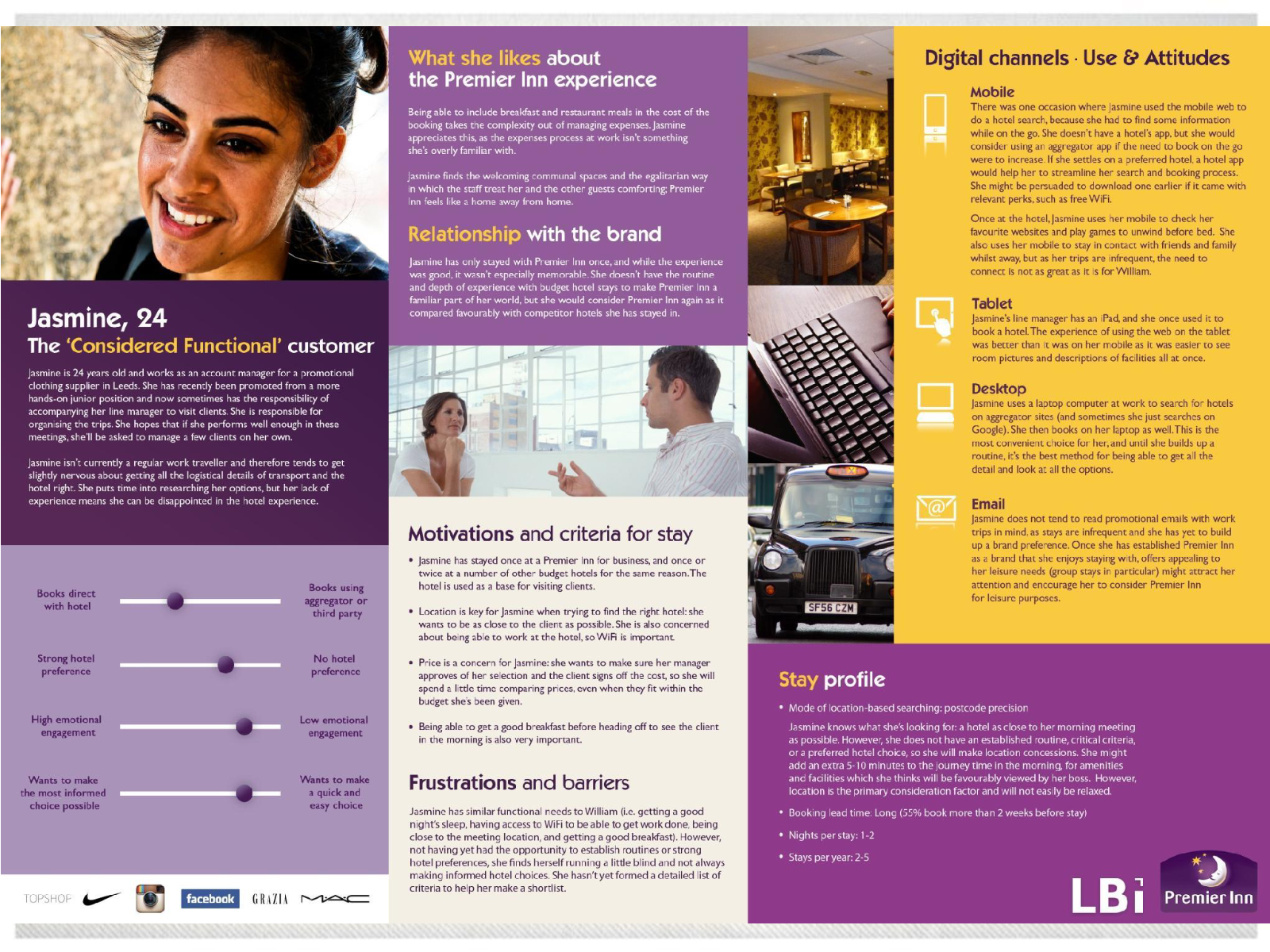
Two things split them most: whether they choose where the trip is, and whether they want a quick choice or the most informed one. The app had to work for both ends of each.
Design principles
Before starting the design work, we agreed UX principles for Whitbread, Premier Inn's parent company, so every designer across the business worked towards the same goals.
Designing around what guests need
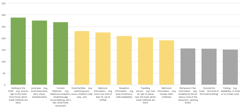
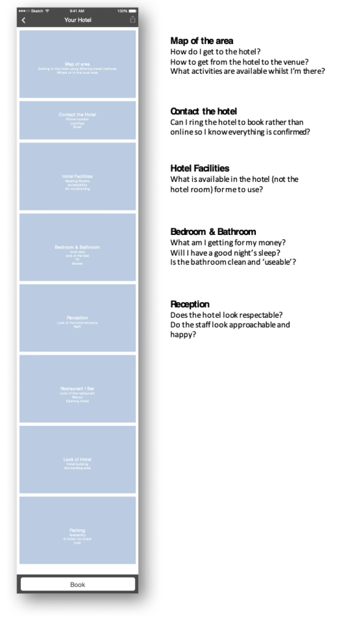
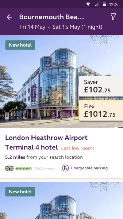
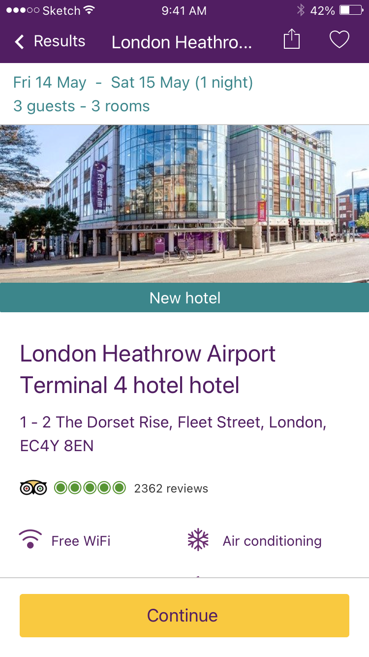
Guests voted on which hotel information mattered most to them. I built the hotel details page in that order, so the right information appears at the right time.
From sketch to prototype
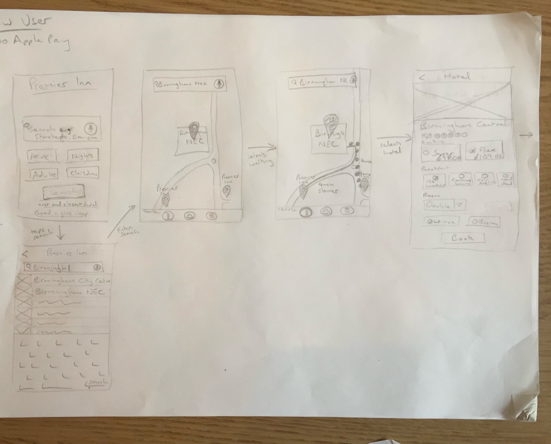
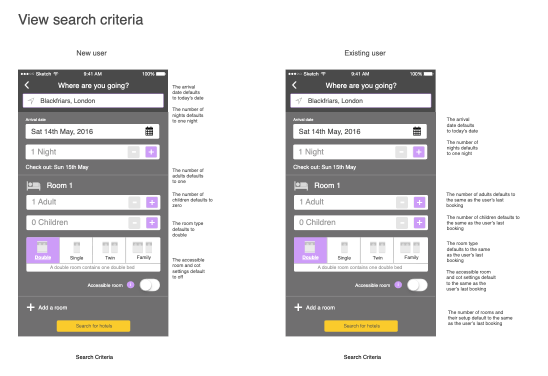
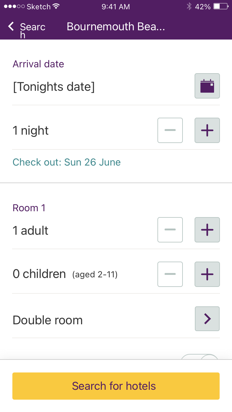
I sketched each journey on paper first, then drew every step of it as wireframes, with notes on what each screen defaults to and why. Search was the most-used journey, so it got the most detail.
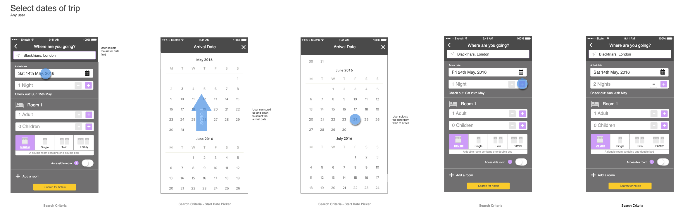
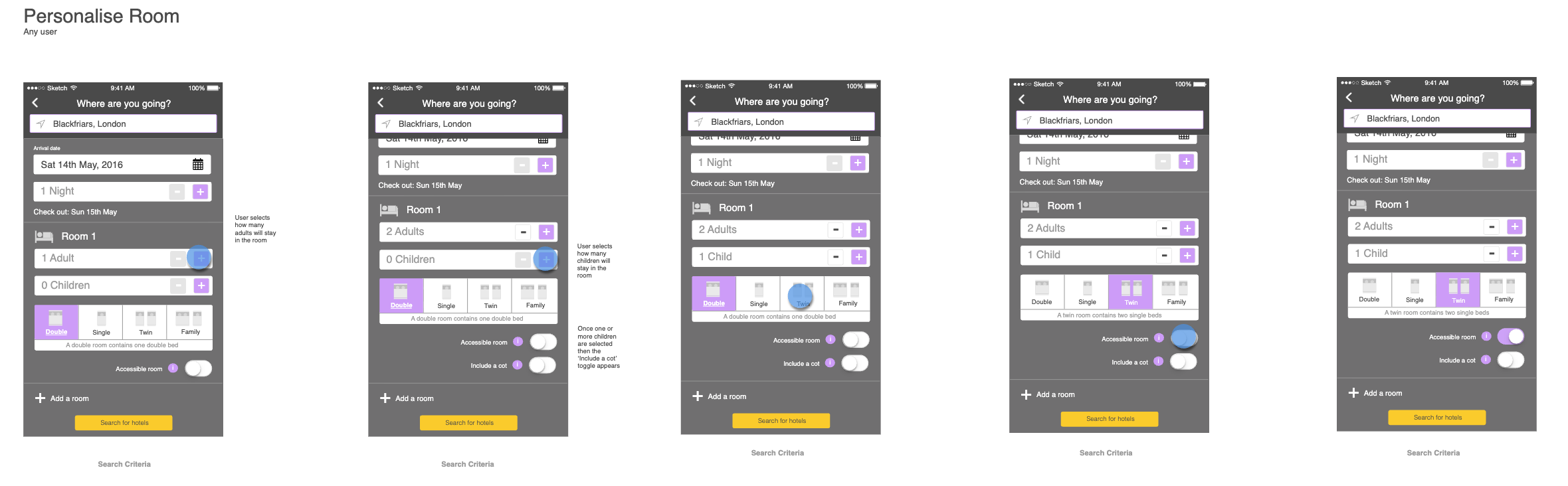
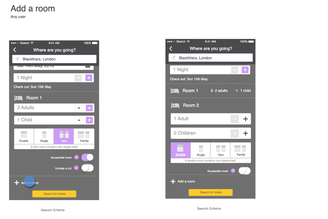
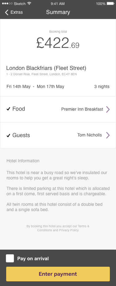
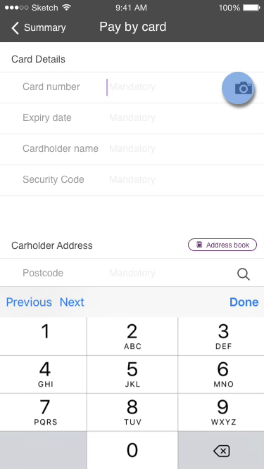
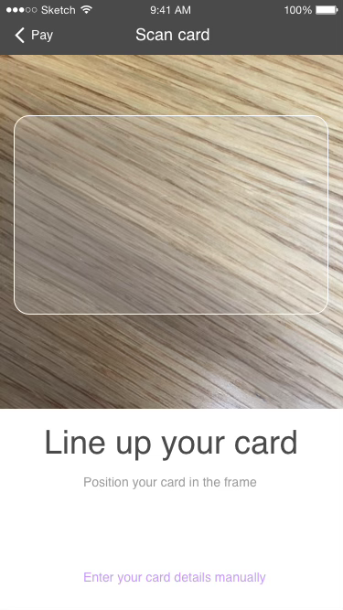
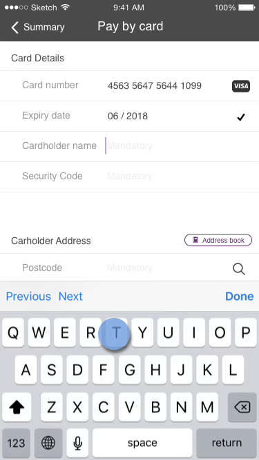
Each journey became a clickable wireframe prototype for testing. Payment got the most attention: guests could scan their card with the camera instead of typing the number.
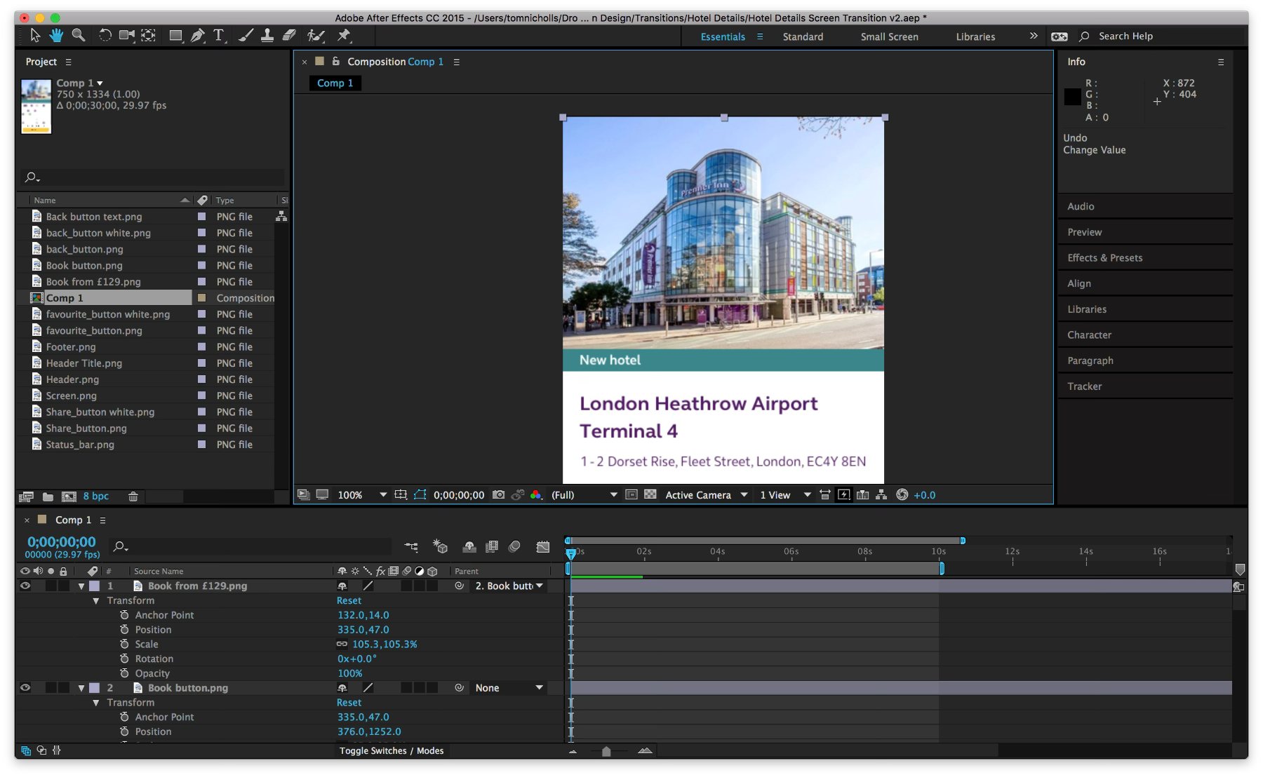
I designed subtle transitions so people understand what just happened when they tap something. When you open a hotel from the search results, its card grows into the details page, so it's clear you're now seeing more about what you tapped.
Each transition went to the developers as an After Effects video with its timings.
User testing
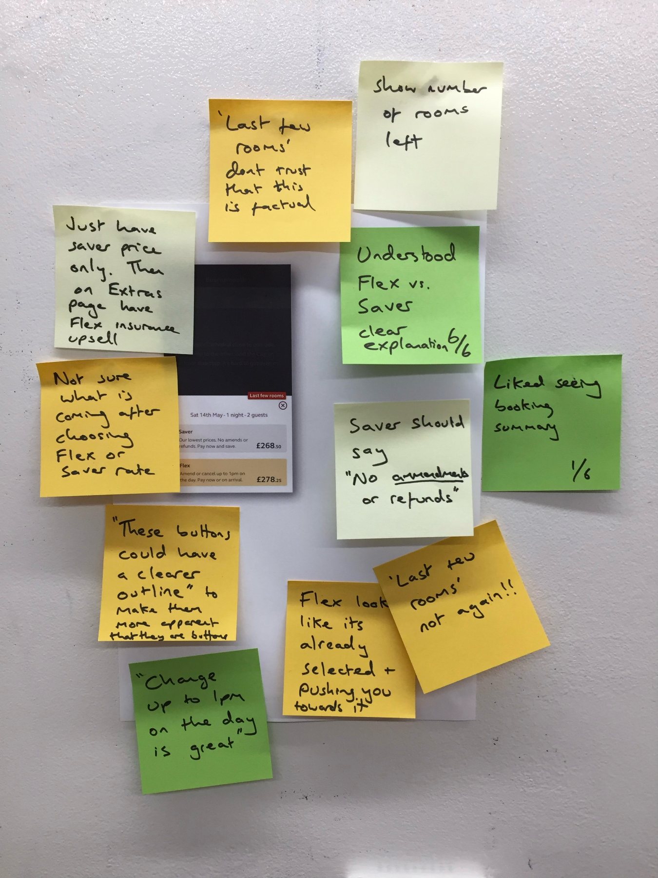
We gave people tasks as close to real life as possible, such as booking a hotel near the theatre they're going to with their partner, and watched them do it with the prototype. Every comment went on a sticky note next to the screen it was about.
I played the results back to the design and development teams, so they understood the reasons behind decisions. That kept morale high. We agreed each change together, and anything we weren't sure of went back into testing.
Visual design
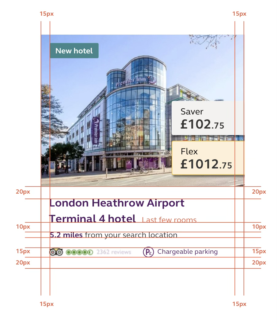
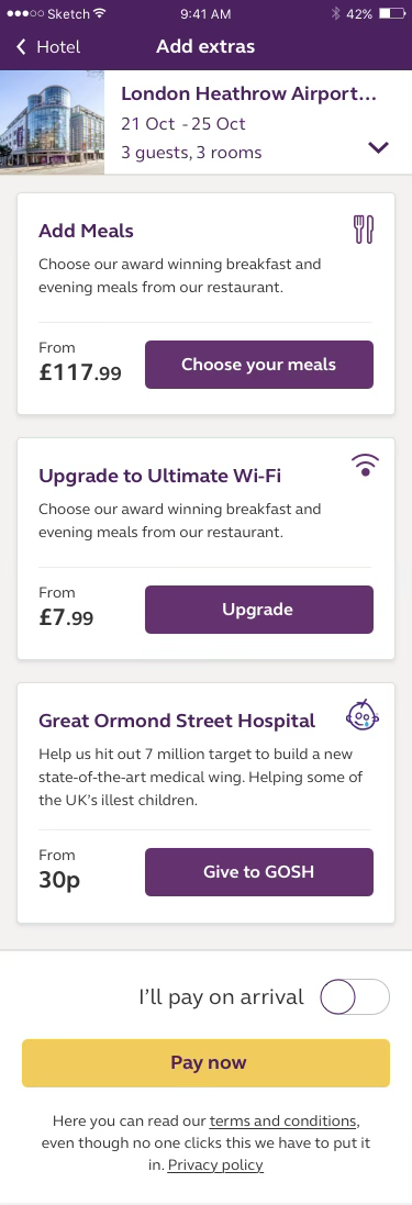
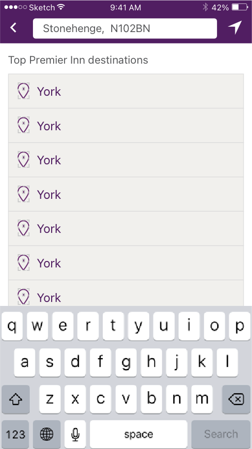
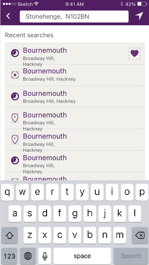
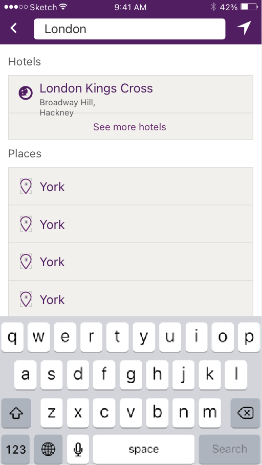
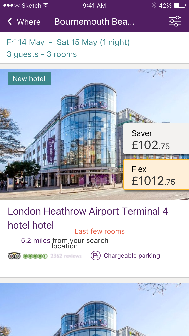
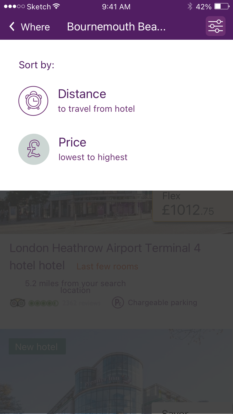
I oversaw the visual design of both apps, following Apple's Human Interface Guidelines and Google's Material Design where it made sense.
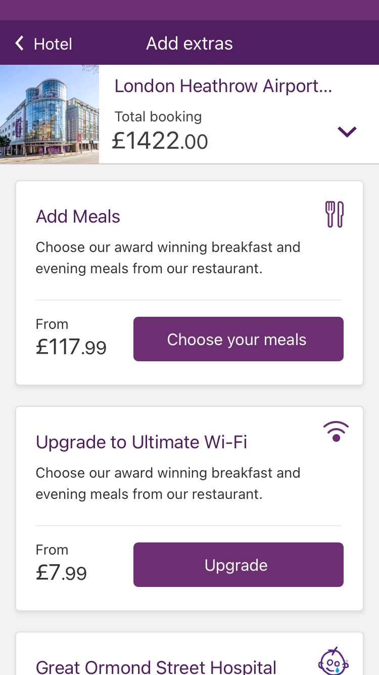
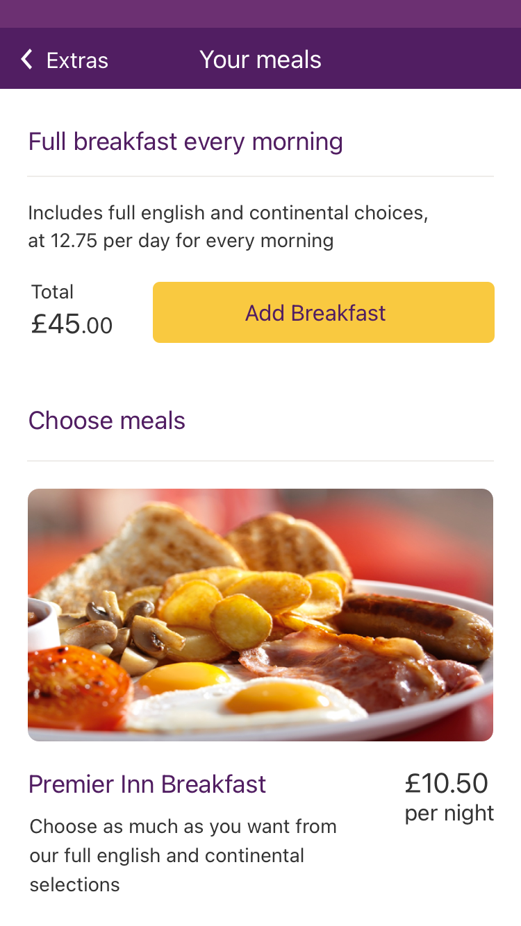
A style guide set out fonts, sizes, highlight colours and spacing, so developers could build quickly without checking every detail with the visual designer.
Development
As Product Owner I was the link between the iOS and Android teams and the business. Making decisions from data kept momentum up and kept us building the right thing.
I kept refining the backlog as user and business needs changed. I worked with the developers every day, so they had a clear direction and weren't distracted by business noise.
Results
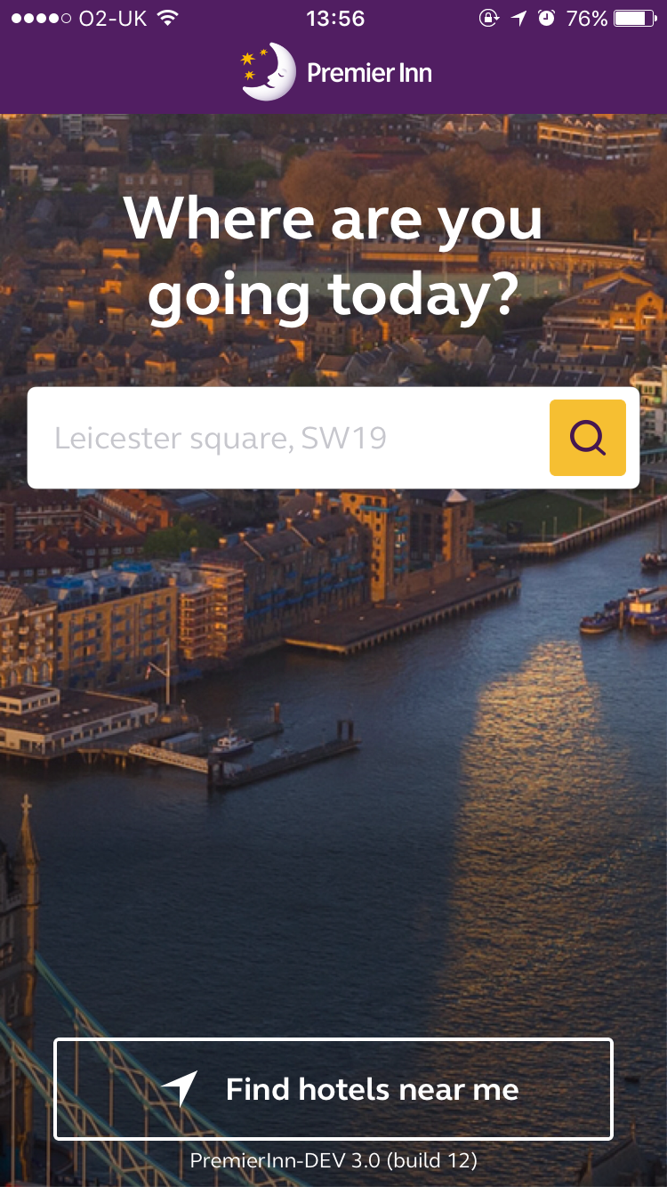
The new iOS app launched first. Early feedback showed it was faster and easier to use than the old one, and revenue went up 31%. We kept working on improvements after launch, and the Android app followed.
“The key to its success? Simplicity. First, you search for a hotel… Then, you book a room!”