Make a
Reservation
Rebuilding a neglected iOS app that still made money
Take a well-known, revenue-generating iOS app that had been neglected for a couple of years and bring it up to date — with the functionality users demanded and a design that makes you want to eat out.
The problem
The app was running on old technology and showing it: search was slow, crashes were creeping up, and every new feature took the developers longer to ship than the last. Meanwhile far larger competitors were releasing quickly and pulling ahead. Doing nothing was the riskiest option available.
Product goals
It mattered that the work was in line with the business. I worked closely with the CMO and CEO to define product goals against the business goals of acquisition, retention and operational effectiveness. The goal types are based on Dave McClure's Startup Metrics for Pirates — the user lifecycle let us agree with stakeholders which goals mattered most.
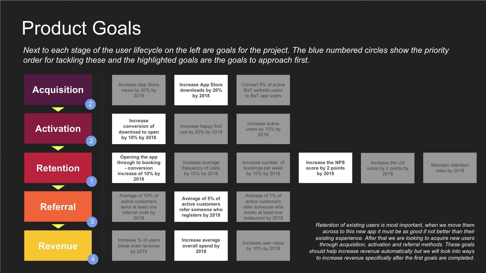
Goals set against each stage of the user lifecycle, numbered by priority — the white boxes are the ones we committed to first, with retention ahead of everything else.
Roadmap
From the goals I built the high-level roadmap — the central point of truth for developers, designers, stakeholders and the rest of the business, so everyone understood what we were doing and when they'd get it.
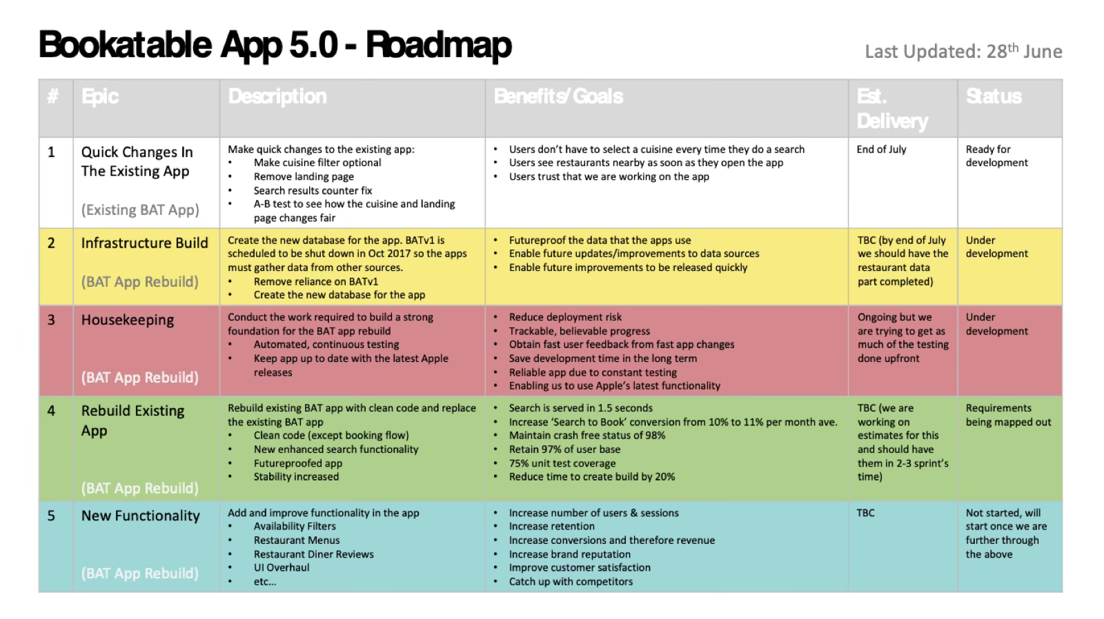
Five epics in order: quick wins in the existing app, the infrastructure build, housekeeping, the rebuild itself, then new functionality — each with its benefits, delivery estimate and live status.
Concept analysis
There was a wealth of data to work through: what was working, what wasn't, what competitors were doing and where public trends were heading.
App usage analysis
The app was used predominantly by educated middle-class women aged 25–35 with disposable income, and most bookings were for two people, tonight, within four hours of booking.
Market analysis & public opinion
Hospitality reports and UK/EU opinion data to understand the state of the industry and predict where European restaurant trends were going — Brexit and social unrest were both pulling bookings down.
Competitor analysis
Mapping competitor features against ours, working out their likely next move, and understanding the flow of restaurant-goers towards us and away from us.
Most bookings were for two people — which decided what we pre-loaded the 'No. of diners' filter with.
User research
Talking to a large number of bookers and diners — Bookatable users and not — to understand the issues they faced before, during and after a meal out.
User segmentation
With UXR: surveys, interviews and booking analytics to define behaviours, goals and needs, and personas to base feature prioritisation and design decisions on real data.
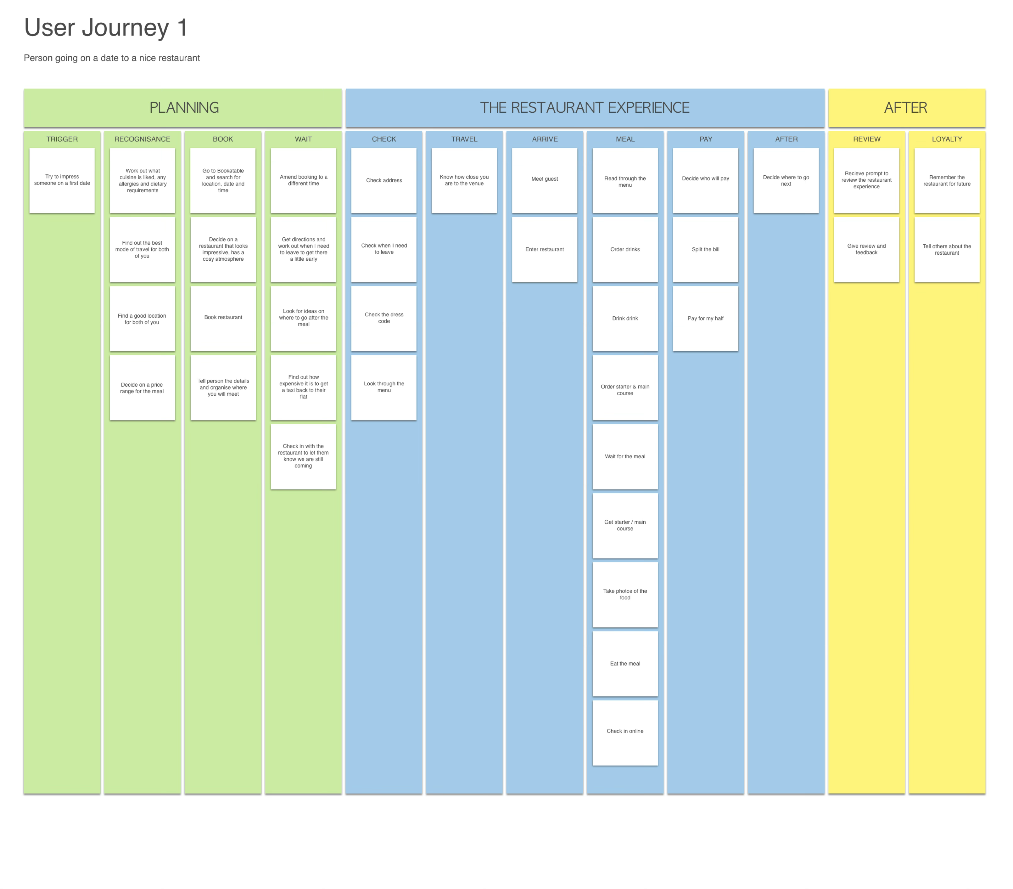
User journeys
We mapped the end-to-end journey so we designed a service people found useful and came back to.
The five scenarios
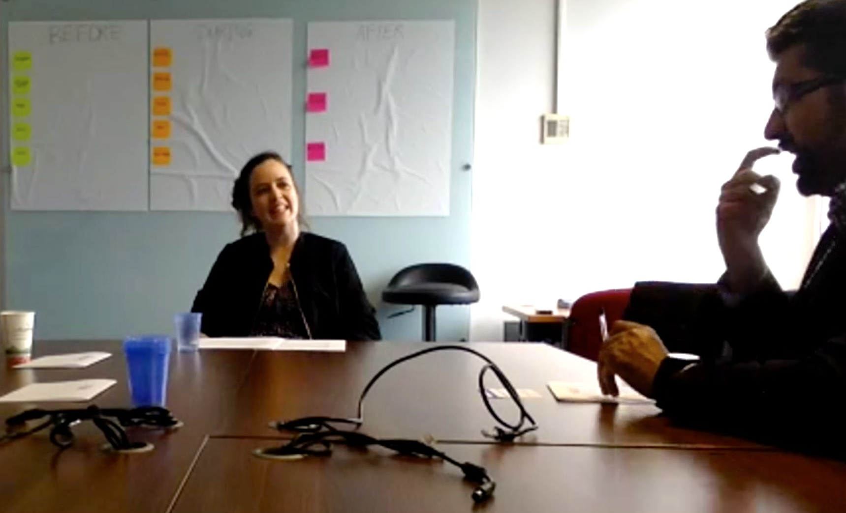
Helen, our researcher, running a focus group on people's needs before, during and after a meal out — I was videoing and taking notes.
Vision
With insights from users, stakeholders, diners, bookers, restaurants, technology futurists and the rest of the hospitality chain, I built a map of ideas for the app at every stage of the user journey. Each idea then needed a business case and user testing to work out which should go further.
Wireframes
With the primary journeys understood, I wireframed them and mapped out how the user moves through the app.

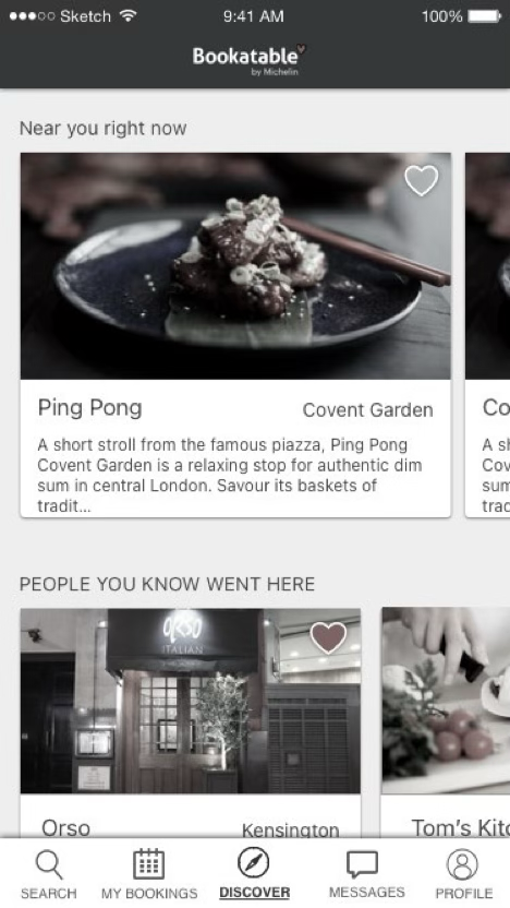
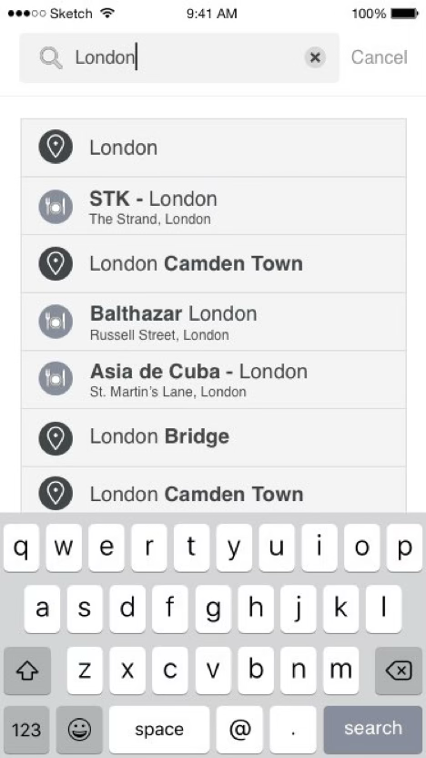
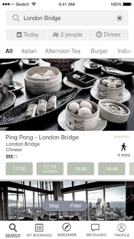
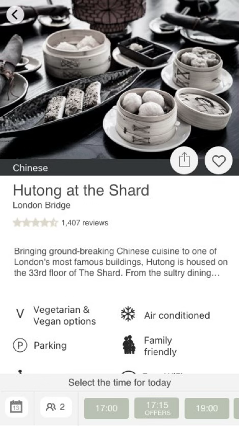
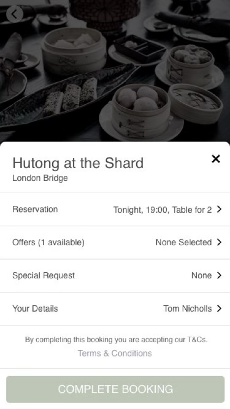
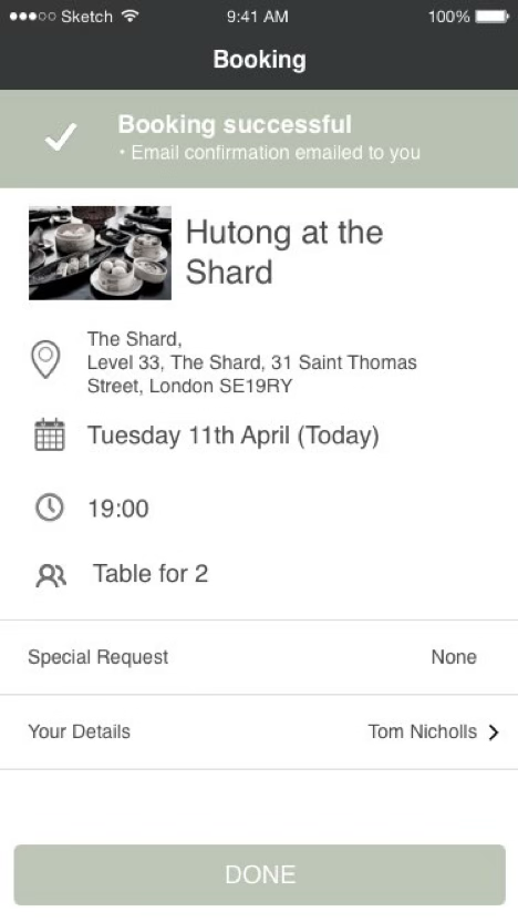
The whole booking flow, screen by screen: launch into Discover, search a location or a restaurant by name, filter the results by date, covers and time, pick a slot, confirm everything in a single booking card, and land on a confirmation with the details already emailed.
The session always starts on the Discover tab, so the user gets a feel for what's out there before typing an area.
One list holds every type of result — restaurant names, areas, points of interest, postcodes, vibe — and each type resolves to something different when tapped.
Tap the restaurant for details, or tap a time to go straight to the booking card. The sticky footer is pre-filled from the previous page; only the time always needs choosing.
The booking card can be altered; if it's right, one tap on 'Book' and it's done. Confirmation shows, and the booking appears as a badge on the My Bookings tab.
Design & branding strategy
Getting consensus from the business on the values the company holds, then translating those into the principles the product would be designed and developed by — which particularly helps tone of voice and visual design, and helped set the order we tackled goals in.
Product principles
The principles direct what gets made and how it works. They define what's important to us and let the team prioritise, freeing the PO to look at the future.
- Clear and digestible
- Build trust and familiarity
- Pre-empt the user
- Minimise user input — e.g. remove the need to enter favourites
- Fast and reliable
- Minimum effort restaurant booking
- Get people exploring new restaurants
- Encourage users to come back to the app
- Joy to use
- An app with personality
Product personality
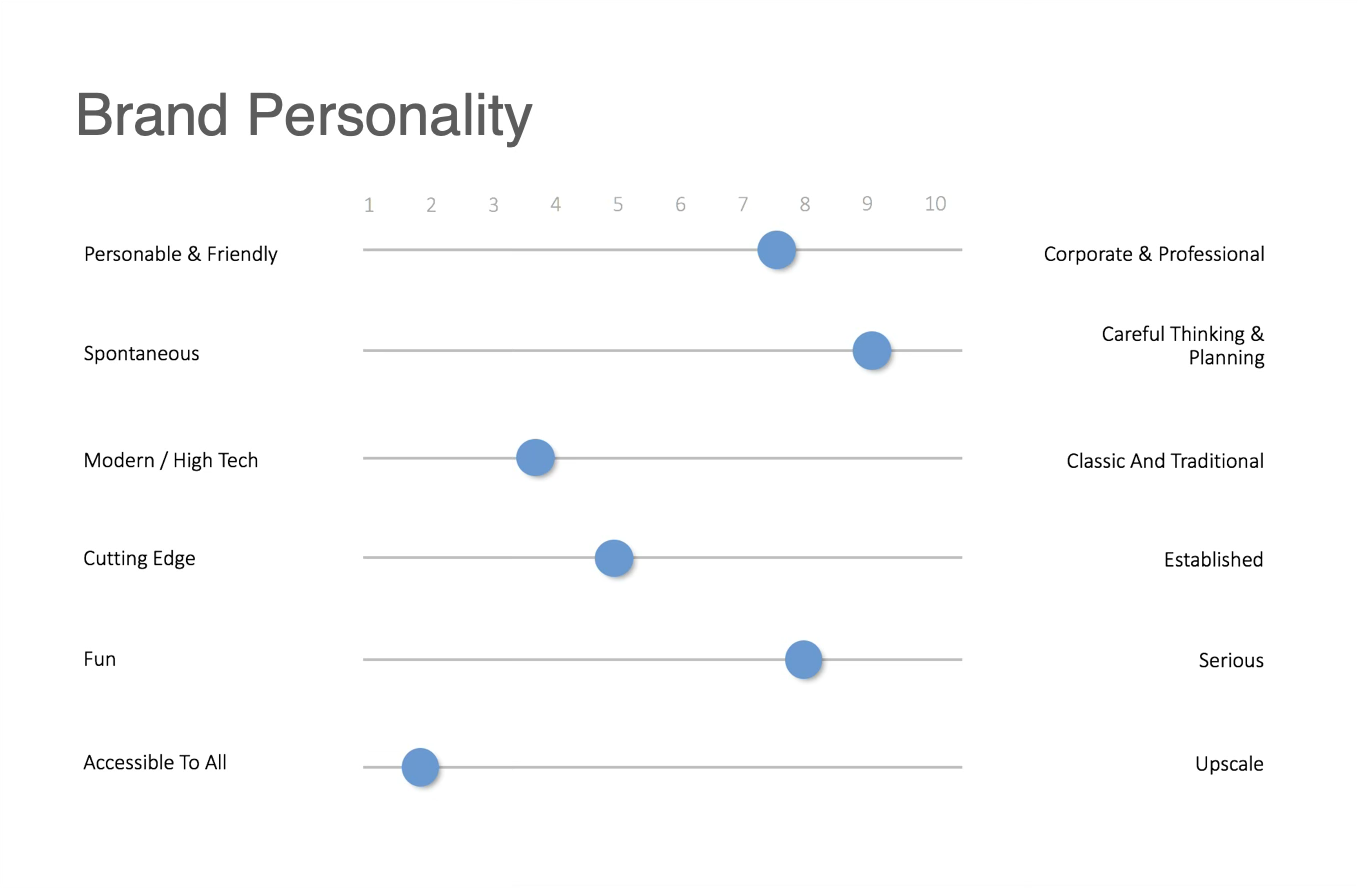
Personality sliders to get consensus on how the app should feel.
User testing
Testing ran continuously through the project and shaped the journeys.
Usability testing
Participants talked us through their real-life situation, then told us what they understood, expected and were confused by in the prototype.
Card sorting
With diners, to find which information matters most when shortlisting and then choosing. The winners: location, cuisine, price range, distance to a station, and a restaurant photo.
Multivariate testing
Workshops generated hypotheses, which were built and tested in Mixpanel.
Implementing the changes
I presented results back in Sprint Review, we agreed an interpretation together, then planned the course of action.
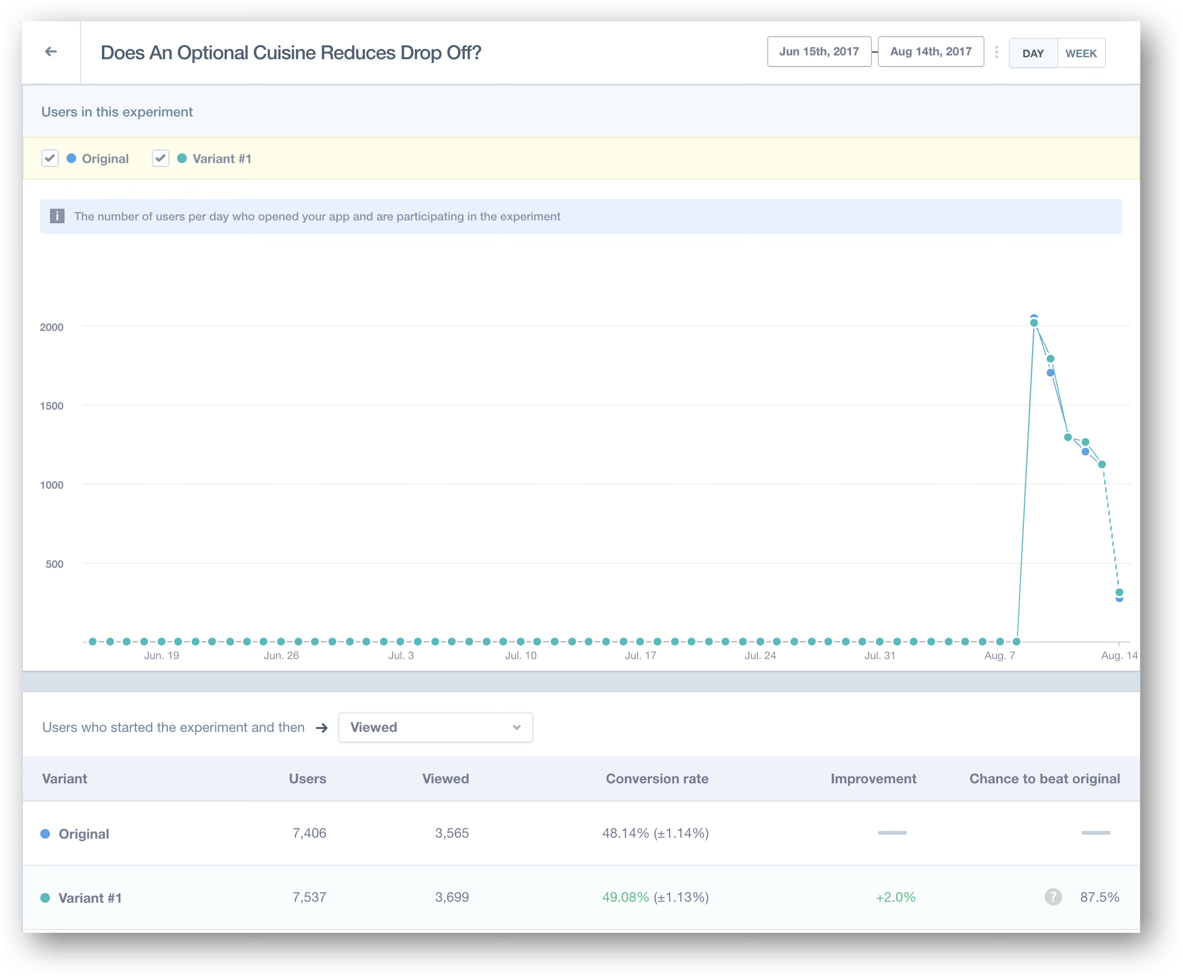
Making the cuisine filter optional lifted conversion from 48.14% to 49.08% — a 2% improvement, at 87.5% chance to beat the original across ~15,000 users.
Visual design
Working with the visual designer we took one new direction into testing — clean and well crafted, like the food on offer. Photography carries the page, the chrome steps back, and the only colour that shouts is the offer.
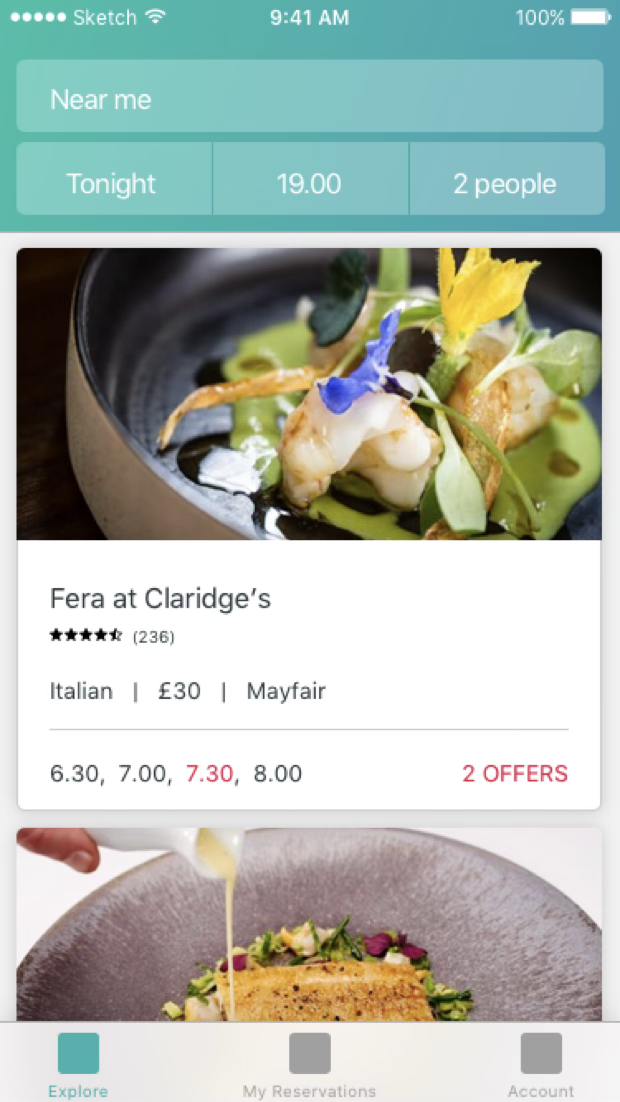
Explore — the dish does the selling; times and offers sit underneath.
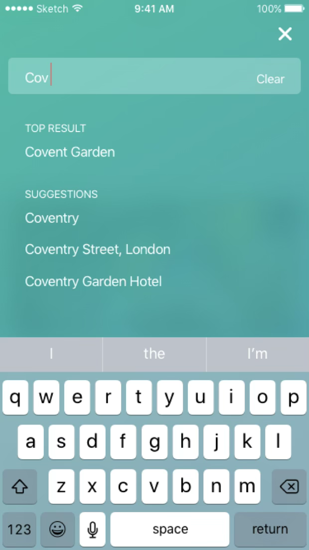
Search — full bleed, one top result, suggestions under it.
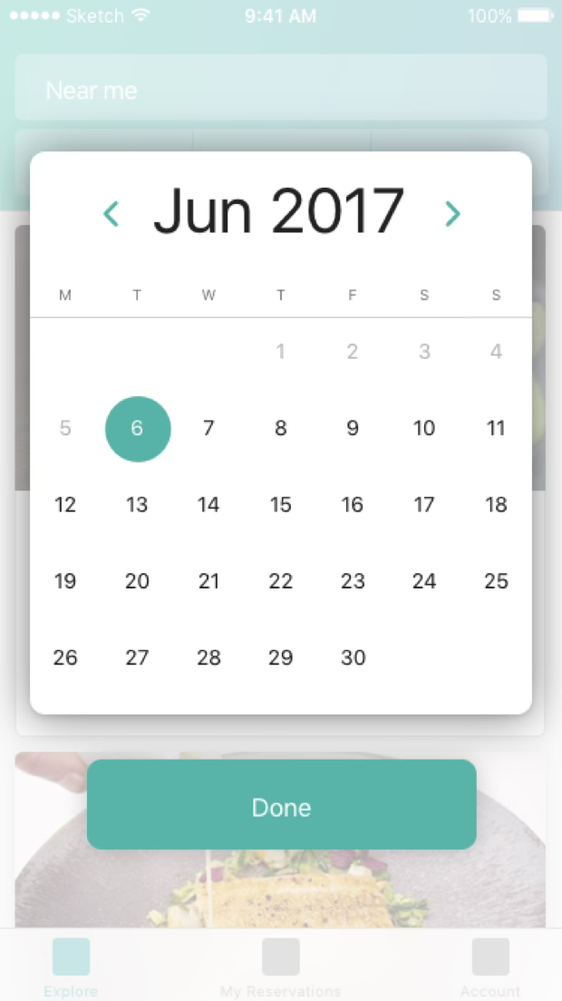
Date — a sheet over the results, never a new screen.
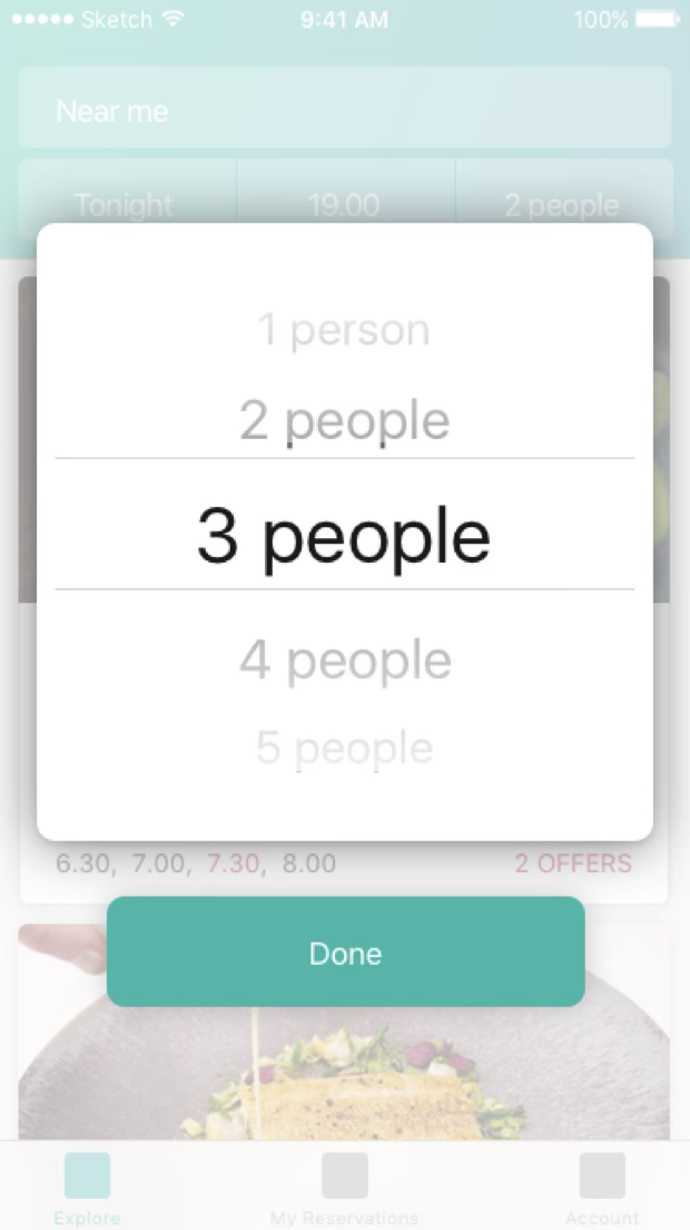
Covers — the same pattern, so the whole filter row behaves alike.
Deploy
The app went live on the App Store and was updated continuously with user-tested features and enhancements.