Manage
candidates
Replacing an off-the-shelf CRM with one built for the job
Robert Walters ran their recruitment on an ageing off-the-shelf platform about to go out of support. The vendor's replacement was enormously expensive and still didn't do everything they needed — so they decided to build their own. I led the UX, working agency-side.
The shipped product: a job's candidate pipeline, with bulk stage changes — the task consultants do most.
Aim
Change the way recruitment agents at Robert Walters manage their clients, jobs and candidates. The existing system was outdated and inefficient — cumbersome processes and an overload of information nobody needed, which frustrated the people who had to live in it all day.
The goal was a modern CRM that streamlines those tasks, improves productivity and matches the company's brand and long-term objectives — built on user research, iterative design and continuous feedback rather than a feature list.
The legacy platform was about to go out of support. The vendor's upgrade cost a fortune and still missed functionality the business depended on.
Building their own was the cheaper option and the only one that could fit how Robert Walters actually recruits — so the design work had to earn that decision.
Process
Stakeholder and user input feeding an iterative build: define objectives, research, ideate, scope, test, build, then learn and adapt. I laid it out linearly to explain Agile to non-digital stakeholders — the product itself was designed and built iteratively.
Agree with stakeholders what the product has to achieve.
Shadowing, interviews, card sorting and surveys with the real user base.
Hypotheses against each stated user problem.
What goes into this slice, against real resource.
Benchmarked against the legacy system, not against nothing.
Alpha environments so tasks could be tried in real scenarios.
Feed the findings back in and go again.

The seven stages I used to explain Agile to stakeholders who'd never worked in it.
User research
I shadowed recruitment team members, looked at the paper and digital tools they actually use, ran as-is interviews across a large slice of the future user base, and used card sorting surveys to find which candidate information genuinely matters.
Participants spanned London (14 consultants, 3 team supporters), Milton Keynes (4 consultants, 1 team supporter) and a business working group of around ten APAC and ten EMEA consultants.
One consultant kept their candidate hotlist in a paper notebook, because the digital platform wasn't trusted and was "not as versatile as a piece of paper".
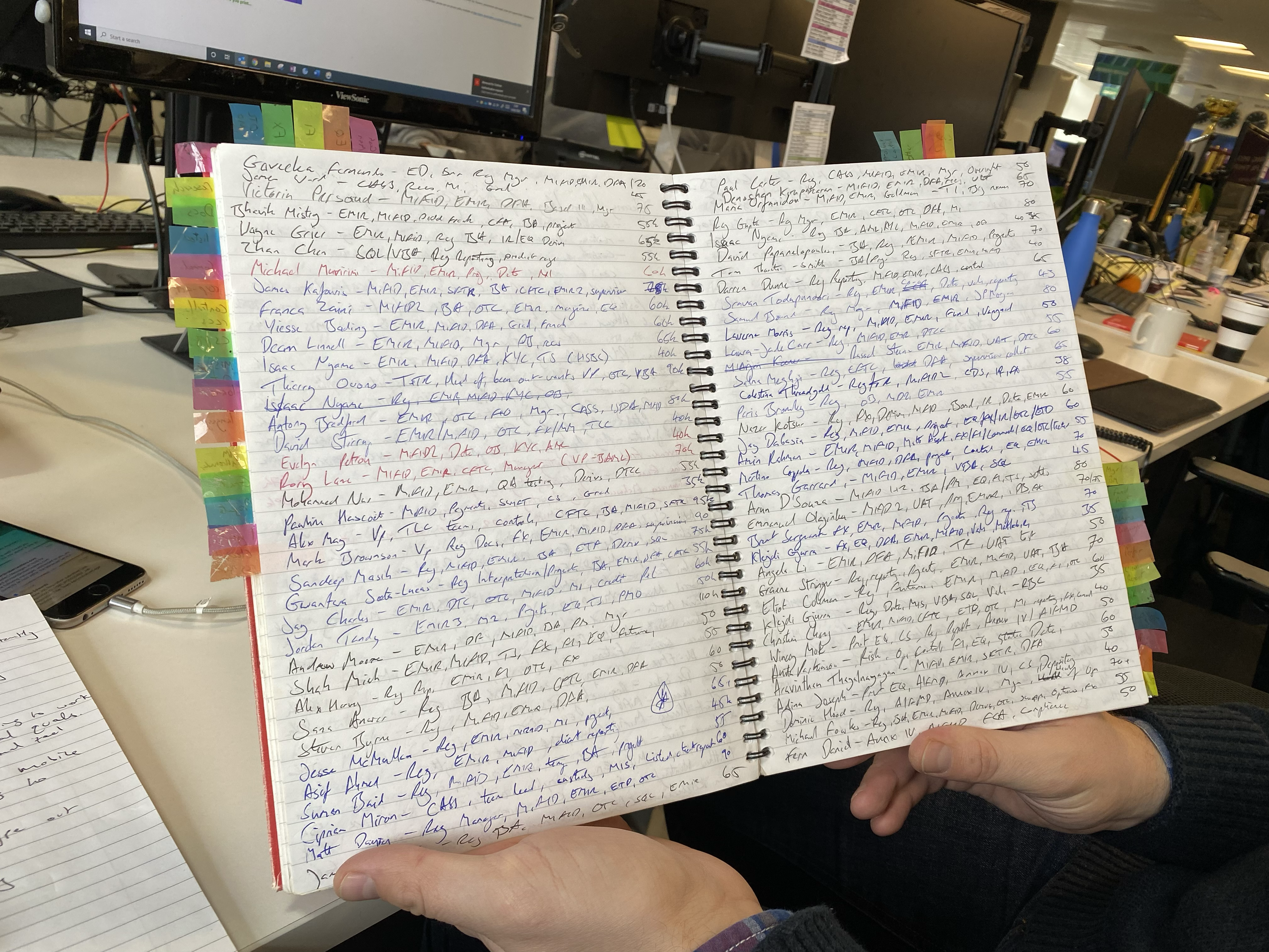
That actual notebook — pages of candidates nobody else in the team could see.
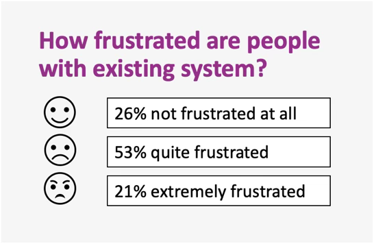
Three-quarters of the people we surveyed were at least quite frustrated — the case for change wasn't a hunch.
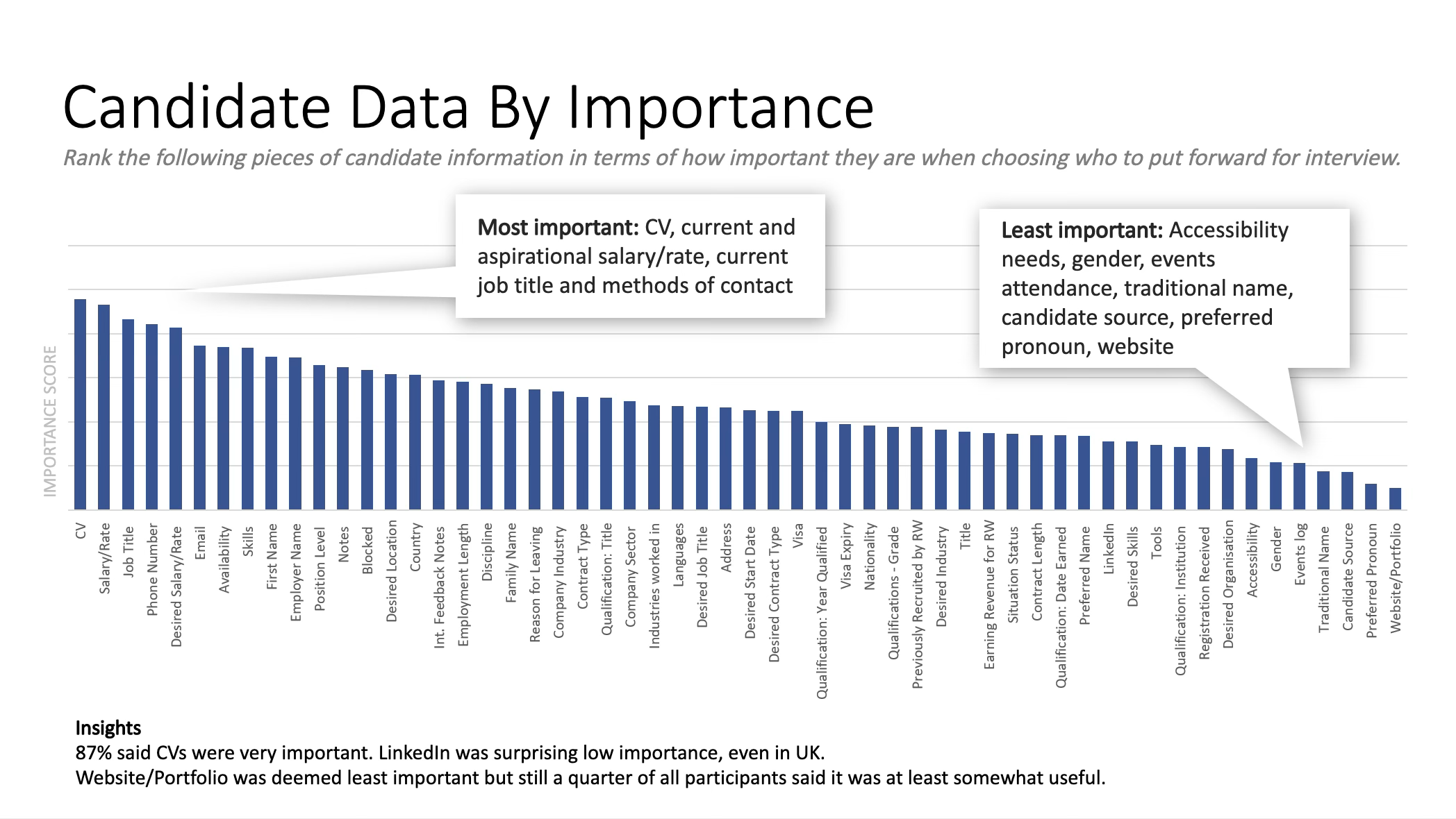
The card sort behind the data-prioritisation insight above — CV and salary mattered most; social profiles barely registered.
What users told us
The verbatims were unusually consistent — and they became the left-hand column of the solution table.
"Registering candidates is a painful process."
"Search is clunky and you have to enter exactly the right information, which is time consuming."
"A lot of information is off the system, so we end up annoying candidates by ringing them again."
"A lot is done over email, which gets lost easily."
"I wish I could access the application wherever I am — in a coffee shop, on the bus, wherever."
"It takes so long to learn how to use the old system — I want to learn it myself."
Segmentation, personas & jobs to be done
We segmented the recruitment staff on the qualities that actually changed their behaviour — profile usage, placement performance, tenure, discipline and how full their candidate pool was.
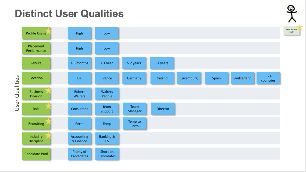
Starred rows are the qualities that changed behaviour enough to shape a persona.
Three personas came out of it. Each had its own jobs to be done, on the system and off it — collating potential candidates, reviewing them with the team — which we turned into specific tasks with a pass mark, then ran in an alpha environment so we knew they held up in real use.
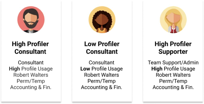
The personas, split by role and how heavily they used the old platform.
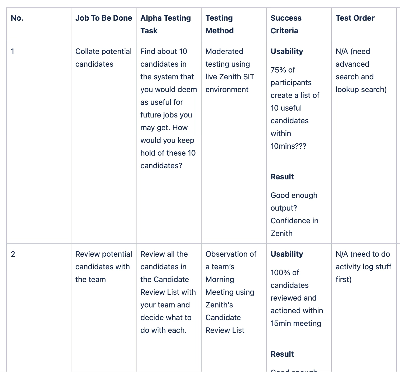
Every job to be done became an alpha task with a testing method and a success bar.
Journeys & the object model
I mapped the high-level to-be journeys for finding suitable candidates for a role — the key steps, and the emotions and thoughts at each one — so the team could see the recruitment experience from the consultant's side and spot where the workflow hurts.
Alongside that, an entity-relationship diagram covering client contacts, organisations, job vacancies and everything they connect to. It was drawn deliberately so business stakeholders could read it — which is how we got useful feedback on the structure of the system rather than just the screens.
The journey map showed feeling dropping hard at one step in particular — entering a candidate into the system. That dip is what the whole quick-create flow was built to fix.
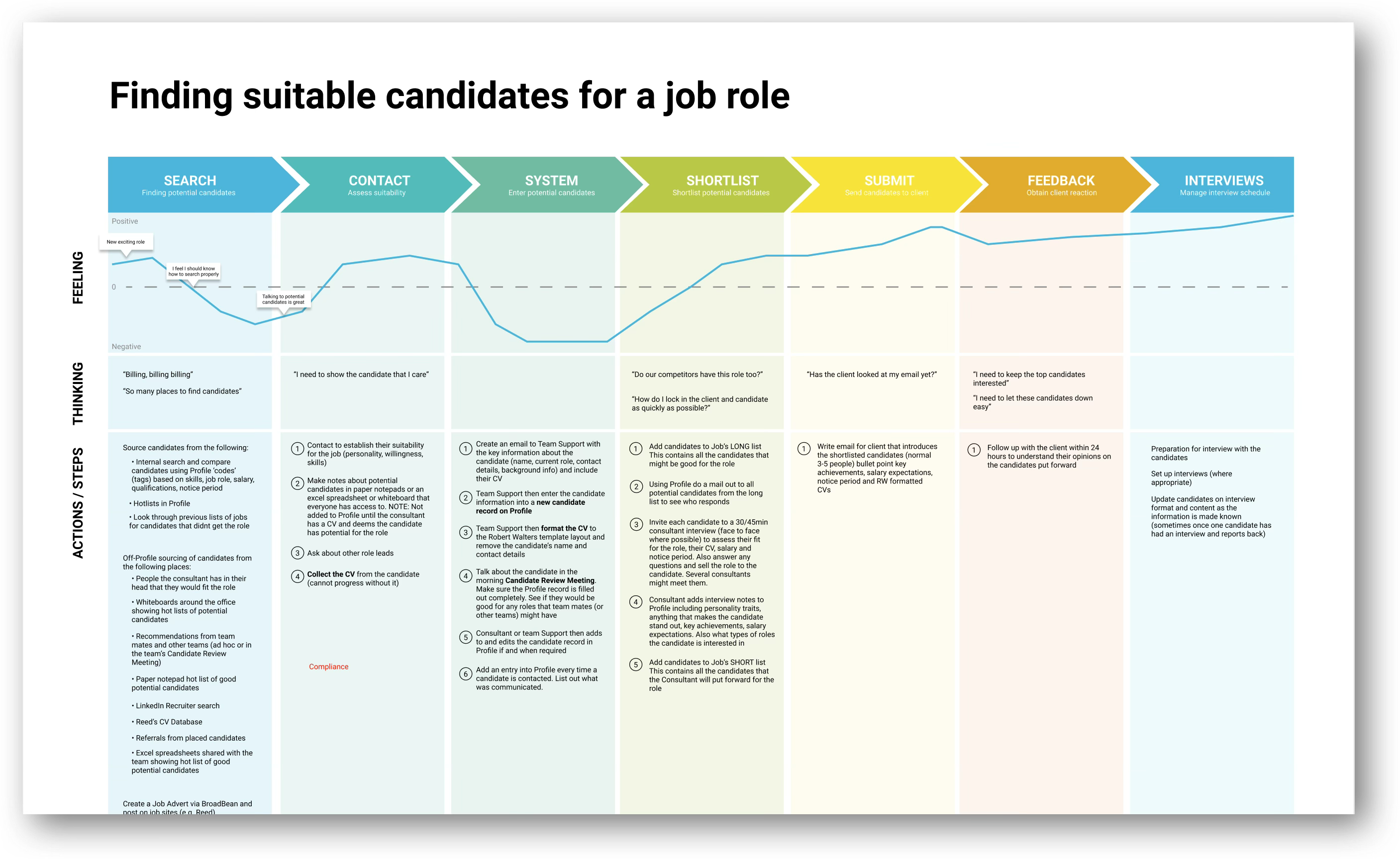
Search to interviews, with what the consultant is feeling and thinking at each step.
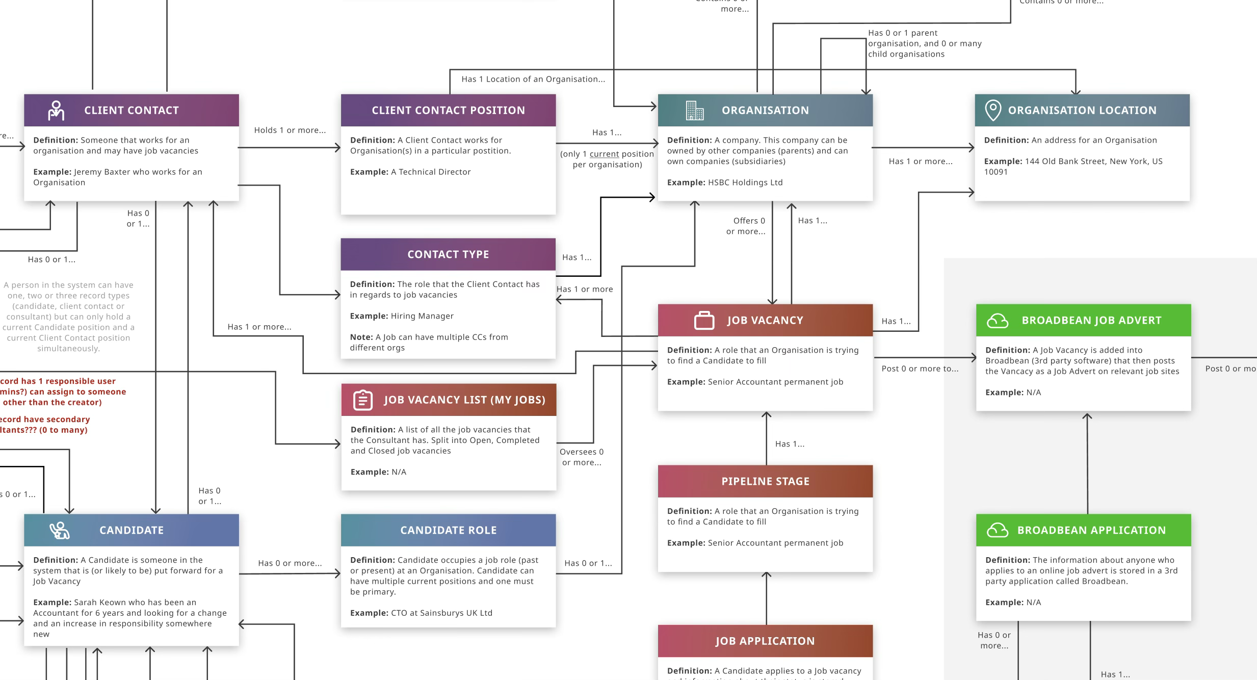
Every record type written in plain definitions and examples, so stakeholders could argue with the model itself.
Solution hypotheses
I ran the UX team as a laboratory: every stated user problem got a hypothesis about what would make it better, and every hypothesis got tested rather than assumed.
| User problem | Hypothesis | Solution |
|---|---|---|
| "Registering candidates is a painful process" | Prioritising ease of entering candidate information will cut time and raise satisfaction. | A quick-create modal carrying only the vital fields, and nothing else. |
| Re-typing what's already on the CV | Letting users upload a CV and auto-populating the fields will cut time and raise satisfaction. | Add a CV to the quick-create modal, parse it into the fields, and let the user review before saving. |
| "A lot is done over email which gets lost easily" | Bringing that part of the workflow inside the product will stop information going missing. | Candidate records as drafts that stay out of search, assignable to a team supporter to finish. |
Prototypes, testing & benchmarking
Wireframes and prototypes were tested head-to-head against the legacy system, so improvement was a number rather than an opinion. That mattered with a user base nervous about change — and it gave the business hard evidence that building their own was working.
Test taps recorded step by step through the rate and contract fields — where hesitation showed up, the field changed.
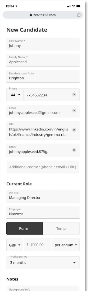
Vital fields only, the CV doing the typing, and everything secondary folded behind 'add more'. Notes sit at the bottom because that's where consultants put the context a CV never carries.
Brand & personality
I surveyed consultants on how they saw the company's personality, and read that against the Robert Walters brand guidelines and accessibility requirements. Three traits came back clearly, and they set the look and feel — and the tone of voice — for each type of record in the application.
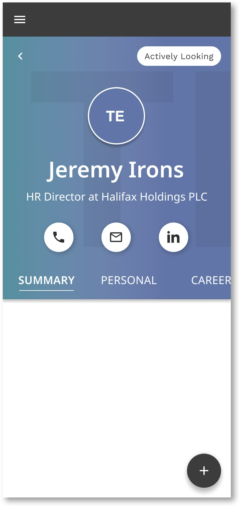
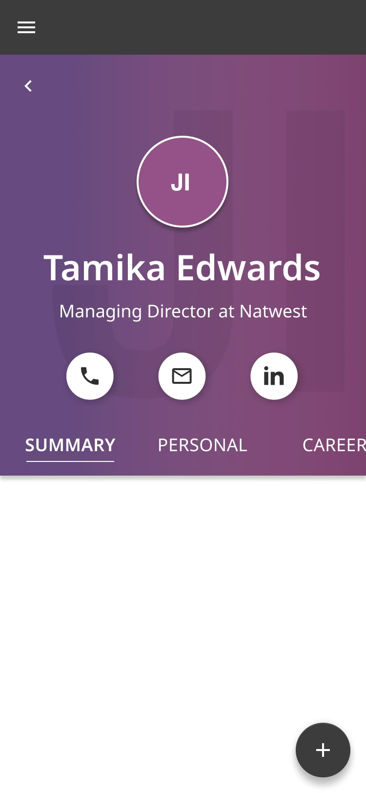
Candidates, client contacts, consultants, organisations and jobs each got their own gradient and mark, so a consultant knows what they're looking at before they read a word of it.
Candidate
Client contact
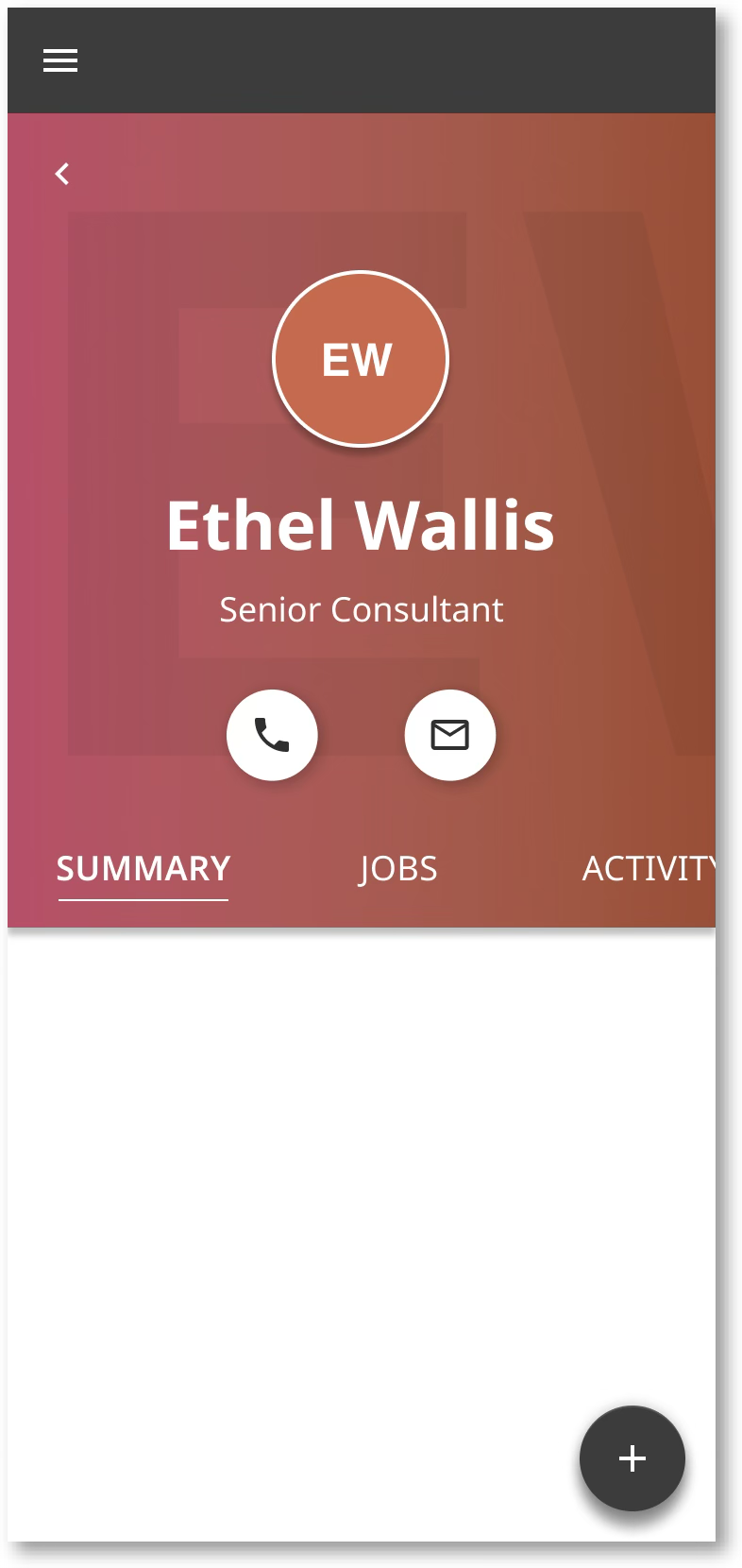
Consultant
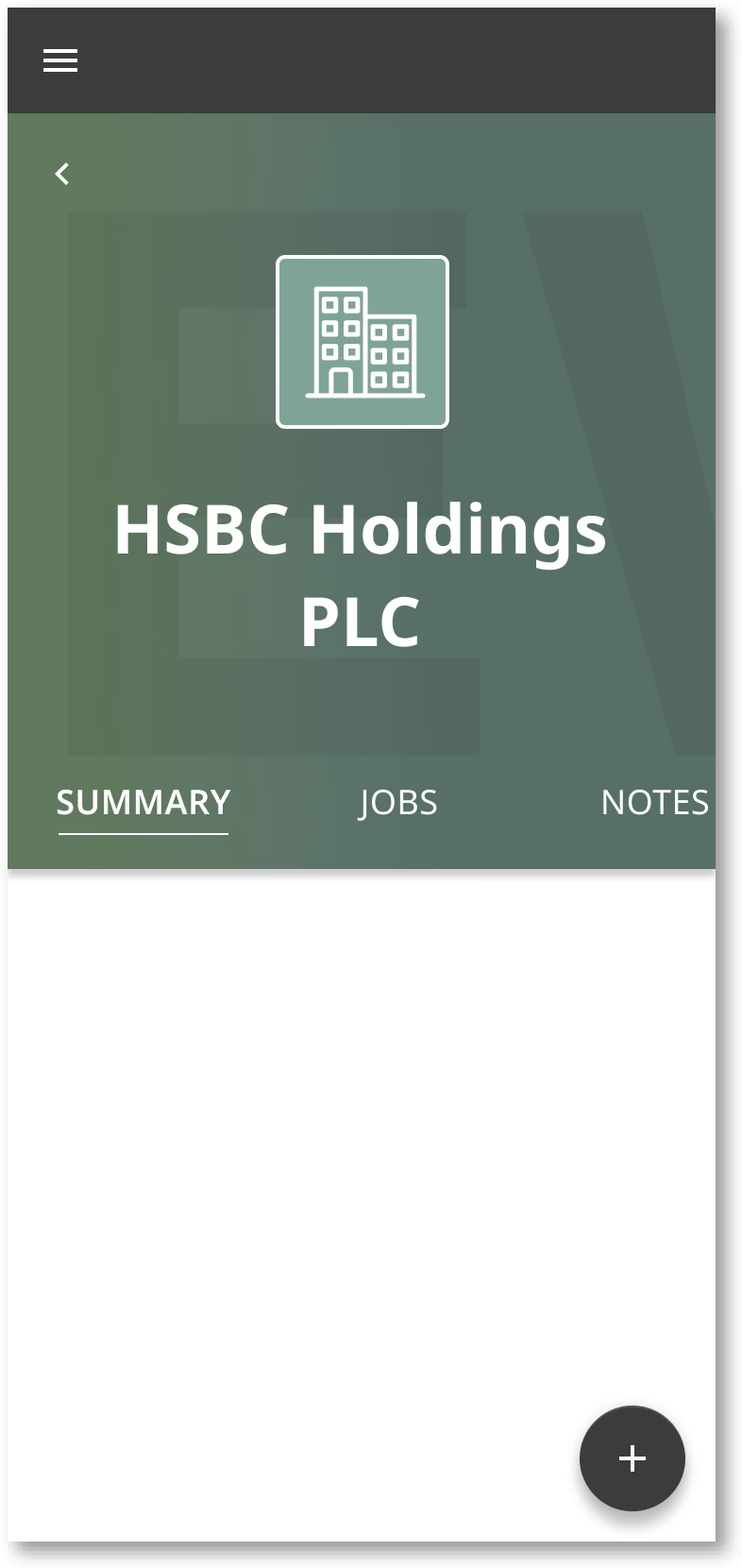
Organisation
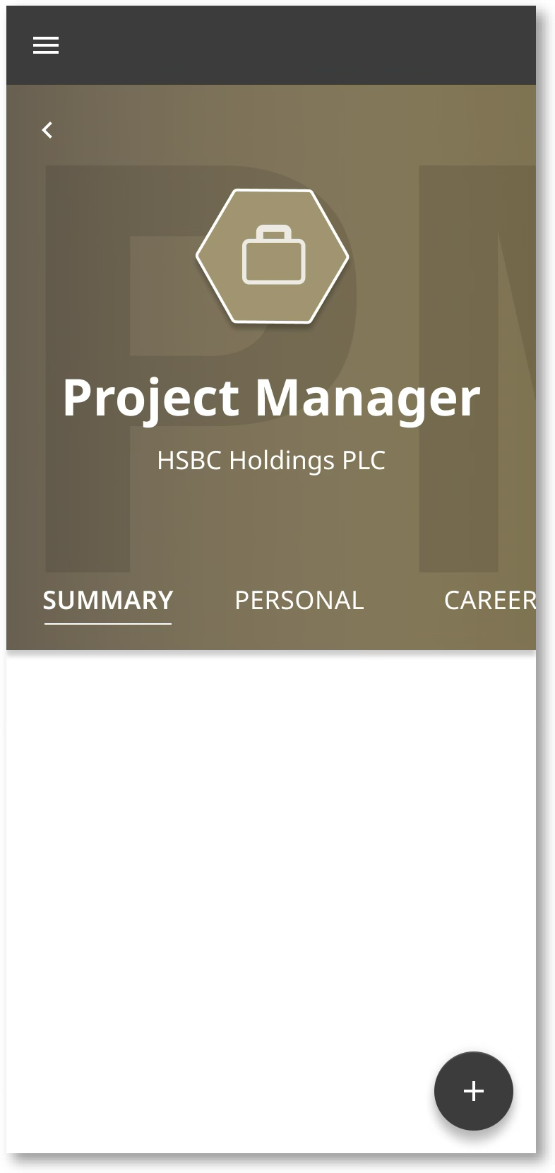
Job vacancy
Detailed journeys, IA & accessibility
Detailed journeys captured every step a user takes through candidate management, down to the screen flows, so the interface stayed intuitive rather than merely complete.
The information architecture gave every piece of functionality a natural home without loading any one page with options — the direct answer to the information overload people hated in the legacy system. Accessibility was worked in alongside the brand guidelines rather than checked at the end.
Every field, empty state and validation message was drawn at screen level — so the build team never had to guess what a half-finished candidate record looks like.
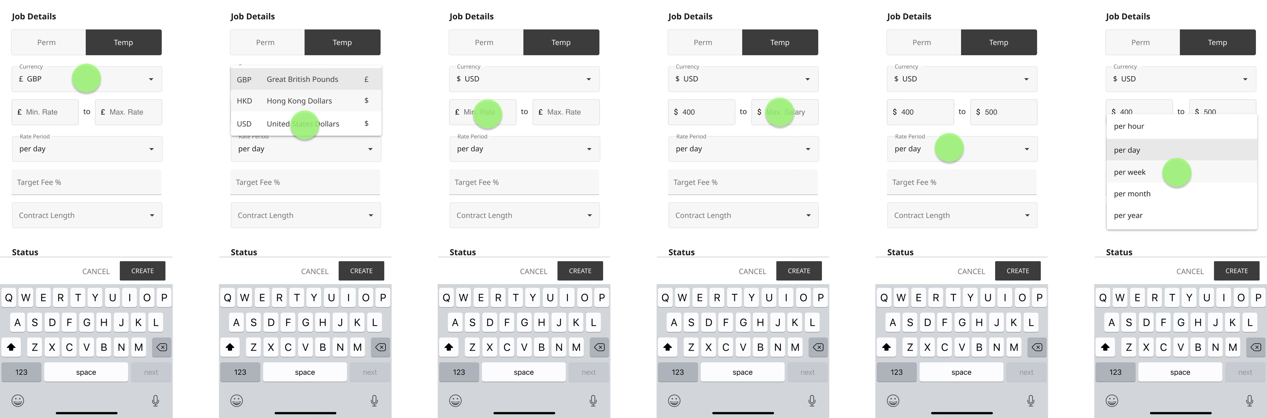
The fill-in-the-form flow, screen by screen, from the candidate list through to a saved record.
Design system
A consistent set of colours, icons and typography, with page states defined, so the interface holds together across the platform and can be extended without re-deciding the basics every time.
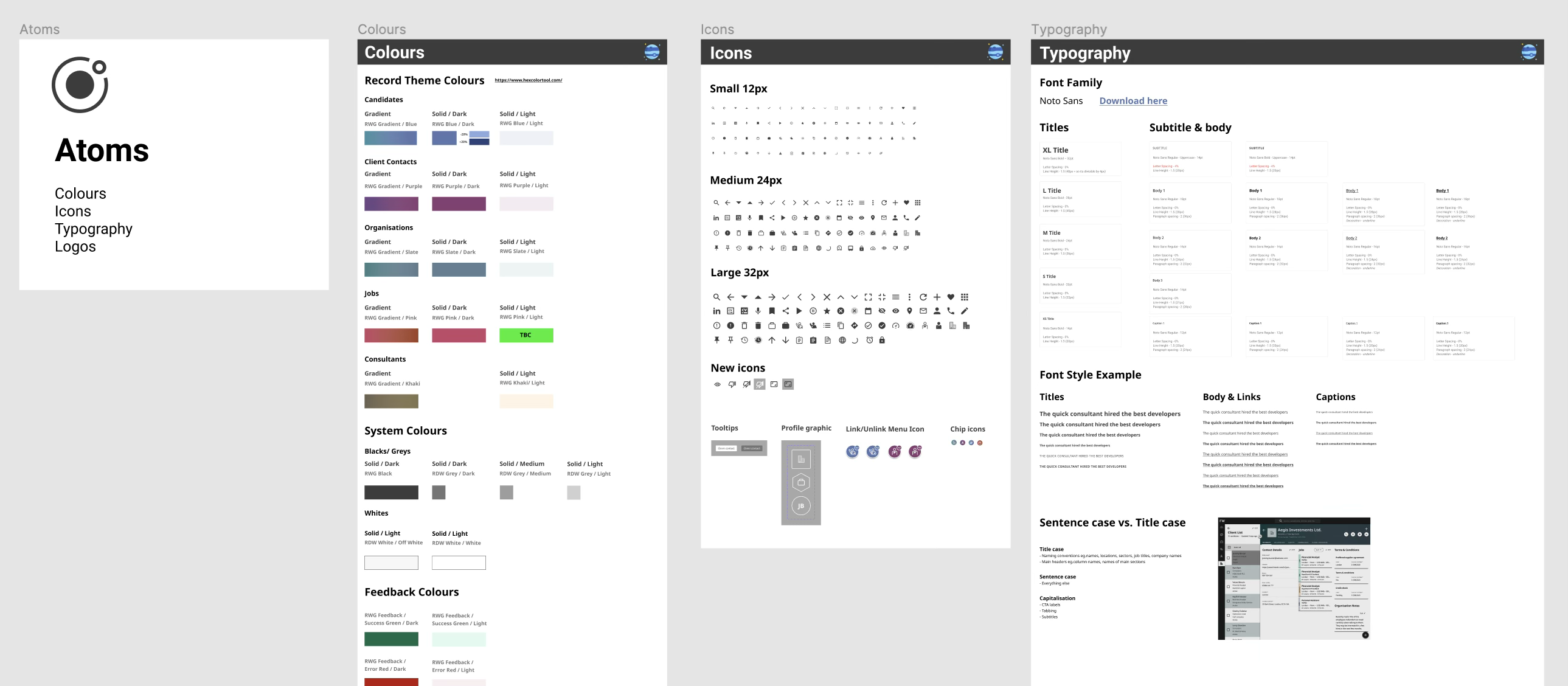
Colour, icons and type documented as atoms — including sentence-case versus title-case, which settles a lot of arguments.
Final visual design
A modern, intuitive interface for managing candidates with streamlined workflows on desktop and mobile — one experience across devices, answering the consultants who wanted to work from a coffee shop or a bus.
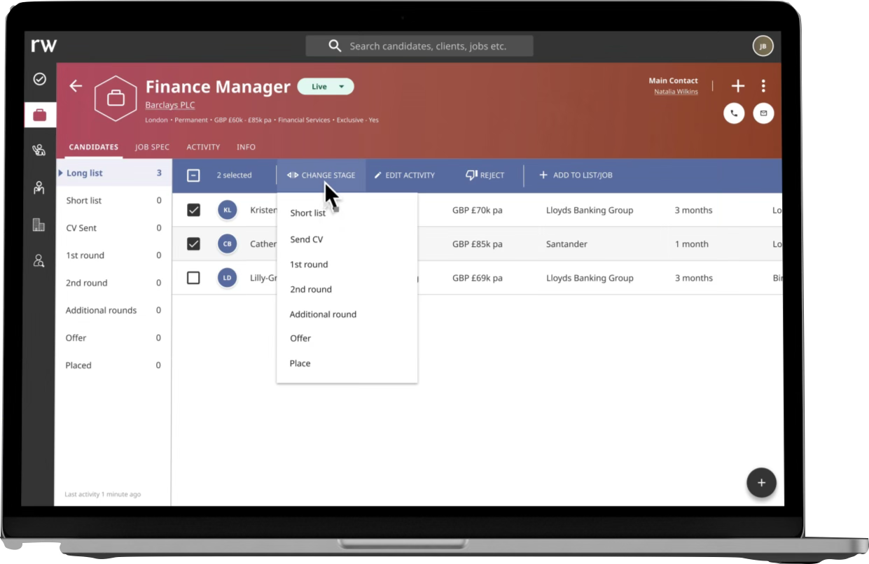
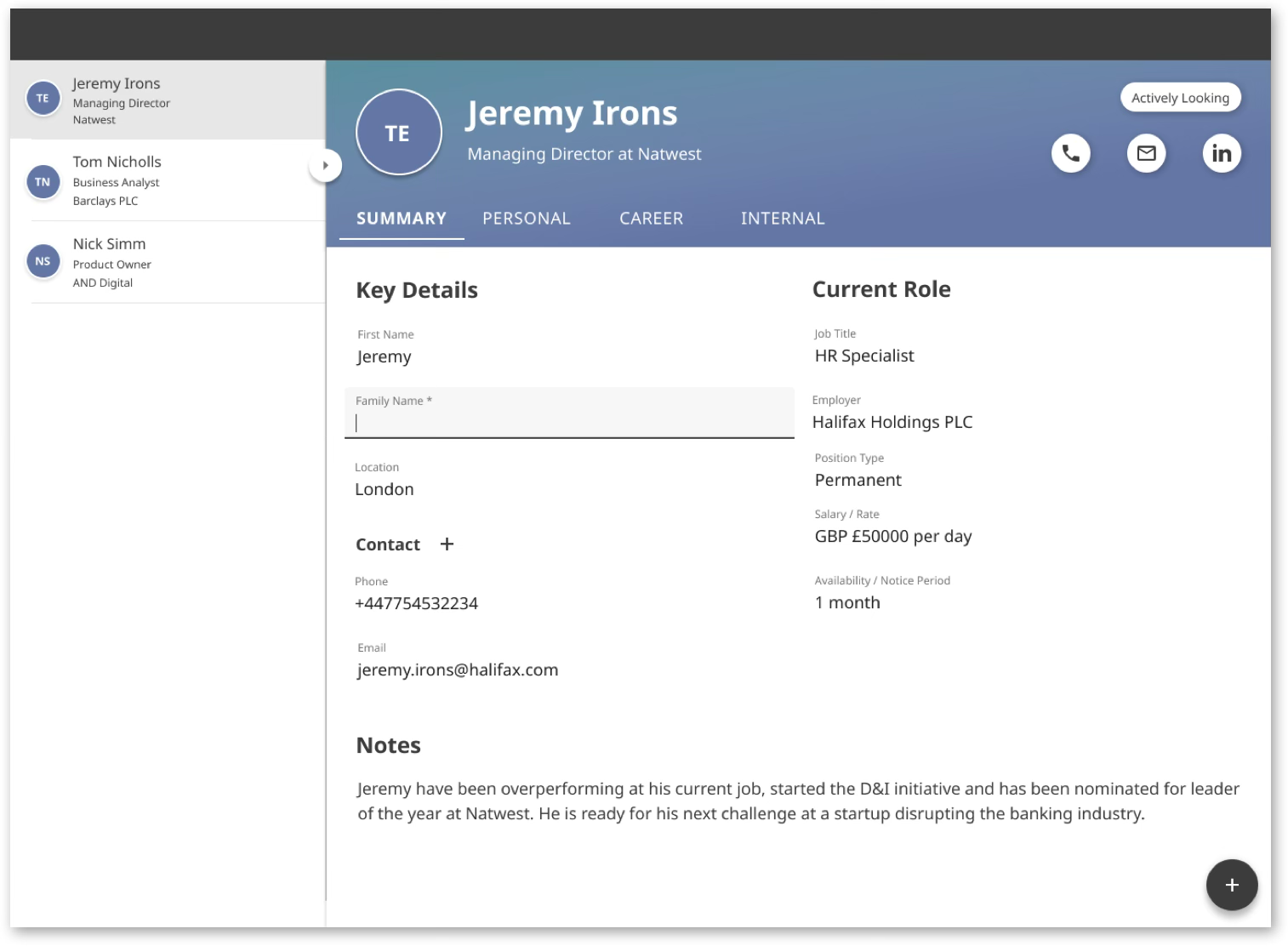
Desktop — the pipeline, stripped to what consultants said they actually use.
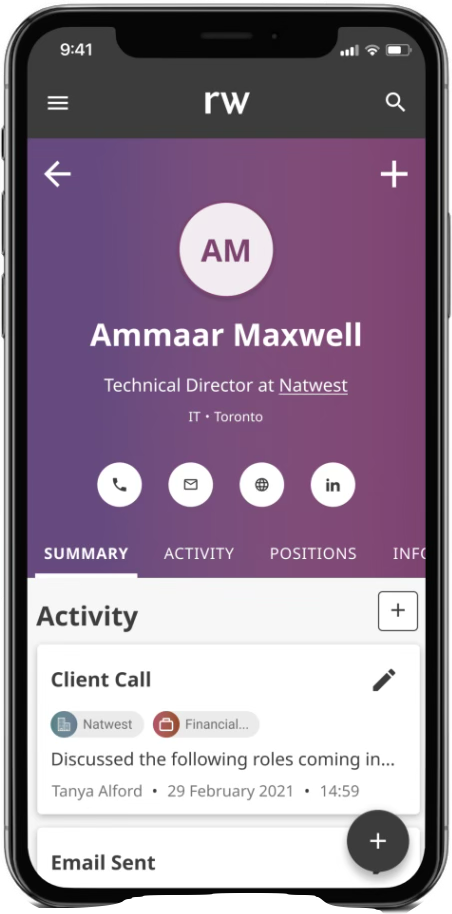
Mobile — the same record and activity log, away from the desk.
Change management
Research had told us plainly that long-term users were resistant, so we designed for the transition as well as the product. A promotional and educational video showed the features and the benefits, and helped staff fold the new system into their working day — it turned out to be one of the most valuable things we made.
Cut and animated in-house — one scene per benefit, in the language consultants use. Watch on YouTube →
Results
"The new CRM system has transformed how our team works — tasks that used to take hours now take minutes. The user-friendly design has been a game-changer."
"The onboarding materials, especially the video, made the changeover much easier than we anticipated. The team was able to hit the ground running."
What I took from it
Change management — communication and training materials — needs planning from the start, not bolting on at release.
If I ran it again I'd bring users in before the initial concepts, not just to react to them.
Scoring prototypes against the system they replace made the case for the build in a language the business could act on.