Understanding
your energy usage
A public app for seeing what you use, what it costs, and what to do about it
Most people cannot name the ways they use energy in and around the home — heating, appliances, hot water, the car on the drive. Strala was built for the public: work out how much energy you use each month, how much you spend on it, and what you could realistically change.

{{ infoText }}
The problem
People do not know all the different ways they use energy in the home and around it — including their vehicles. Without that picture, a bill is just a number that arrives, and reducing it is guesswork.
Strala had to do three things for an ordinary household: show what they use each month, show what it costs, and give them something concrete to do about it. All three depend on knowing a little about the home and the car — which is what put the weight on onboarding.
A personal answer needs personal data. Asking for it up front is the fastest way to lose a public audience.
So the first hypothesis we tested was whether to onboard people at all, or drop them straight into the app on the UK average and let them personalise later.
Product map
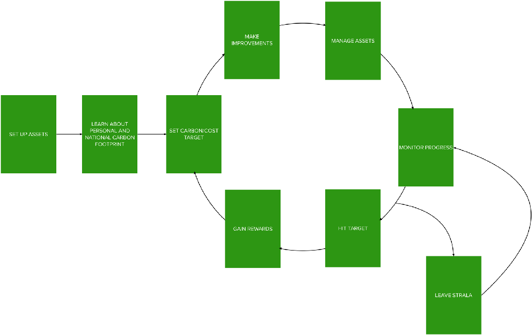
We mapped the app at a high level first — every section we thought it needed — so each piece could be tested on its own merits rather than defended as part of a whole. This case study covers the onboarding slice of that map.
The map also forced the ideas into one place. They were then scored and put in priority order using ICE, which is how onboarding earned the first round of research.
Ideas as hypotheses
Rather than argue about features, we wrote every assumption down as a testable claim with a success criterion attached. Three covered onboarding.
People will find it useful to understand what Strala is before entering the app.
People will be able to enter the right information about their home and vehicle.
People will want to answer questions up front to get a personalised experience.
A hypothesis with a number on it ends an opinion argument — the team stops debating taste and starts agreeing on what would count as evidence.
Working the logic
With Product, I mapped the requirements into the order a person would actually meet them, and every decision they could make along the way — purely the human logic, before any technical shape was put on it.
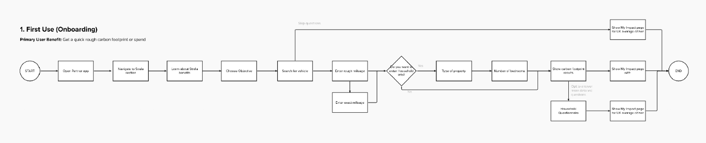
Scroll sideways to follow the logic — every question, every decision point and every skip.
Sketches, then wireframes
Many solutions sketched quickly, so we never got fixed on the first one — weighed against what the app already did, what competitors do, and the build time available. The strongest went to the Product Owner and Technical Manager early, for feasibility and for more ideas.
Wireframes were done bi-focally: rough out the long-term vision, then pare it back to the first buildable iteration. Copy went through our copywriter and legal before go-live.
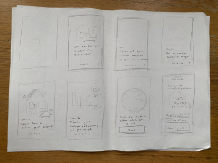
Volume first — no single solution held on to too early.
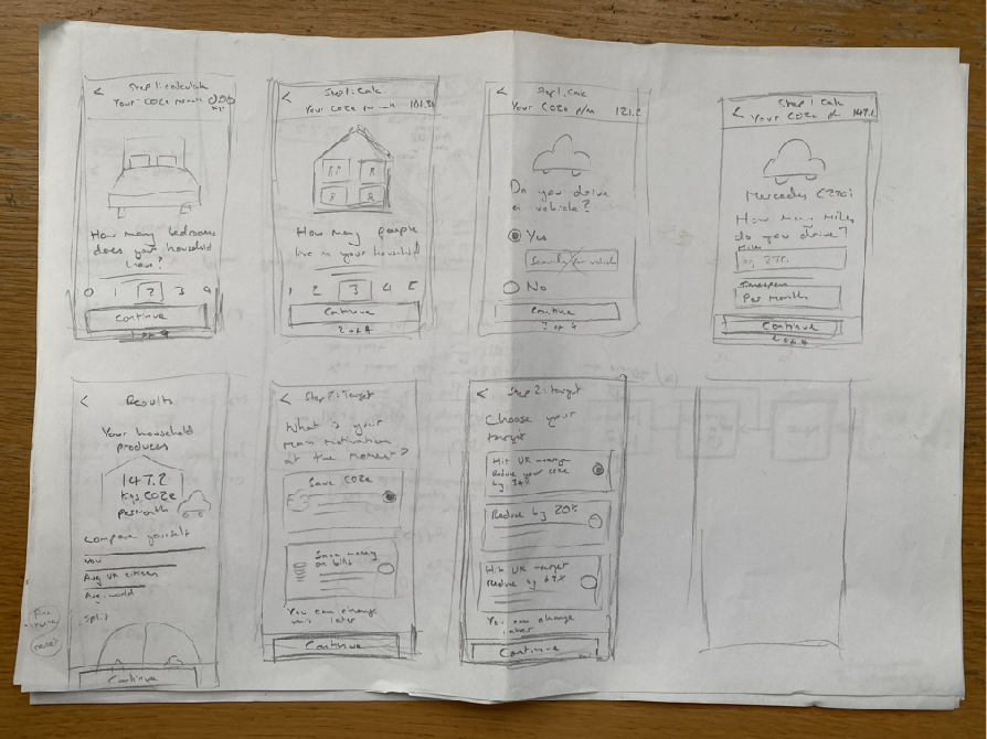
Volume first — no single solution held on to too early.
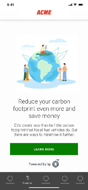
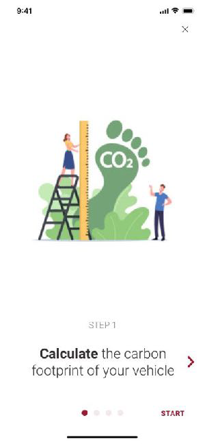
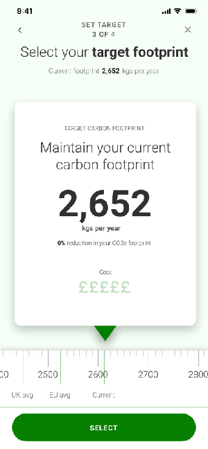
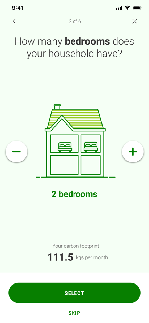
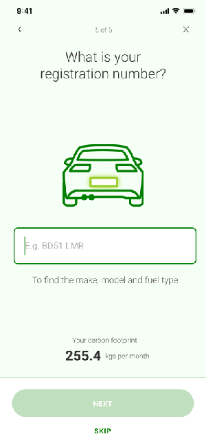
The wireframed onboarding, annotated with the open questions: house type then bedrooms filling the illustration, a scrollable target scale against national averages, and whether to lead with the steps or the benefits. Labelling a slide "Step 1" made people think they had to do it right then — that went.
Prototype and testing prep
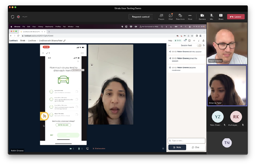
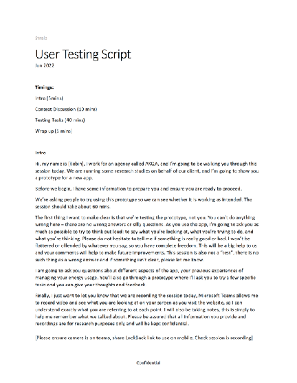
Scenarios and tasks were built straight from the hypotheses, so each task produced a measurable success rate rather than a comment. AKQA moderated the sessions, which kept our own bias out of the room.
We ran a dry run with an AKQA researcher first and found the script and prototype issues before they cost us a real participant.
Results
All three hypotheses passed — but one only just, and that was the useful result. The journey worked; the order of it did not.
What we learned
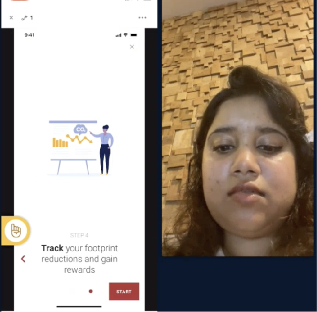
People clicked through the explanation to get at the thing. They wanted to see where they stood before being asked to commit to anything.
The journey we designed
One page to understand the concept, then a choice. The primary action takes you into the personalisation questions — as the testing said it should; the secondary shows the benefits slides for anyone who wants them.
An objective screen decides what the app leads with — carbon or cost. Then the household and vehicle questions personalise the data. Skip them and you see the UK average citizen until you are ready to put your own numbers in.
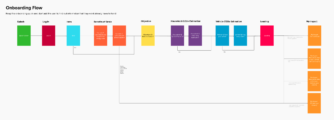
The flow diagram: log-in, intro, benefits, objective, then the household and vehicle questions.
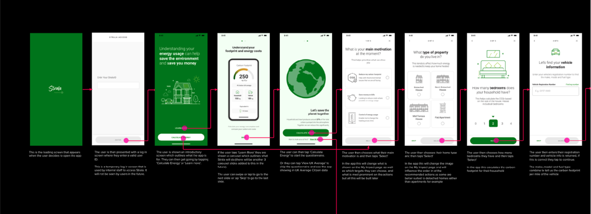
The detailed journey handed to the team: every screen in sequence with the narrative explaining the logic behind it. Scroll sideways to read it through.
Final UI
Built from the wireframes on our design system, and agreed with the PO and Tech Lead — some screens were shelved to keep developer time on the ones that mattered.
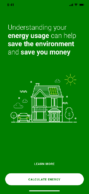
The intro — one page, two ways in.
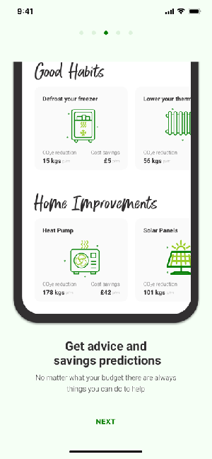
Benefits, offered rather than imposed.
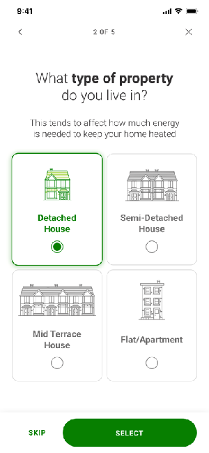
Household — the home's share of the usage.
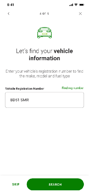
Vehicles — the part people forget they use.
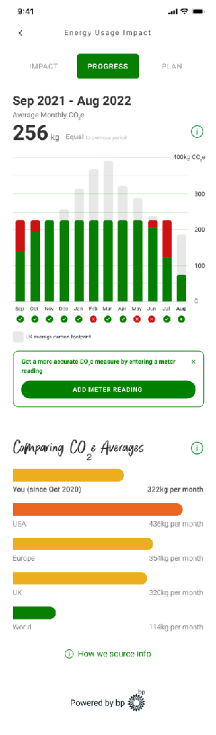
The other half of this research round was targets and progress. This screen came out of it: monthly usage and spend, measured against where you started and where you said you wanted to get to.
Because people wanted to beat the average before committing to a target, progress had to work as information first and as a goal second.
Design system, and handover
New illustrations went into the library; the component layer needed nothing new, which was a good sign. Handover was the full set: final designs and assets in Zeplin, journeys and logic in Mural, workflows, named data points, and explanations to the BA writing the requirements — then working alongside the developers through the build.
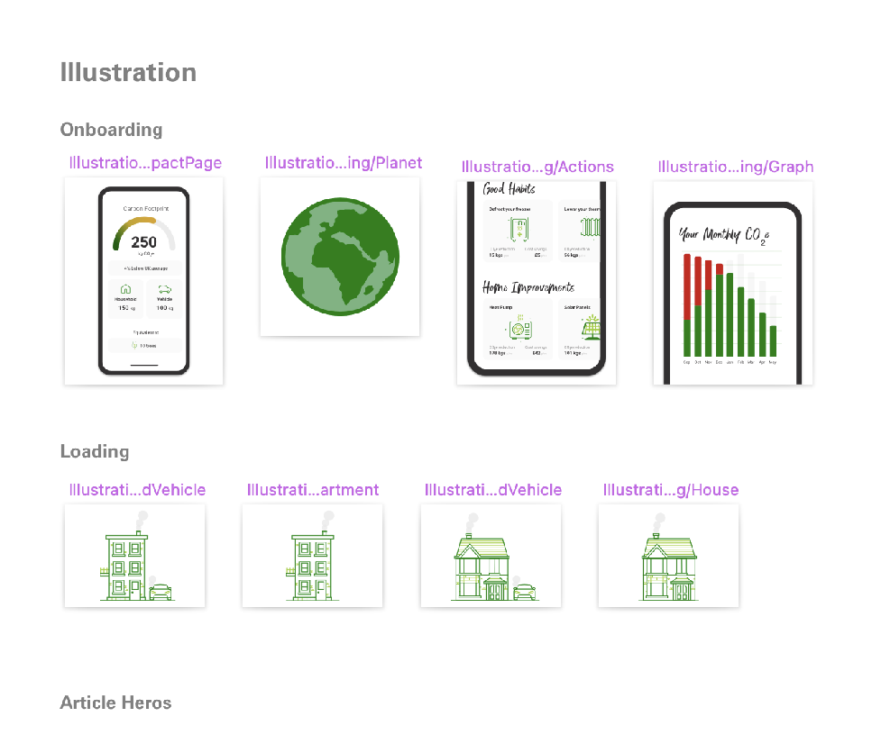
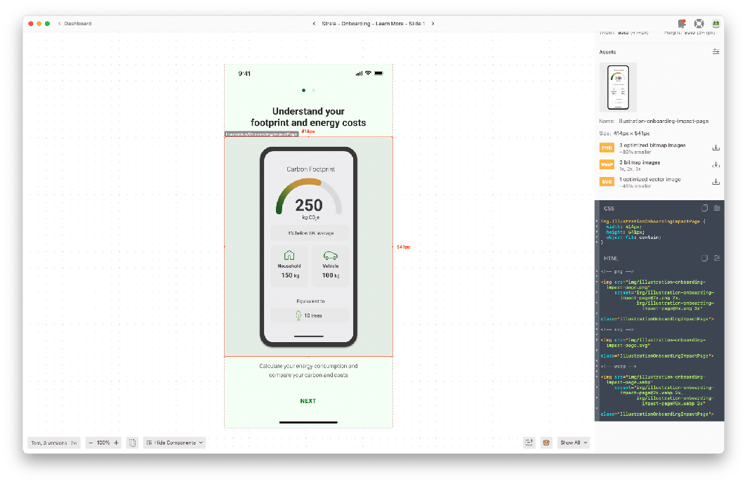
Every screen and asset in Zeplin, with the specs developers needed alongside it.
What I took from it
Every hypothesis passed and we still changed the journey. The recommendations were worth more than the verdicts.
A round 50% was convenient, not scientific. I would now derive the threshold from the behaviour we actually need.
For a public audience, show them something about themselves first. The questions get answered once the app has proved it is worth it.
Areas of improvement
I logged an "areas of improvement" note at the end of every stage — what I would do differently next time, written while it was still fresh rather than at the end of the project. The full list, stage by stage.
- {{ it }}