Assessing mental
health risk
A clinical tool that guides you, instead of one you need training for
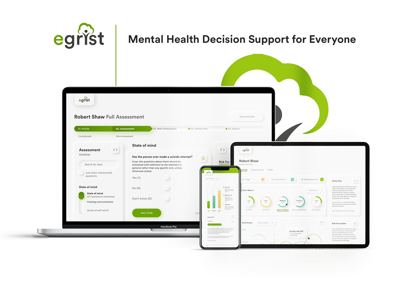
eGRiST helps mental health professionals assess a patient’s risk and decide what to do next. New users needed intensive training, and people were entering incorrect information about patients. I redesigned it around the way clinicians actually work.
The problem
eGRiST needed a redesign for three reasons:
- New users needed intensive training before they could use it.
- Users were entering incorrect information about patients.
- Newer competitors had more professional-looking interfaces.
The client could see the symptoms, but not what was causing them. Finding the cause was where the work started.
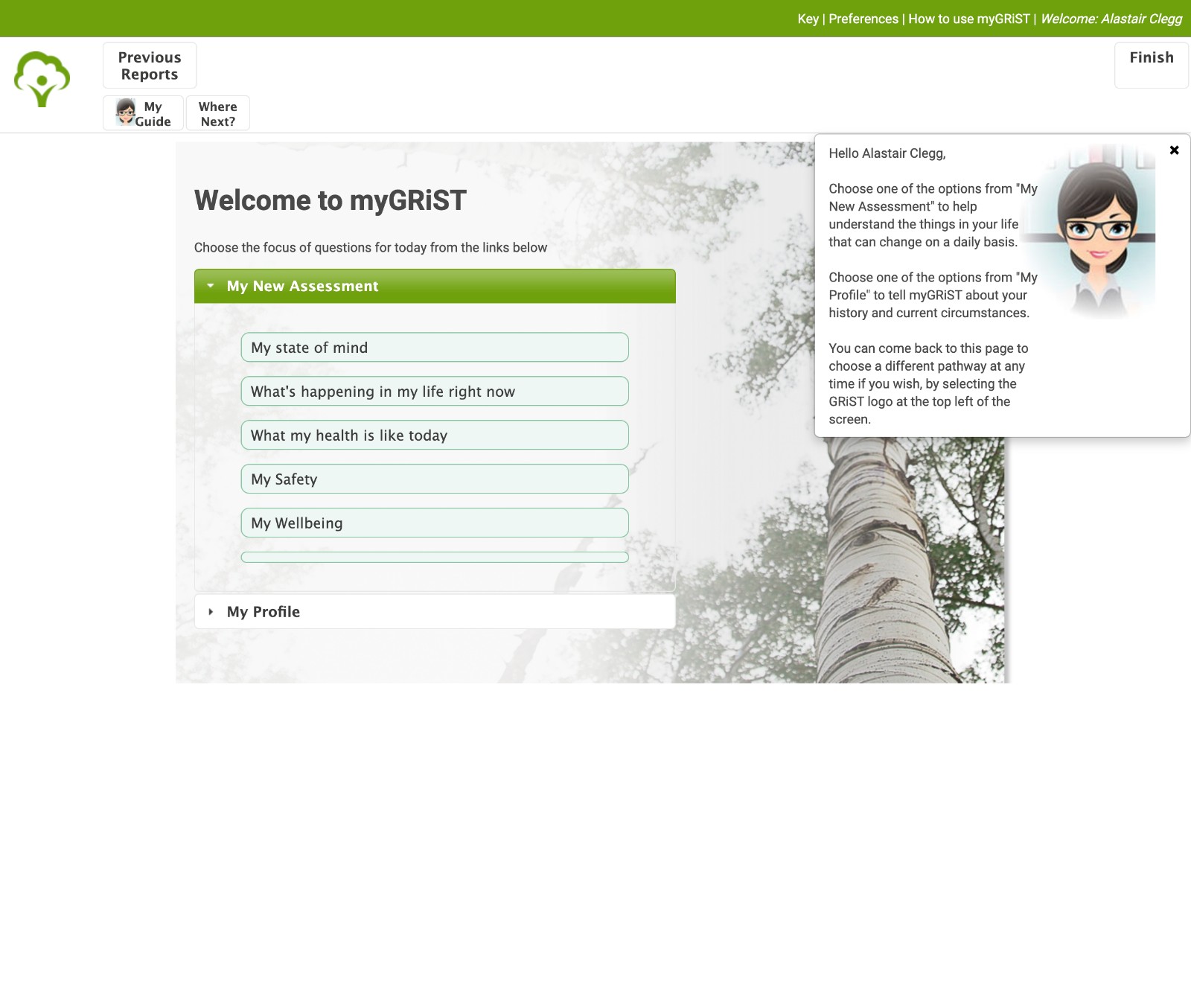
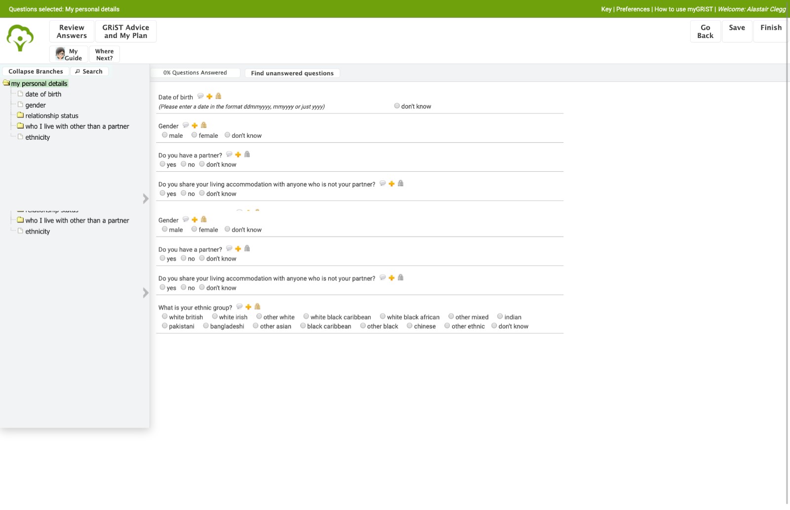
eGRiST before the redesign: the welcome page, and part of a full assessment.
Methodology
I followed the double diamond. Discover opens the problem up, Define narrows it down to what matters, and Deliver hands over the answer and keeps iterating on it.
- Stakeholder interviews
- User interviews
- User stories
- Personas
- User journey map
- UX audit
- Wireframing
- Visual design
- Design reviews
- User flow
- Prototype
- Style guide
- Final designs
- Handover
- Design support
- Presentation
- Atomic design system
UX audit
Making the size of the challenge clear
The client didn’t know how deep the UX problems went, or that they were behind the business pain. I started with an audit to show how much of the product needed rethinking.
To make the findings easy to trust, I made the criteria transparent: Nielsen’s ten usability heuristics, and an accessibility framework covering autism, screen readers, low vision, physical or motor disabilities, deafness and dyslexia.
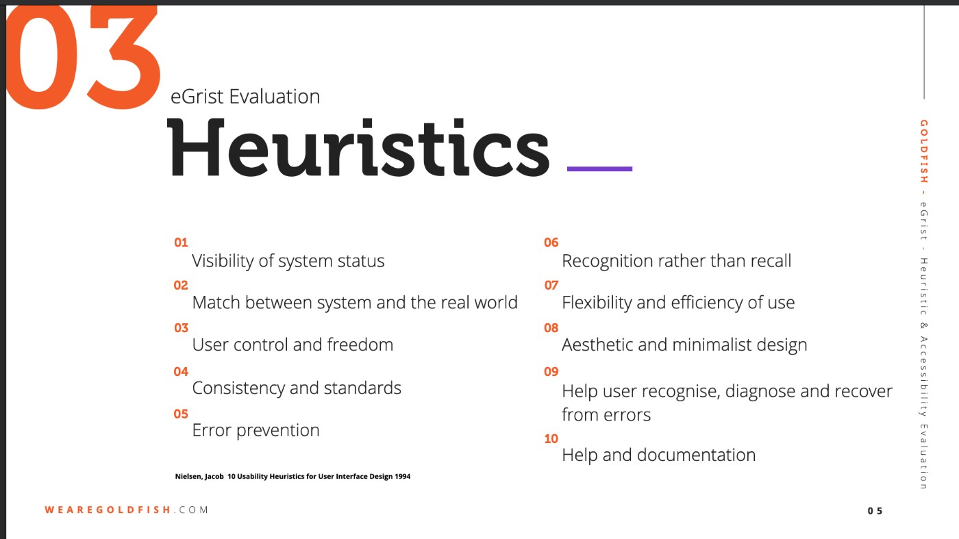
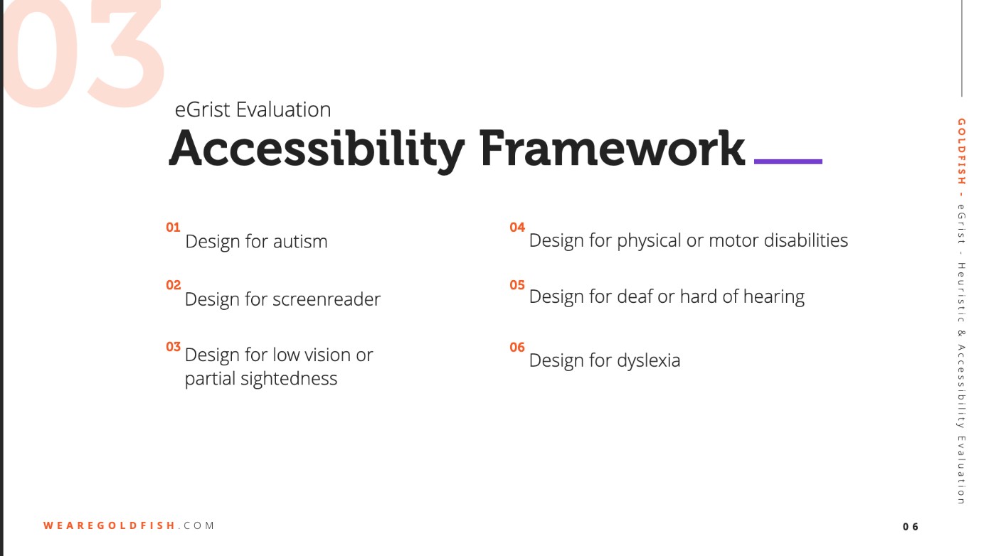
The audit framework, published so the client could see exactly what eGRiST was measured against.
As-is user story map
Making sense of the mess
Before changing anything, I mapped what users could do in eGRiST as it stood.
Persona
User interviews gave us Sally: the person every design decision had to work for.
A front-line health care professional who takes clients through a robust process.
To assess the mental health of a client.
- To be protected from any audit if a client dies by suicide
- Recording an assessment to be fast
- A process that only needs basic computer skills
- To share information with secondary care professionals
- Interviewing clients
- Assessing their mental health using the correct framework
- Printing assessments and sharing them with colleagues
- Arranging sessions with clients
- Providing detailed information when audited
User journey
Sally’s journey follows one patient from their first screening to the point where they no longer need assessing.
What we heard in user interviews.
A new patient is coming in for a screening session today.
Two weeks later, the patient comes back for a full assessment.
Every two weeks the patient fills in a self assessment, so the consultant can keep track of them.
The patient is at high risk, so the consultant is notified.
When time allows, the consultant goes through the full self assessment to plan next steps.
Once the results start improving, it’s time to wind up the assessments.
User flow
Defining Sally’s workflow
To guide Sally through an assessment, we first had to define the process. Mental health experts reviewed it to make sure it was in line with the latest research.
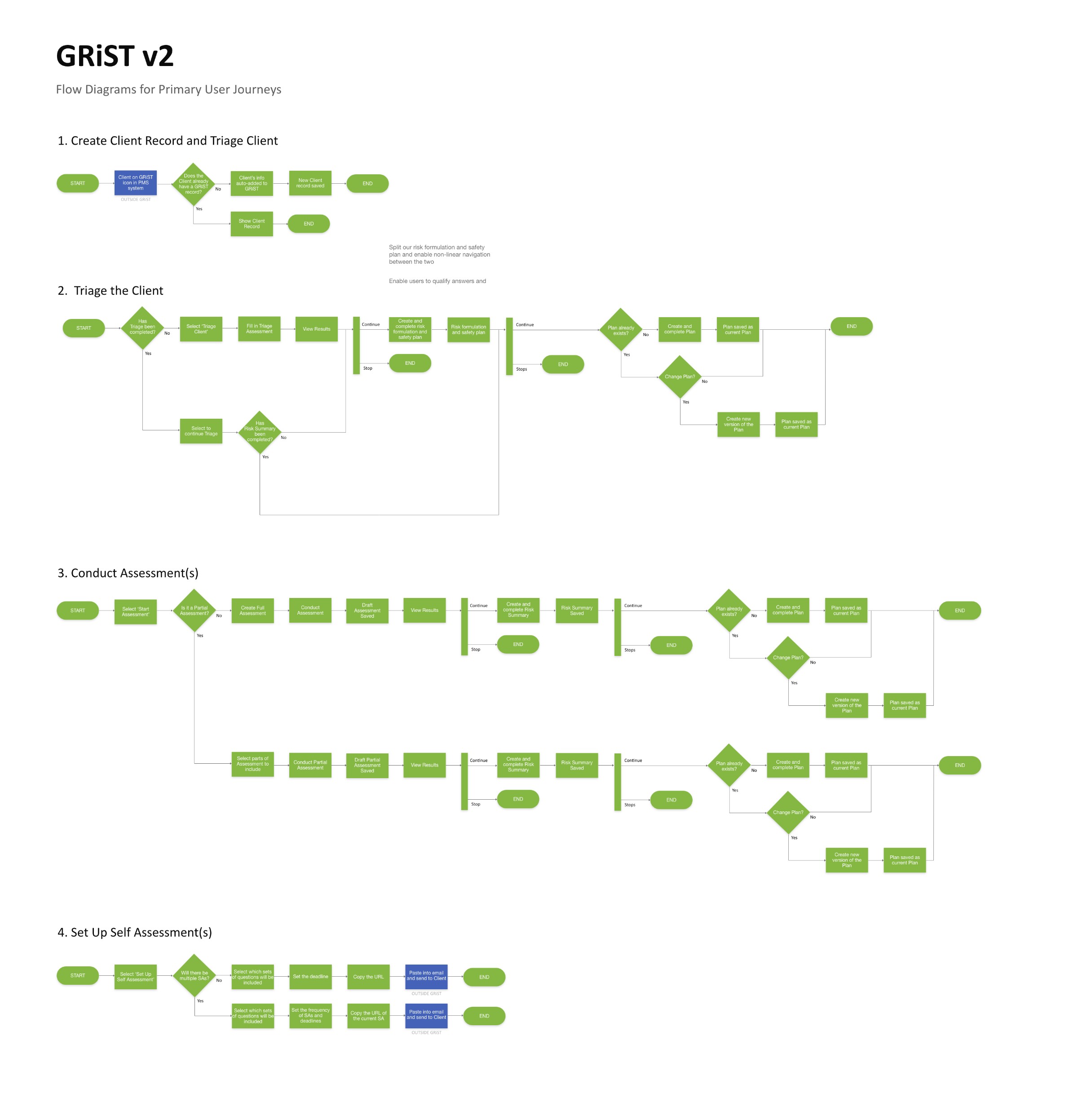
Four flows: create a client record, triage the client, conduct an assessment, and set up self assessments.
Open full size ↗To-be user story map
Redefining the feature set
The new feature set puts everything about a client on one dashboard: triage, assessments, self assessments, risk history and the safety plan.
Wireframes
The wireframes introduced the ideas that carried through to the final design.
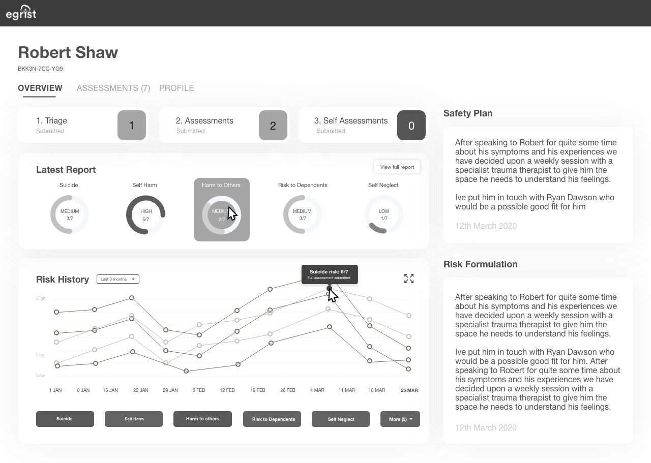
Workflow mental model reinforced: the client overview follows the order of the work.
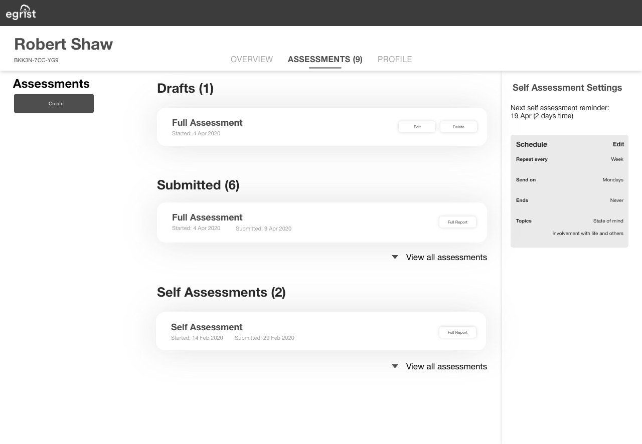
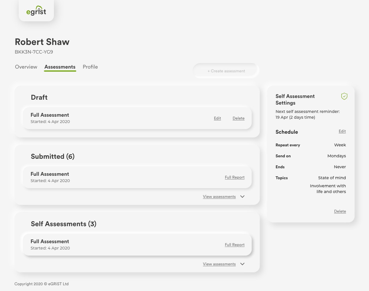
Assessments sorted by where they are in the workflow: drafts, submitted and self assessments.
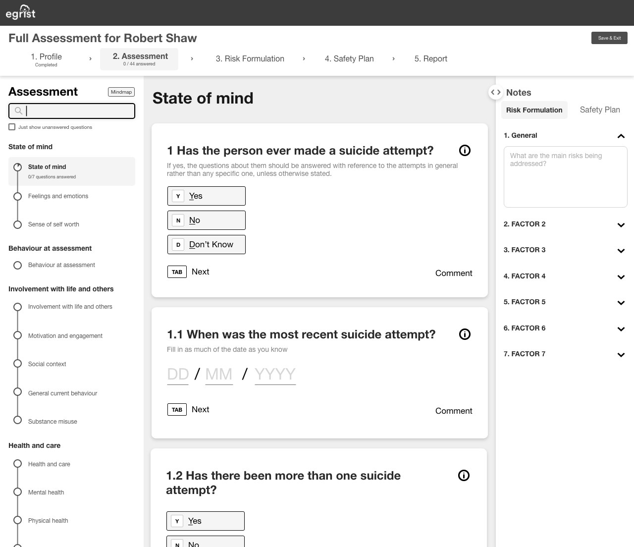
Three panels, so clinicians can multi-task from the same view.
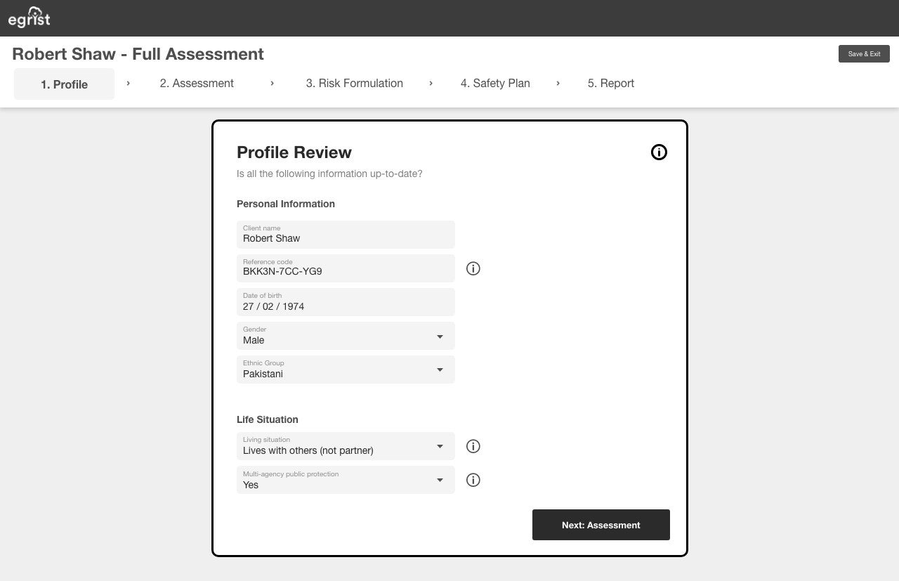
Profile review, the first step of a guided full assessment.
Iterating the dashboard
The dashboard went through a design review with the client and then user testing. It changed after each.

{{ dashCap }}
The assessment page
The old assessment was one very long page. In testing, users told us these three changes were what they loved most about the new one.
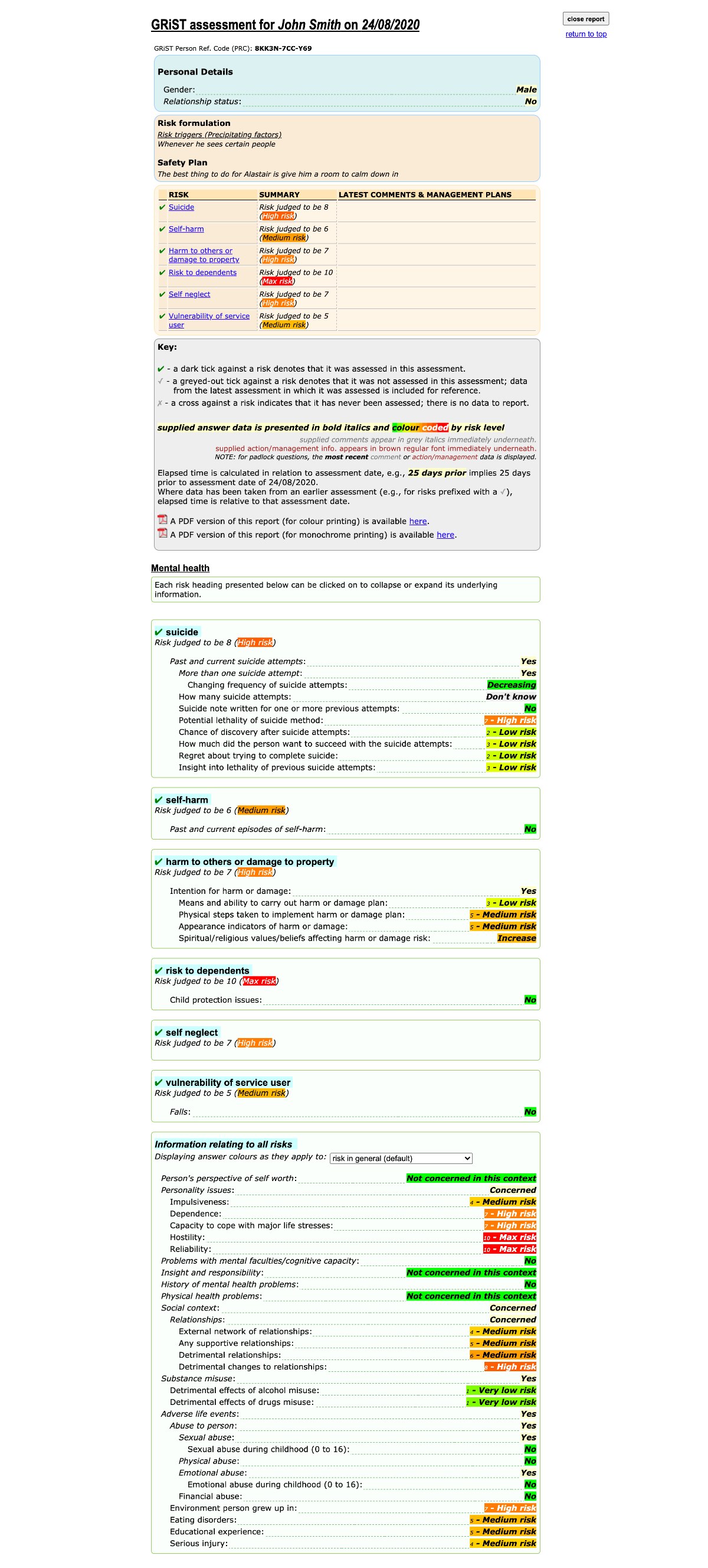
Scroll to see how long the old page was.
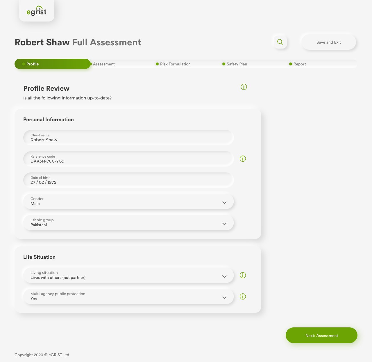
Final designs
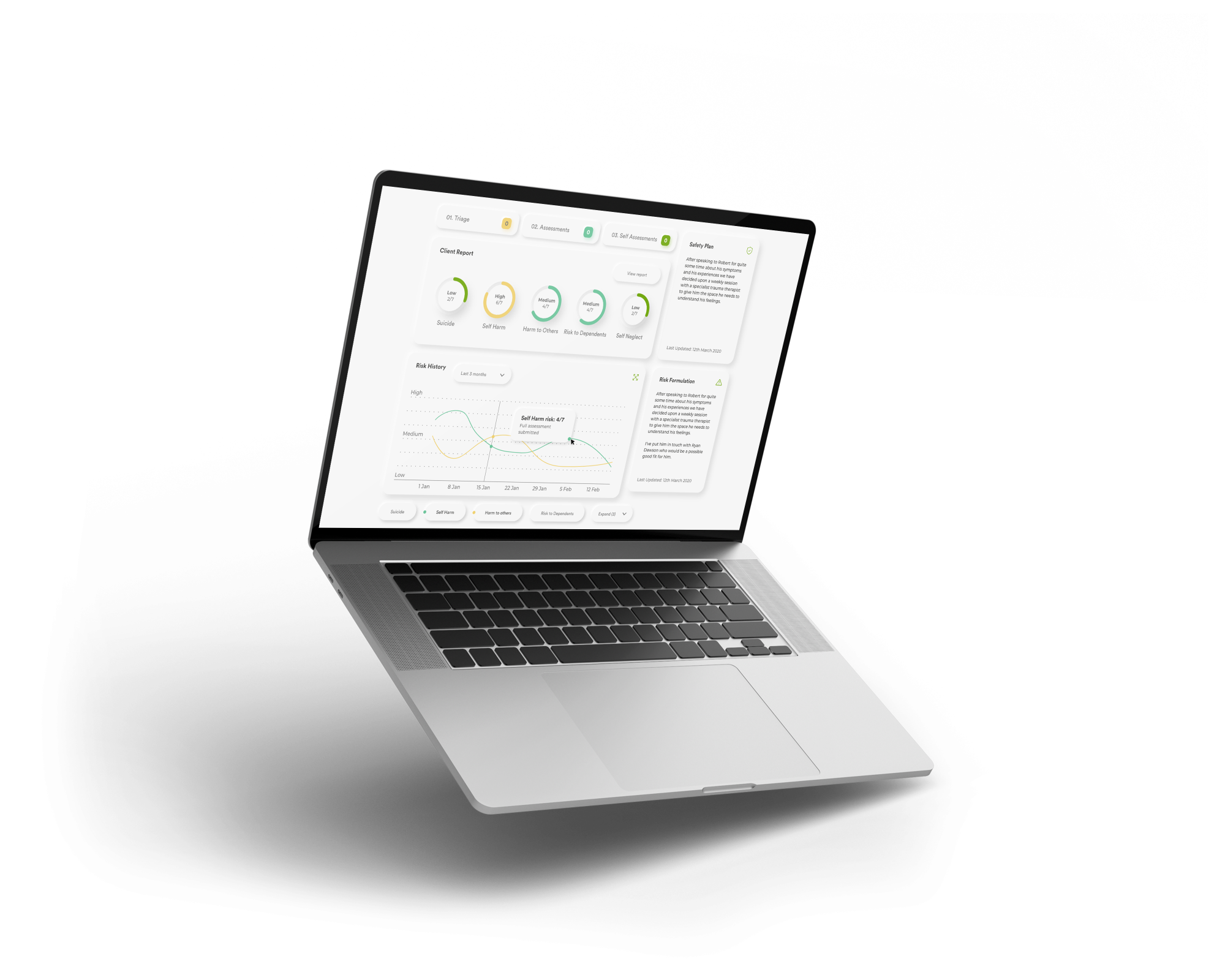
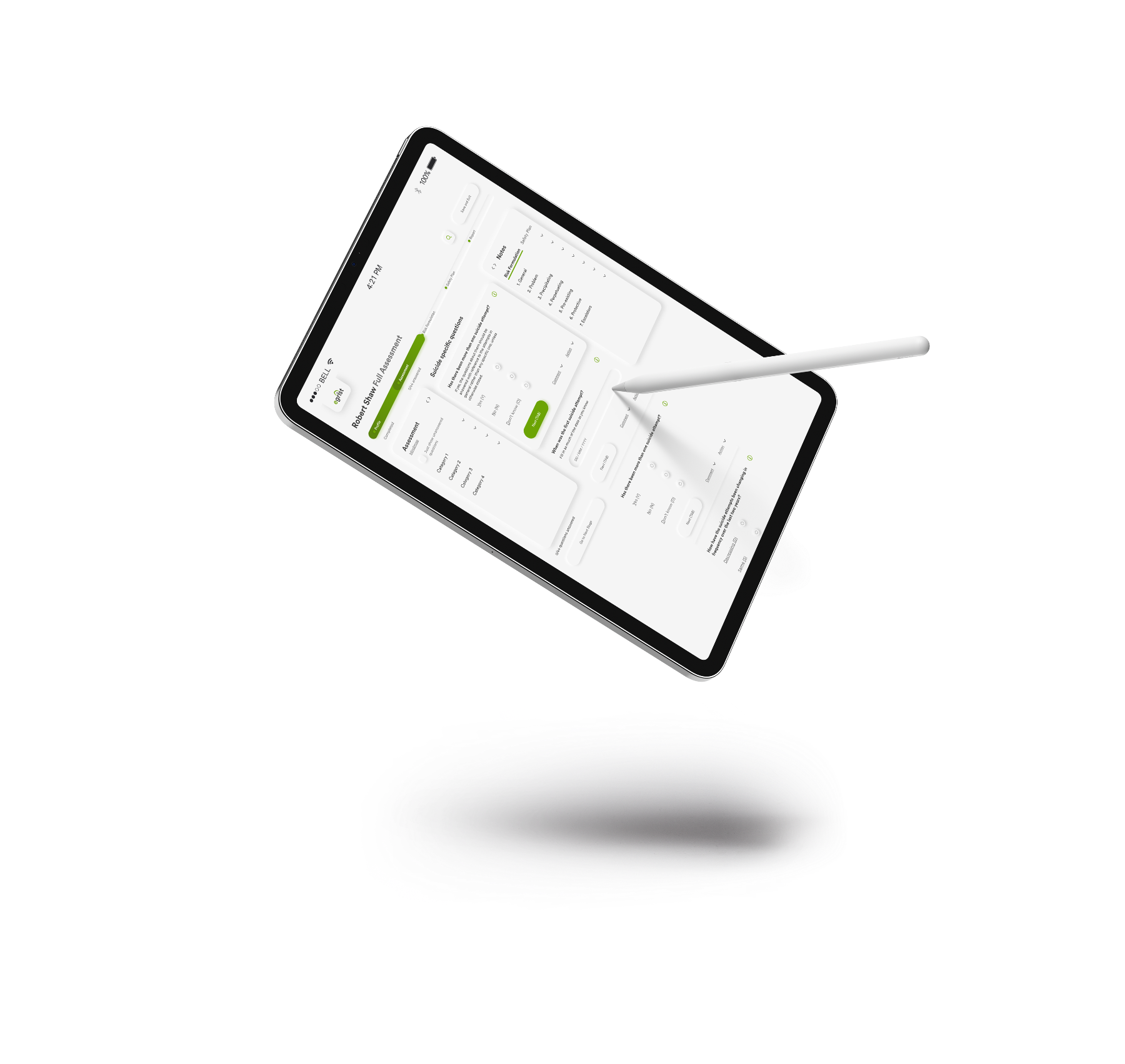
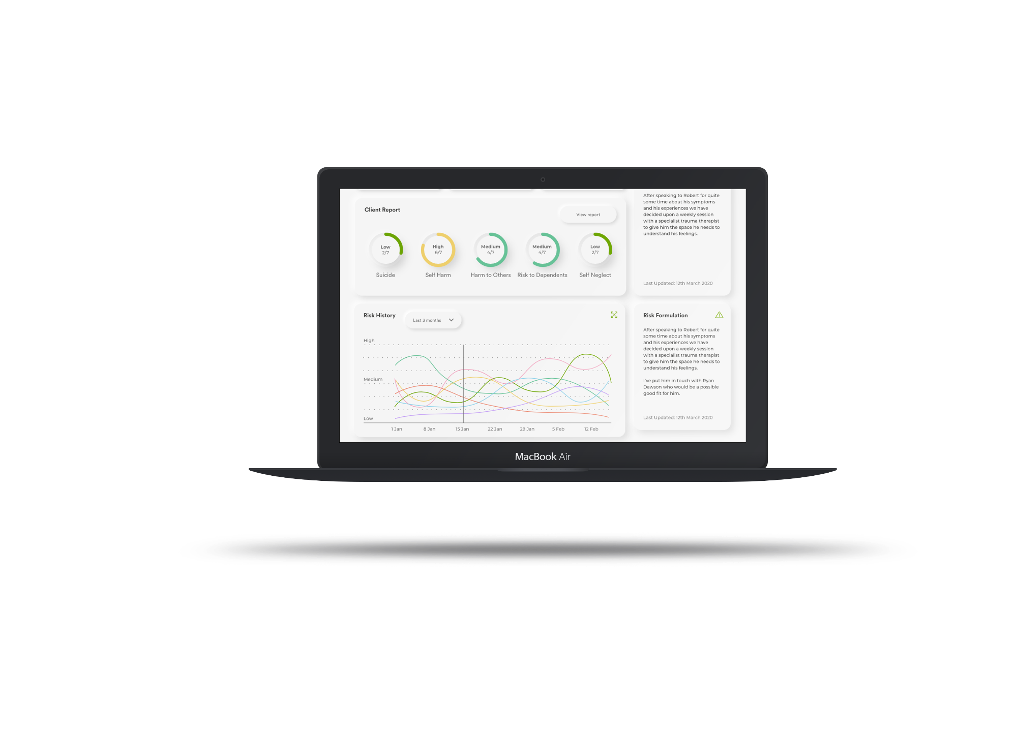
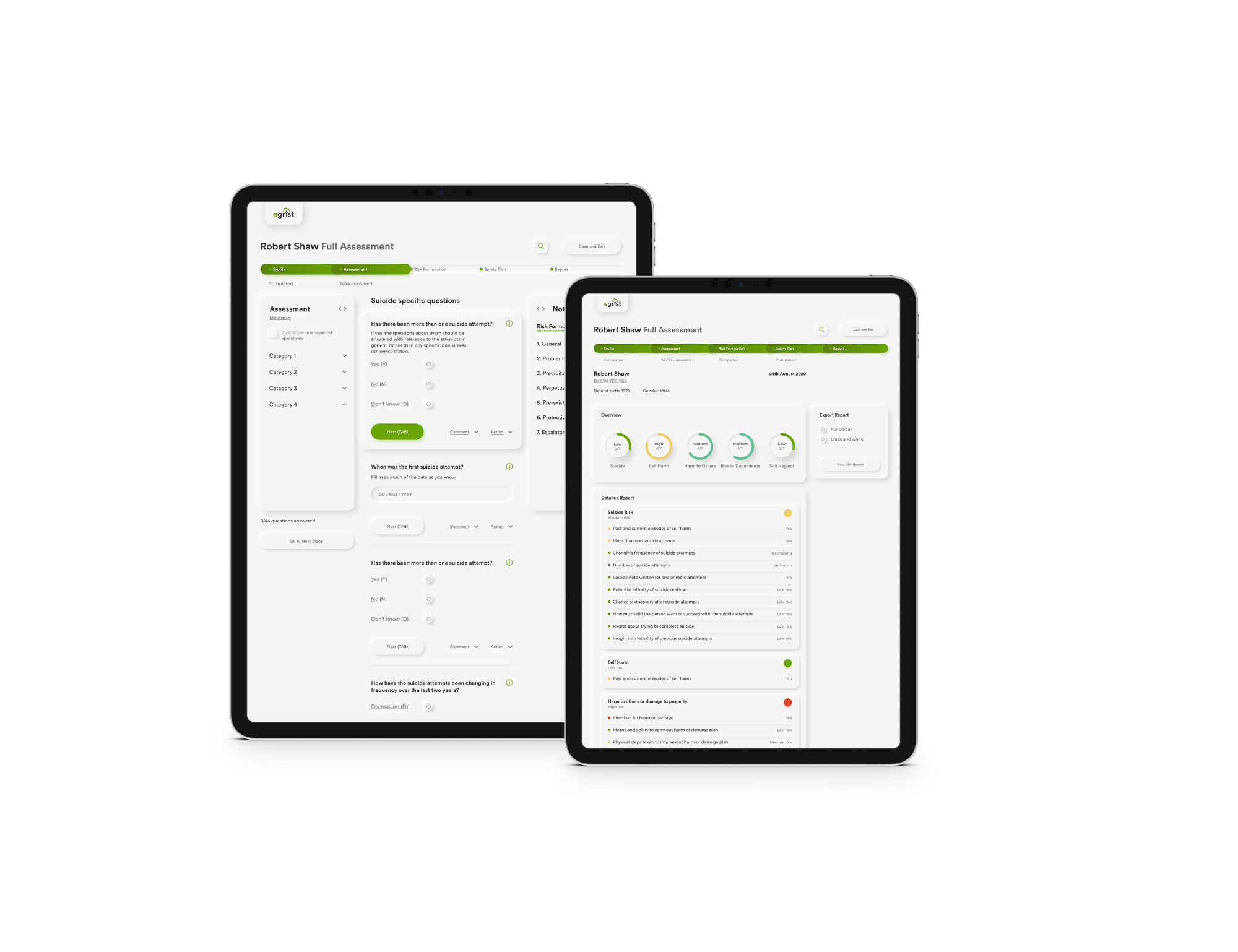
The final designs, on desktop and tablet.
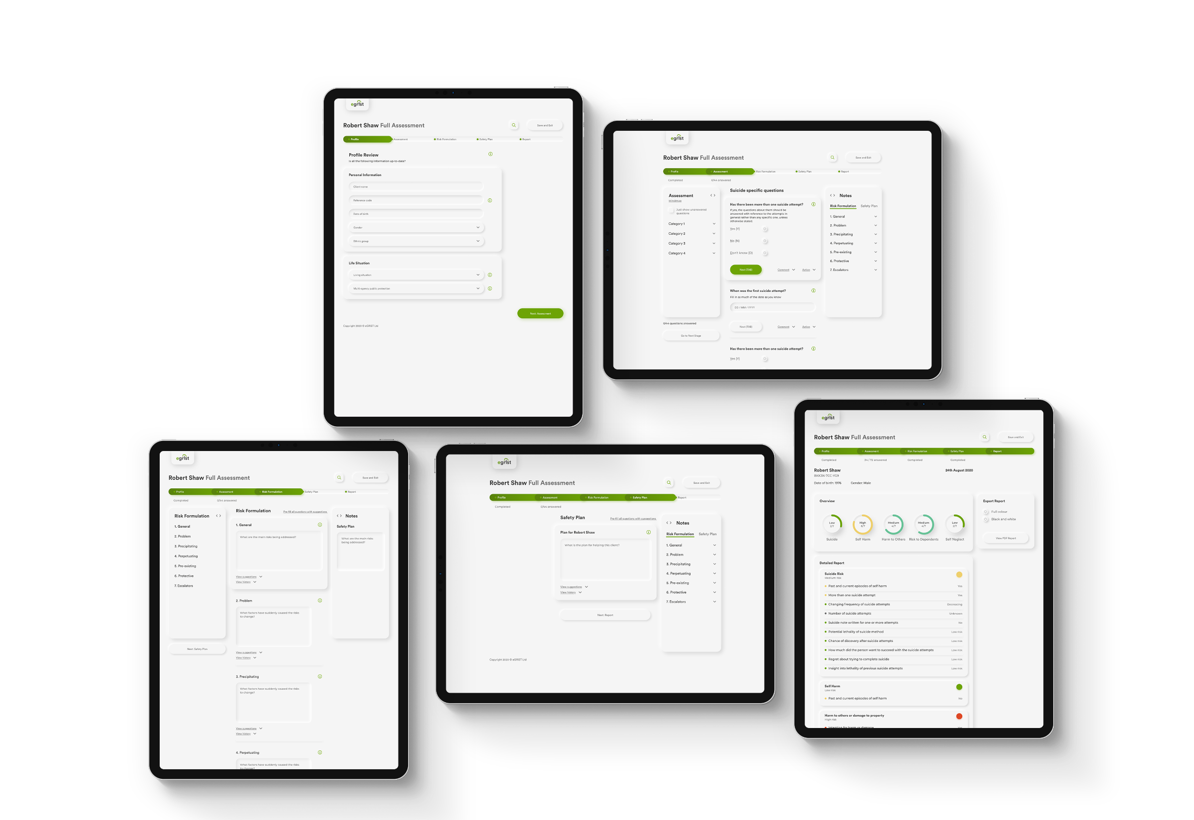
Guided workflow
A full assessment is now five steps, taken in order.
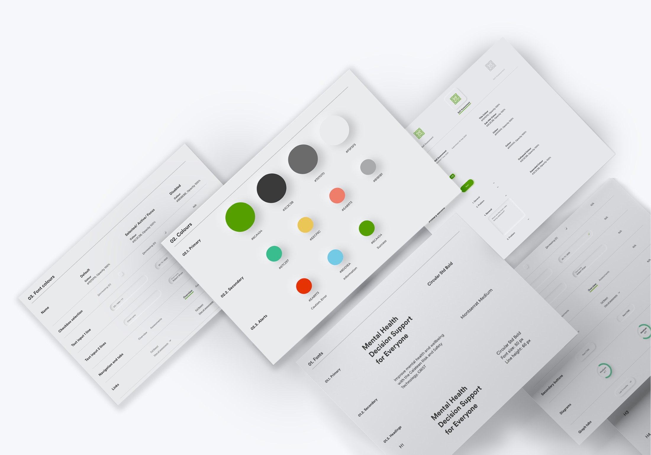
Style guide
The style guide set out the colours, type and components used across the product.
Atomic design system
I handed over an atomic design system, so every screen was built from the same parts: from single buttons up to whole sections like the client report.
Results
New users needed less time to get up to speed.
Users entered better quality information about patients.
eGRiST won new tenders, partly thanks to its new, more professional look.