Joining the gym
from the app
Five steps from Join to a door PIN. Joining fell from 32 minutes to under four, and the app’s sign-up rate more than doubled.
People downloaded the PureGym app to join a gym, tapped Join, and were dropped onto the website homepage, which took half an hour and two payment methods to get through. Most never came back. This is how we moved joining into the app and made it something you can finish on the bus.




The problem
Too many people dropped out before they joined. Of everyone who tapped Join in the app, only about 1 in 7 got as far as a gym PIN, well below similar subscription apps. The app’s Join button just opened the website homepage in a browser, and 4 in 10 gave up right there. Of those who carried on, nearly half quit at choosing a plan, where the price climbed from £14.99 to £35.99 a month.
Discovery
To see the journey a new member faced, I joined PureGym through the app myself and screenshotted every step, from the App Store to the welcome text. I found 56 friction points. Three of them were blockers that stopped a new member outright. Dashed screens show other routes through the same step.

Hypothesis
The app already had a Join button. It just sent people to the website. The question for the business: is a native joining flow worth building?
User testing
The analytics showed where people left, but not why. I ran moderated sessions with six people planning to join a gym in the next month, none of them PureGym members. Each started in the App Store and tried to join their nearest gym on their own phone, thinking aloud. Four of the six gave up before they signed up. This round tested the existing website journey. The new flow was tested later, in section 07.
Solutionising
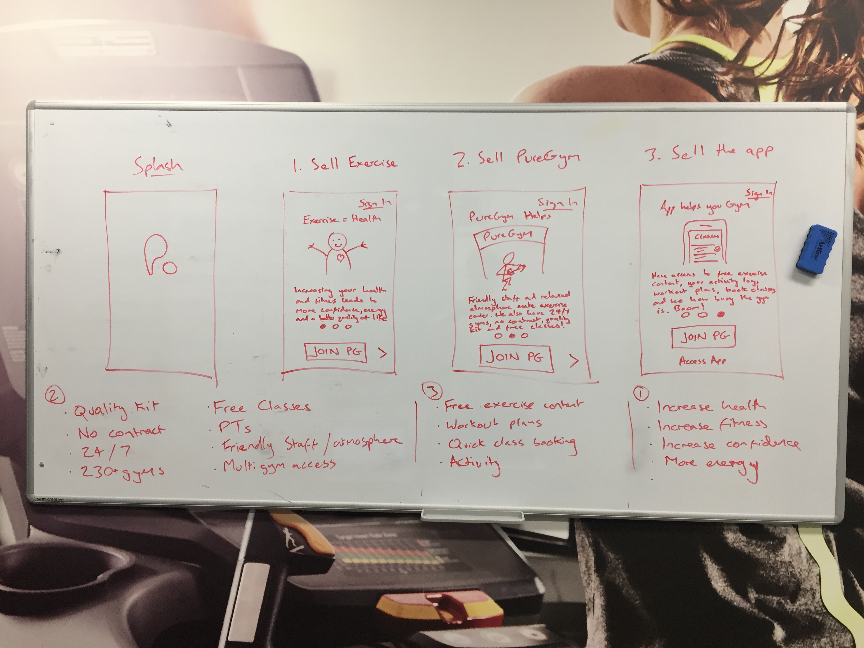
I mapped the journey on a whiteboard with the innovation team and the mobile lead, stuck every friction point to its step, and started with the two biggest drop-offs: the move from app to website, and choosing a plan. Every idea had to answer one question: what would stop someone leaving at this step? Most of the answers pointed the same way. The website asked people to decide the same things twice, pay twice, and work out where to go three times.
First pass: the prototype we tested
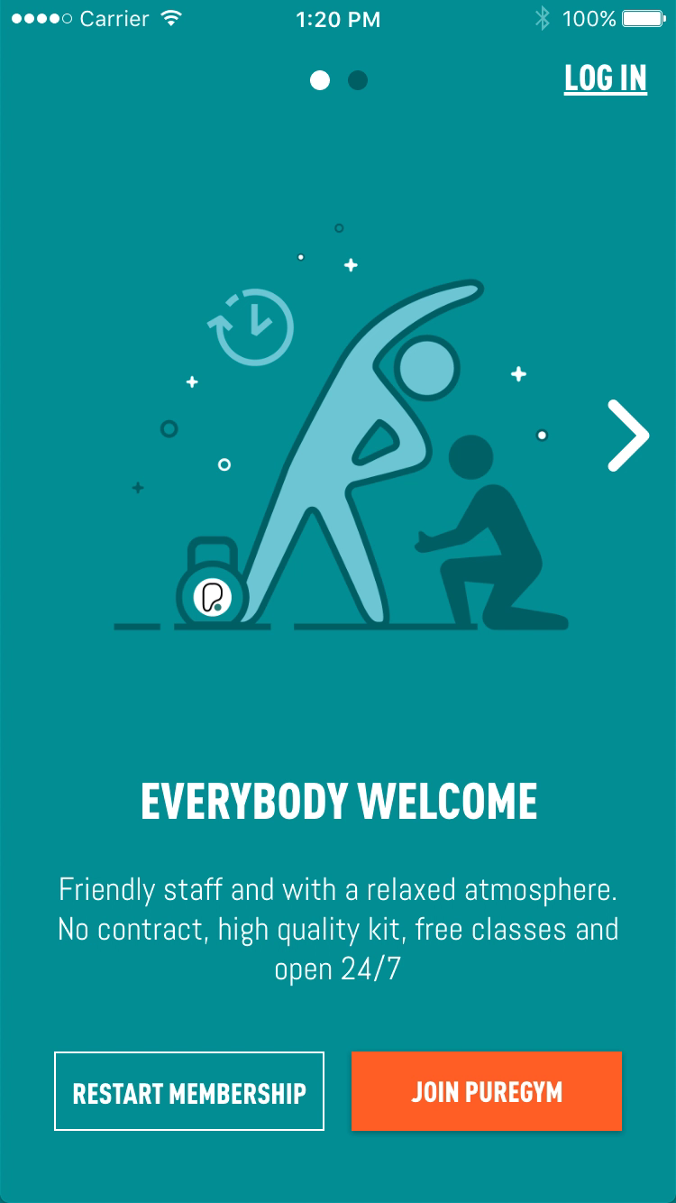
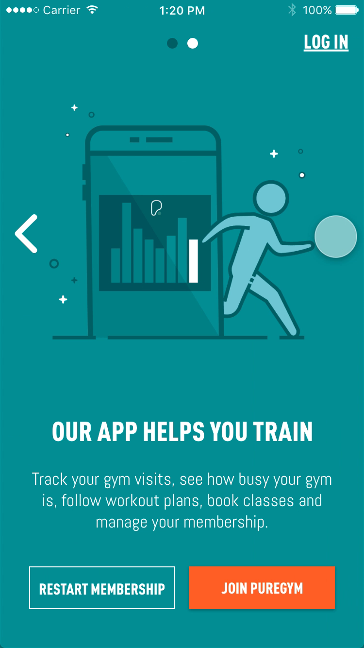
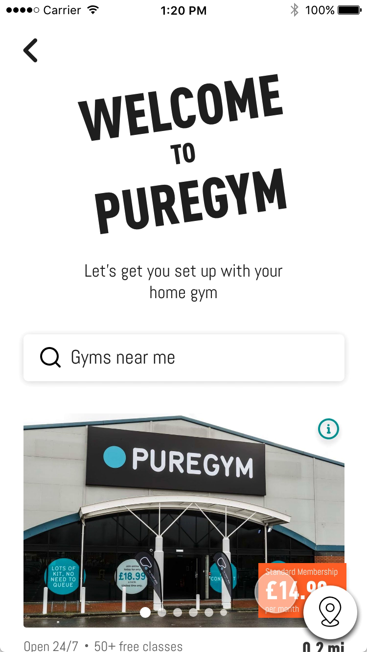
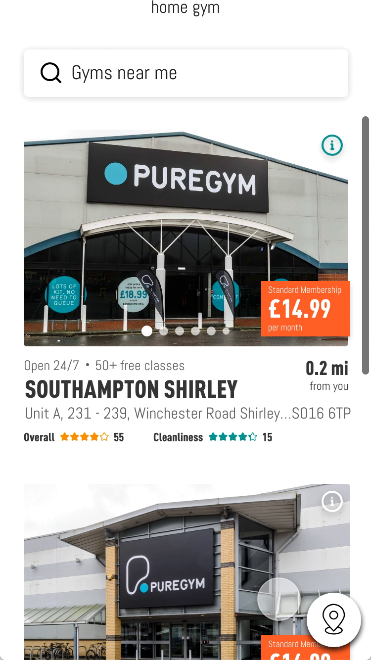
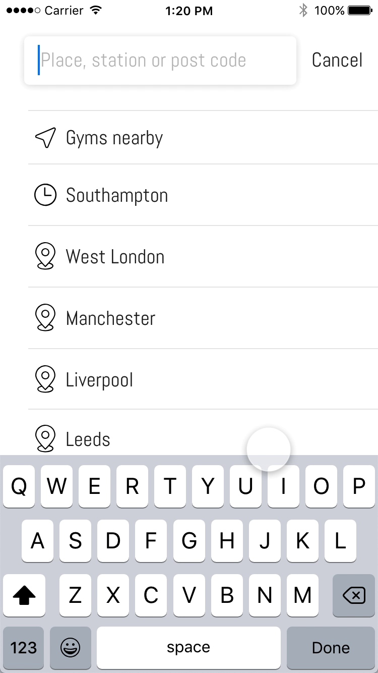
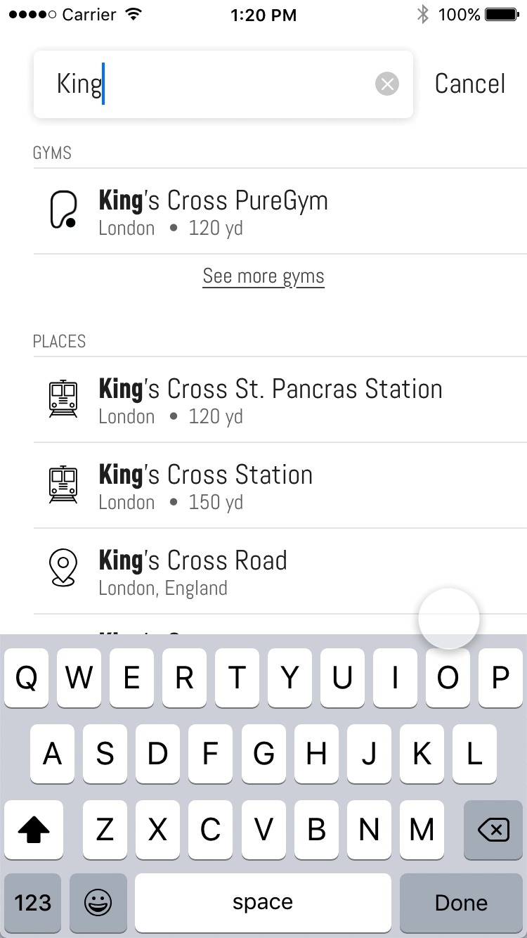
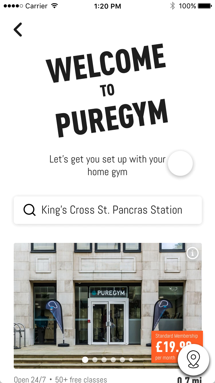
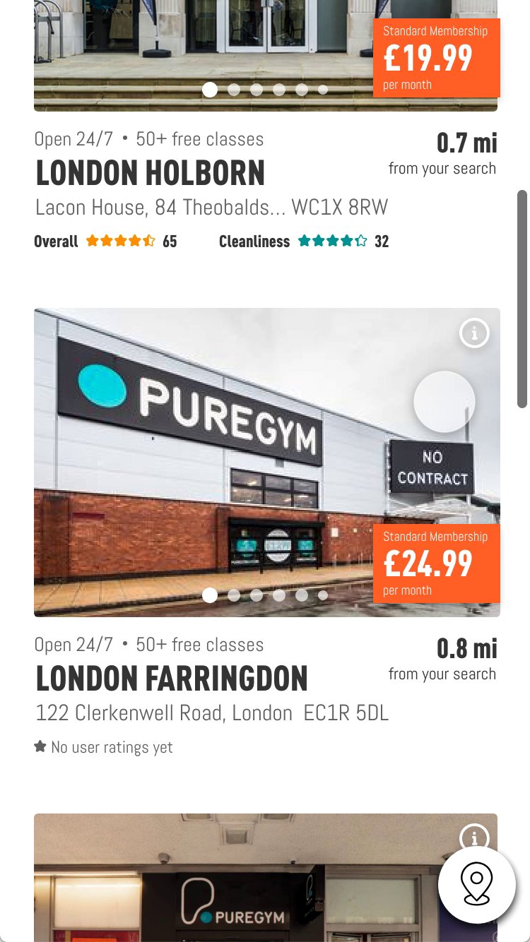
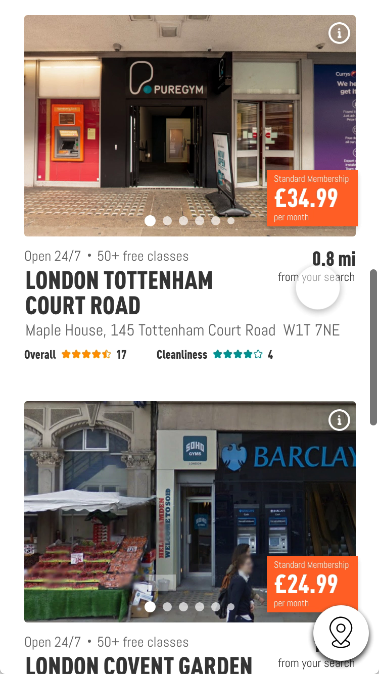
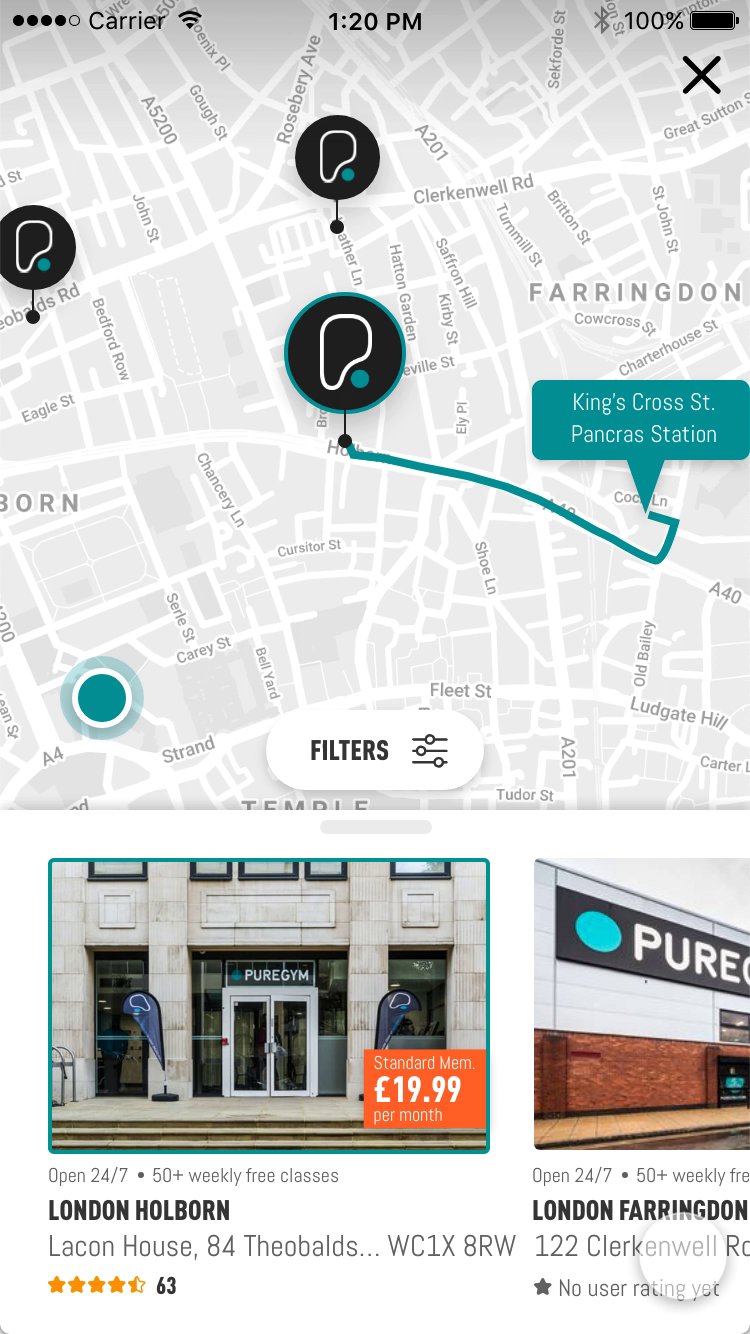
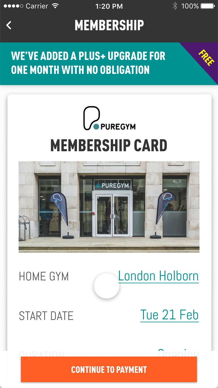
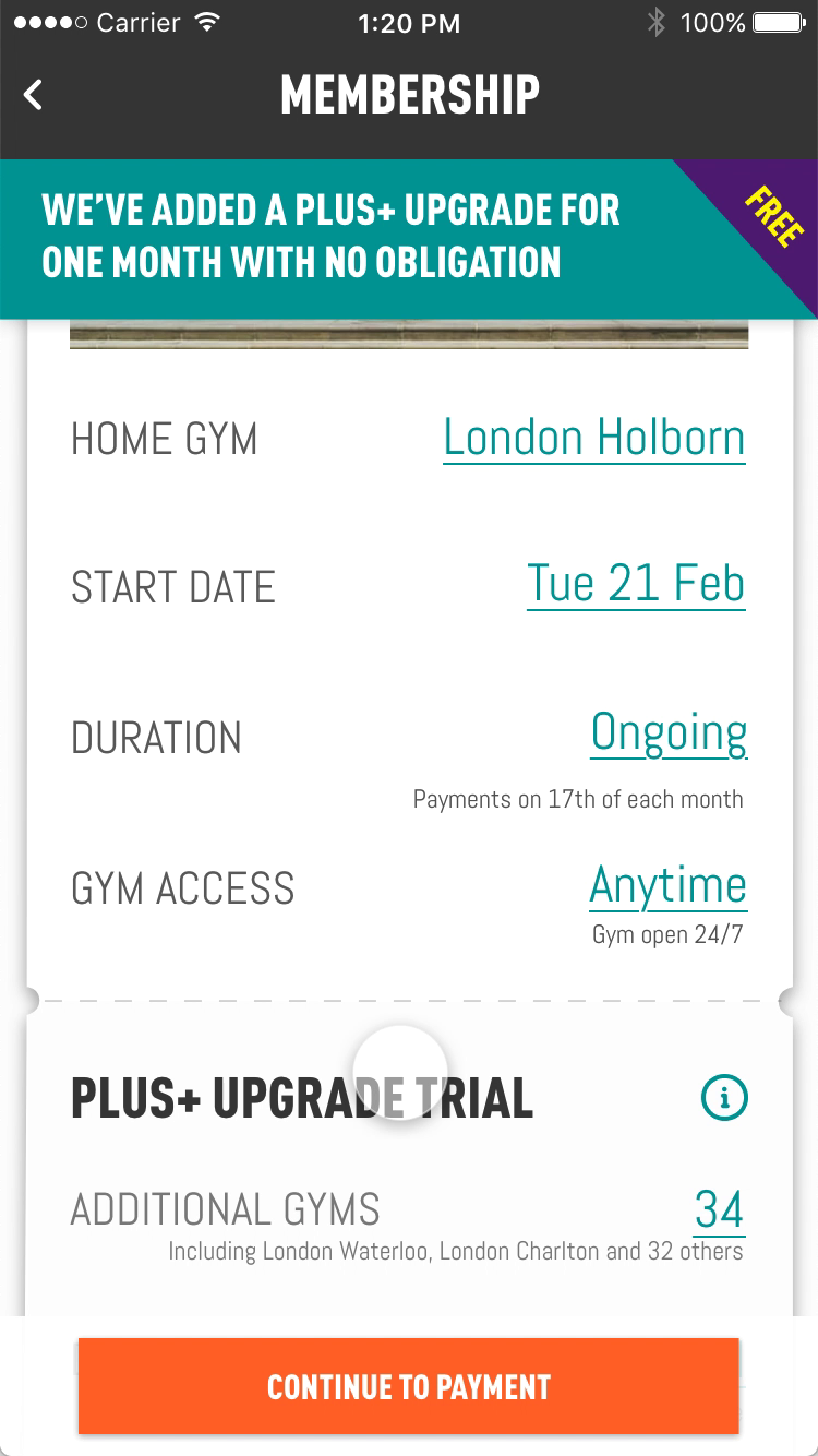
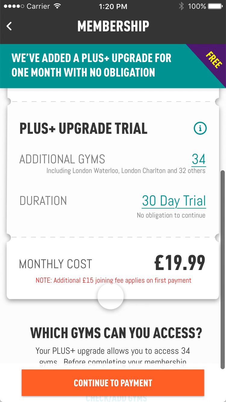
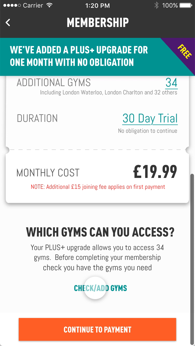
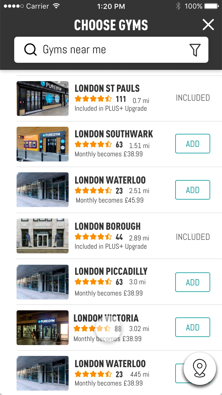
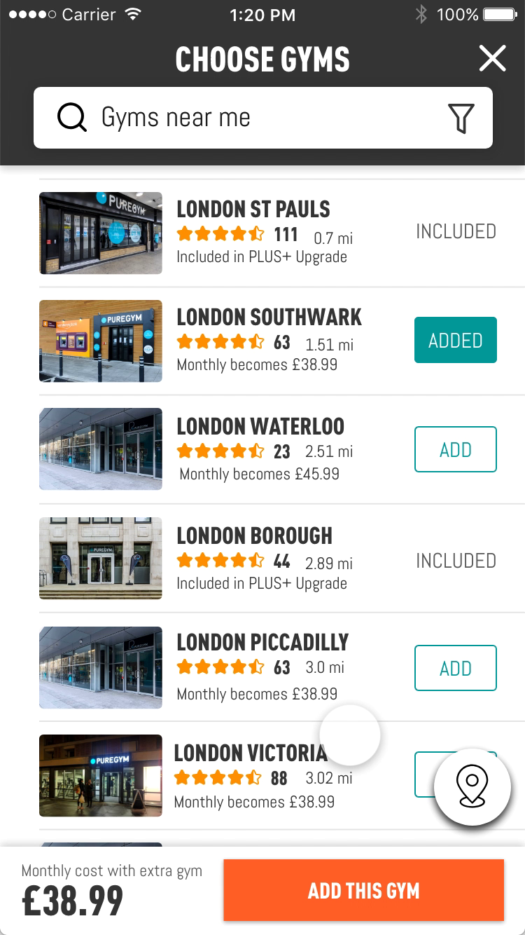
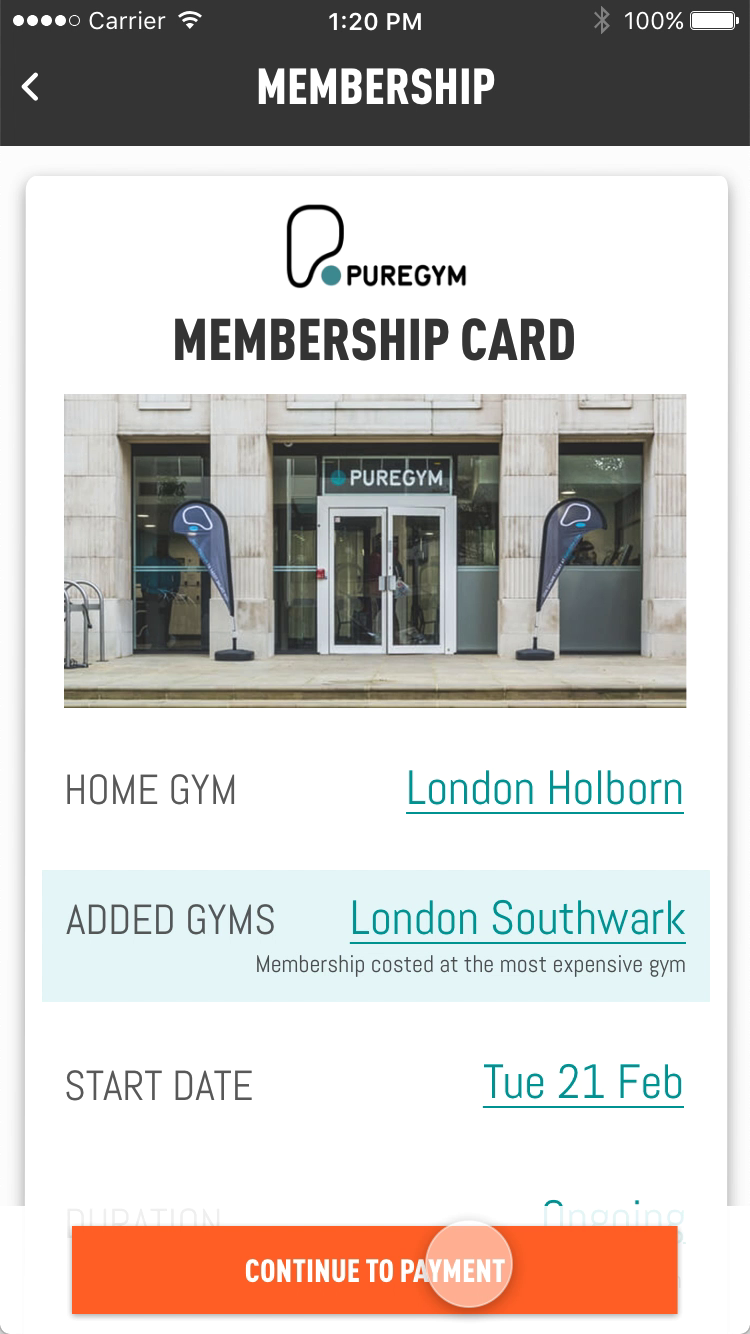
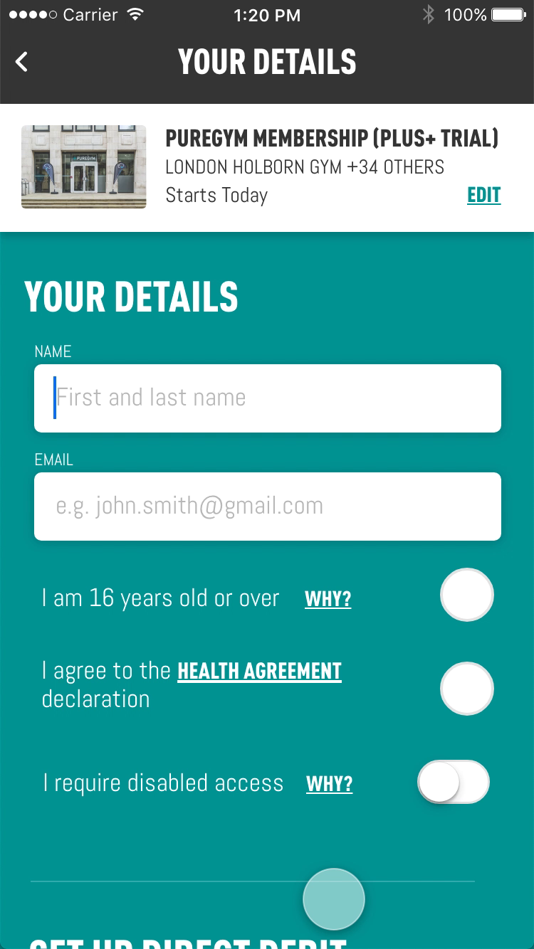
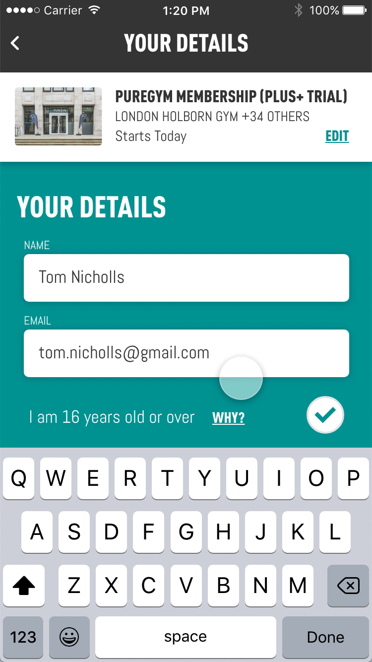
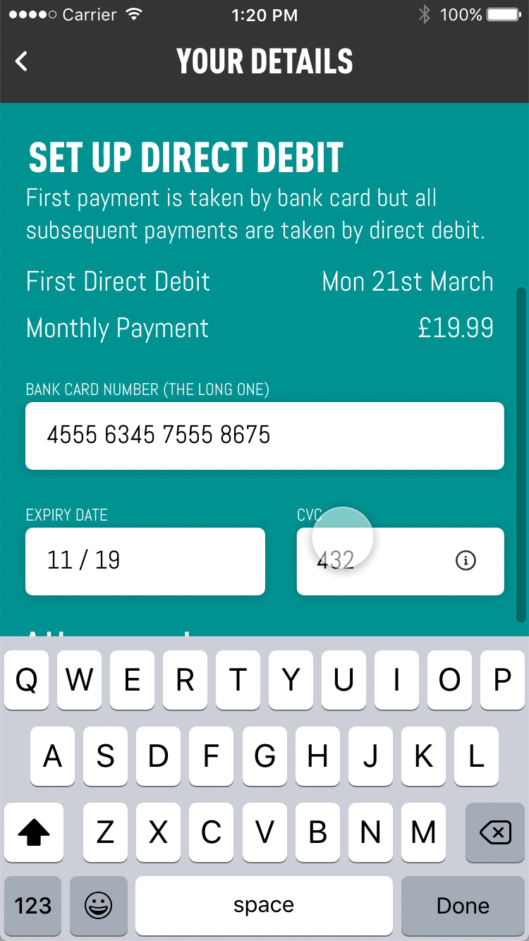
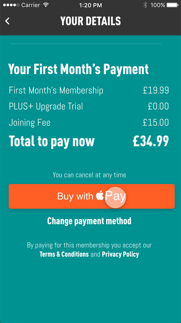
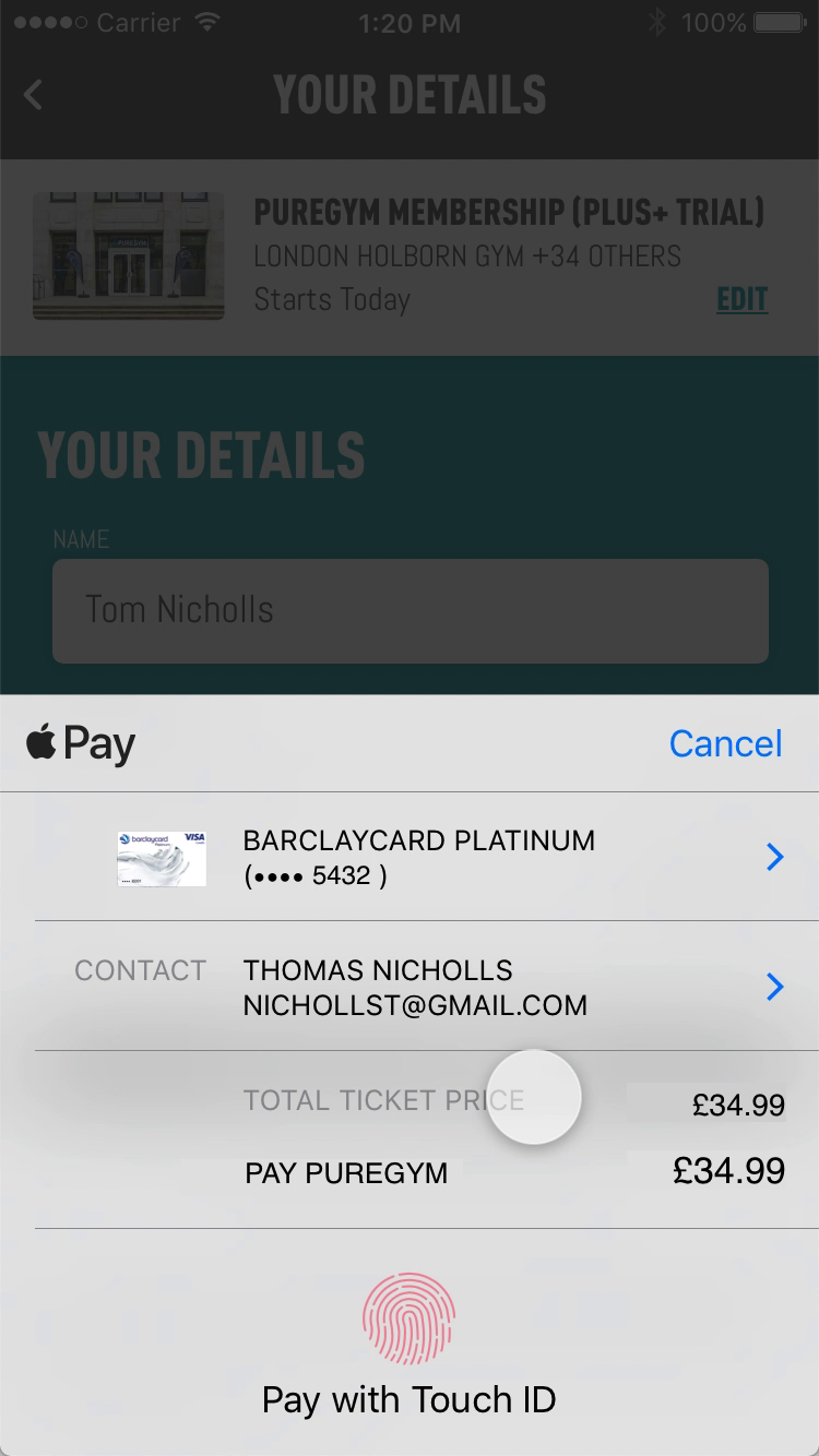
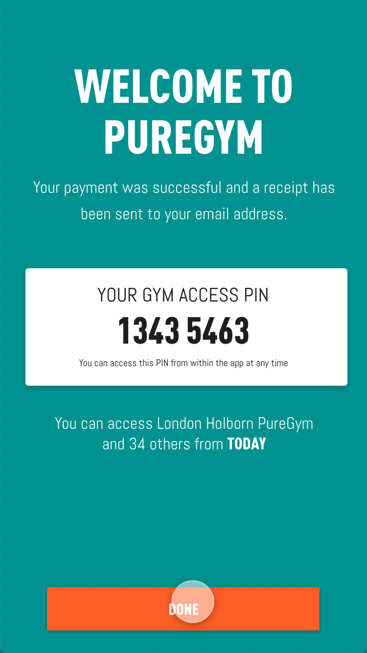
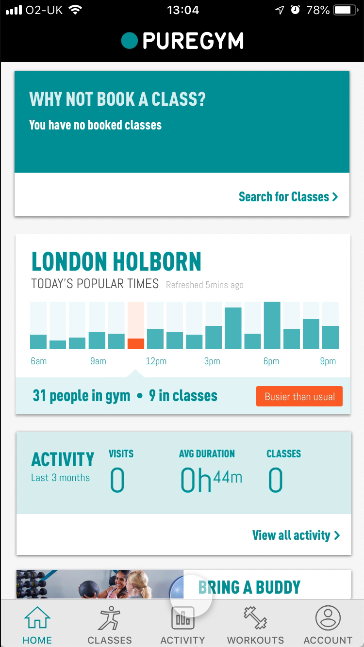
I built a low-fidelity prototype of the new in-app flow and put it in front of people to test. It was clickable on a real phone but stripped back to structure and content, so feedback stayed on the journey rather than the visuals. Below is every screen a participant tapped through. It proved the shape of the flow and showed what was still too much.

Testing it in the gym
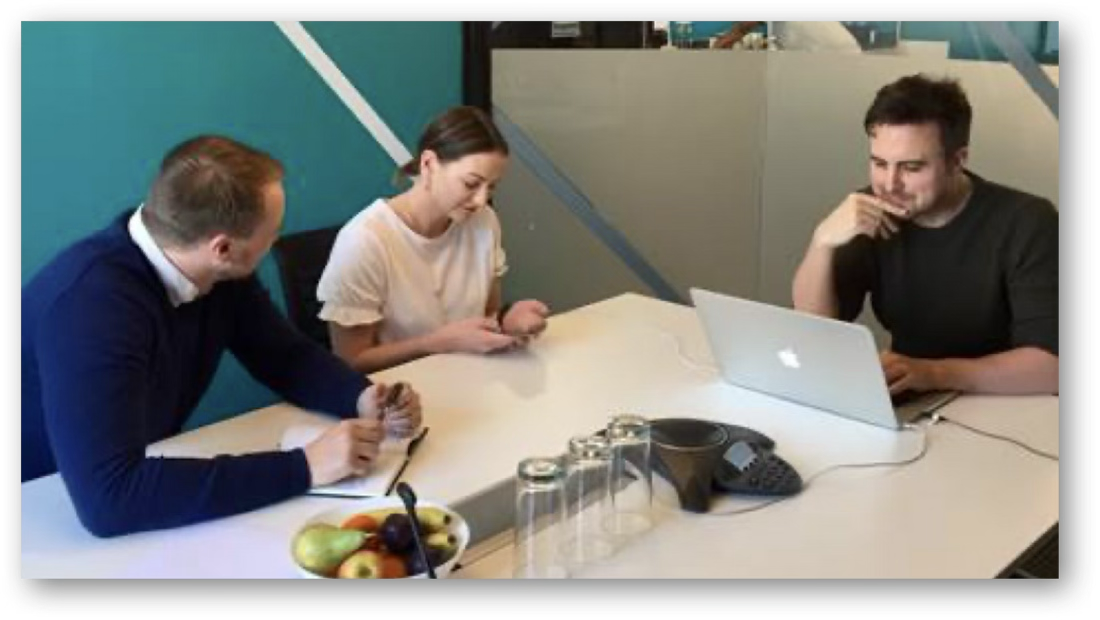
The second round, this time on the new prototype. Eight intercepts at London Lewisham and Oval, on weekday evenings when new joiners actually turn up. Each person had just joined on the website or was asking about joining at reception; they tried the prototype on a test phone while I watched and asked questions.
Design system
PureGym’s app library was built for people who were already members: classes, busy times, workouts. Joining needed parts it didn’t have. I added five atoms, updated two more, and documented every state of each one in the library, so other teams could reuse them. They all use the existing tokens. The only new colour is a light orange for nudges.
The improved flow
The version at the top of the page. It keeps everything the first pass did, including the intro carousel, search and map, extra gyms, the payment summary and Home, and takes out what testing showed got in the way. One payment method, nothing that asks you to leave the app, and a price that only changes when you choose.
to a door PIN

Each part of the hypothesis became a set of design changes. Every one is backed by where people dropped out in the analytics, and what we saw them struggle with in testing.
Results
Measured over the first three months after release, against the success metrics in the hypothesis. Every target was beaten.
A joining flow that lives in the app isn’t a channel. It’s the first fortnight of membership starting four minutes after download. The same screens later shaped the website’s own “Join Reimagined” redesign.
Lessons learned
What I’d carry into the next joining flow, and what I’d do differently.