Supplier & inventory
management
A one stop shop for M&S and its suppliers, built while MPs were watching
Suppliers had rated M&S badly for years, and the scores were still falling. We replaced a set of fragmented systems and spreadsheets with a single platform for supplier management and oversight — and turned the trend around.
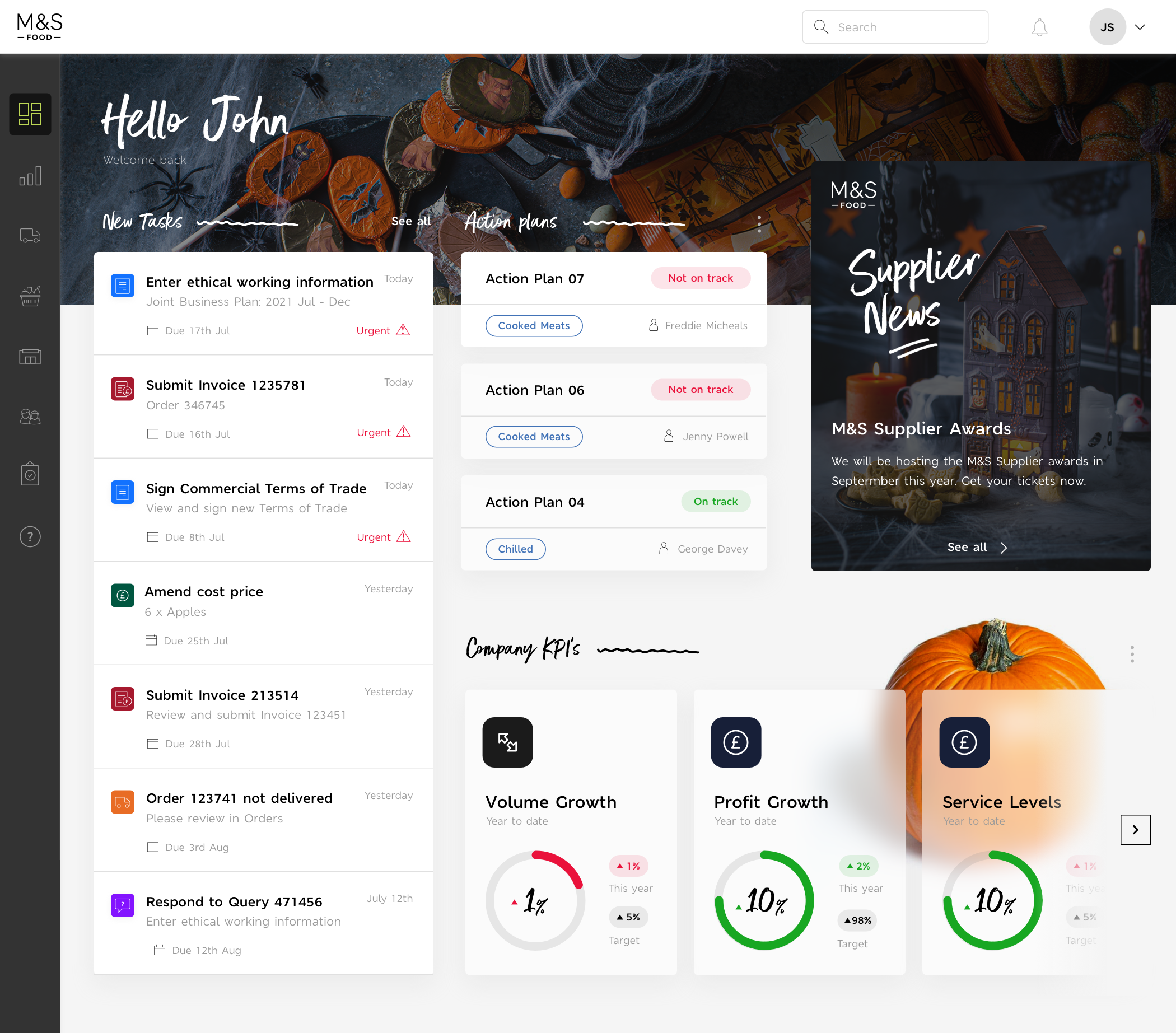
The supplier's landing page — urgent tasks, action plan status and company KPIs in one view.
Problem statement
Suppliers had consistently rated Marks & Spencer with low scores — real dissatisfaction with how the supply chain was run, and it was getting worse year on year, not better.
The discontent had escalated far enough that members of parliament were engaging with M&S. That put a commercial problem into political and regulatory territory, with the reputation of the food business attached to it.
Low supplier score for M&S
YouGov's supplier survey put it in public: on net improvement, Marks & Spencer came second from bottom of every major UK retailer at −6, with 21% of its suppliers saying practice had got worse over the previous twelve months. That's the number the project existed to change.
Internal research
Interviews across M&S departments turned up the same frustration from every direction: fragmented systems, and no unified way to manage or reach information.
Every department had already solved the problem locally — in a spreadsheet. That's what we were really replacing.
Each interview was written up as a profile with the three things that stakeholder needed the system to do — specific enough to design against, and to hold the project to later.
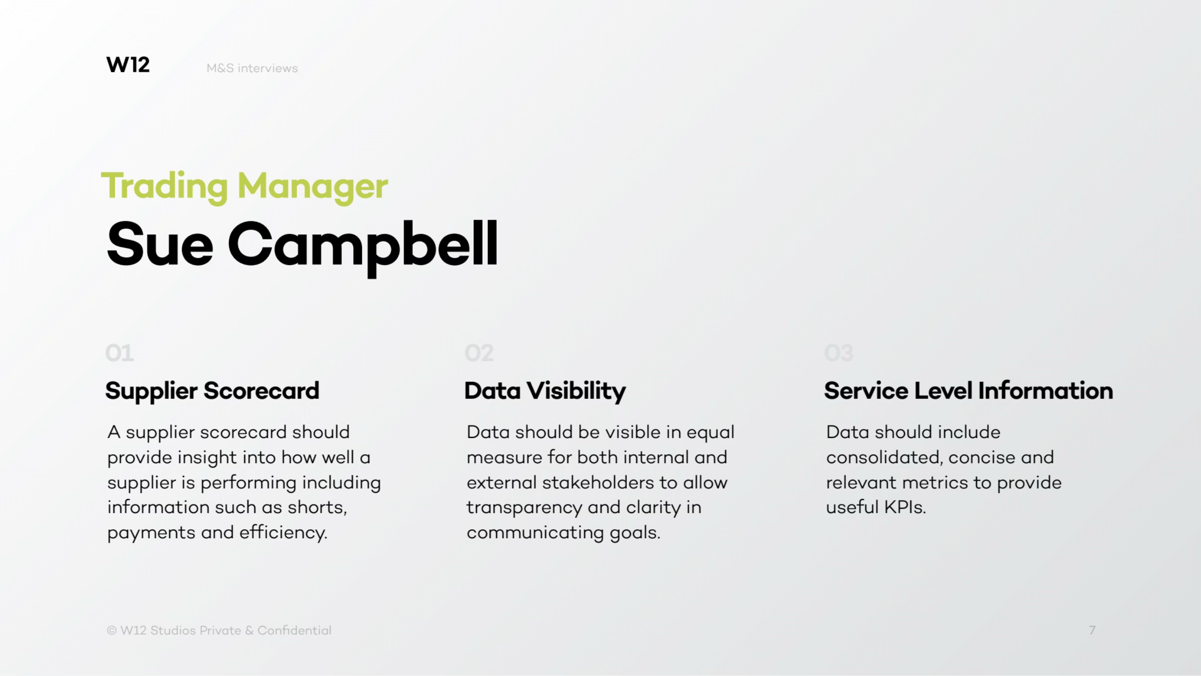
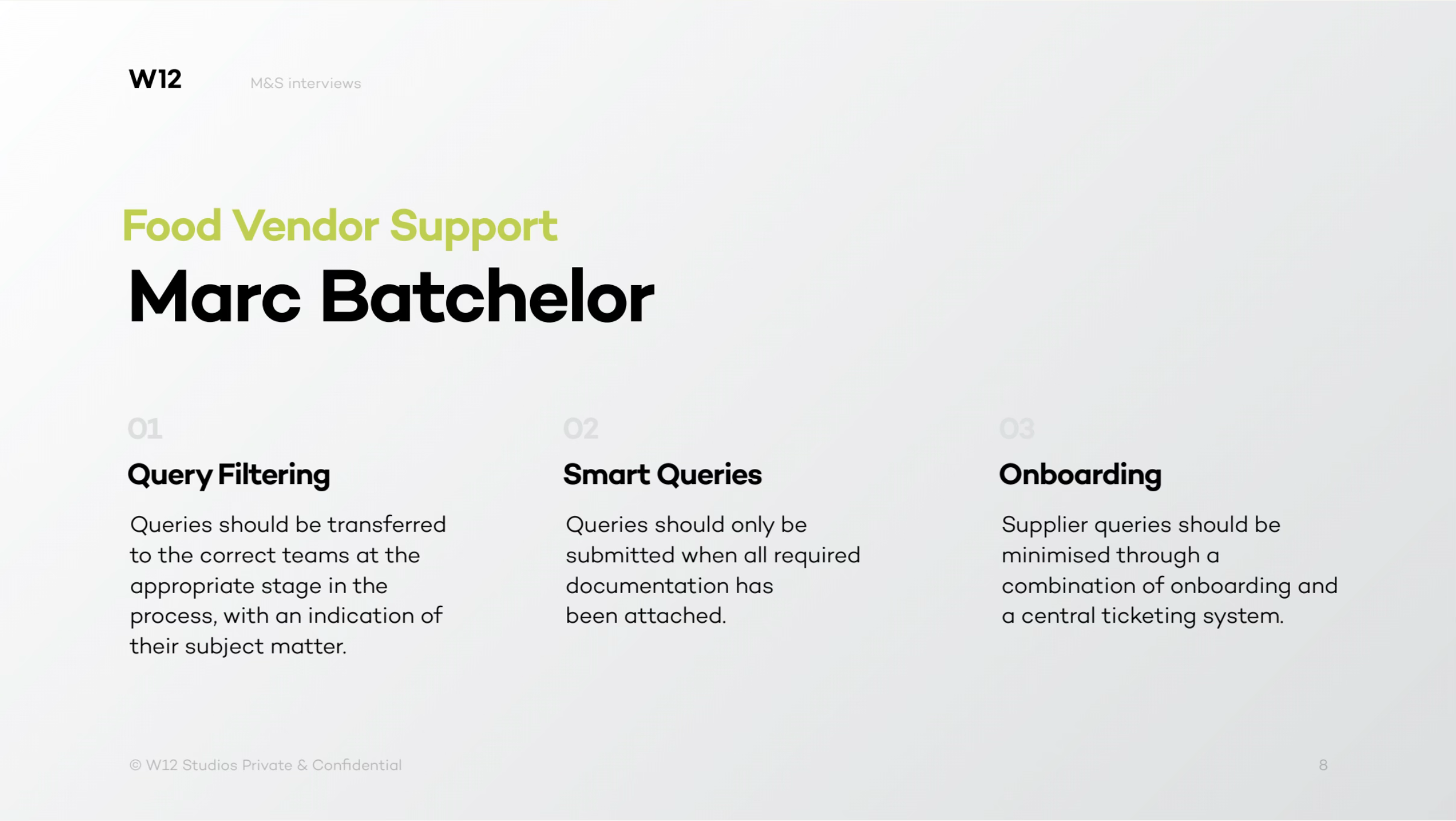
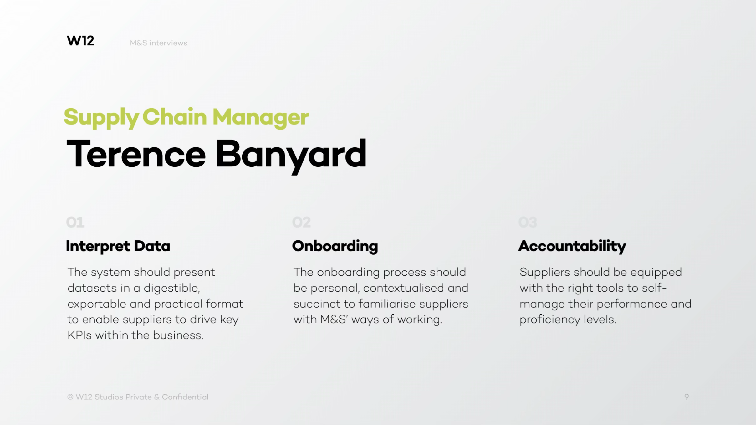
User research — 32 interviews, both sides
Over three months the team ran 32 contextual interviews and focus groups with stakeholders at M&S and at its suppliers, so the operational picture came from both ends of the relationship rather than one.
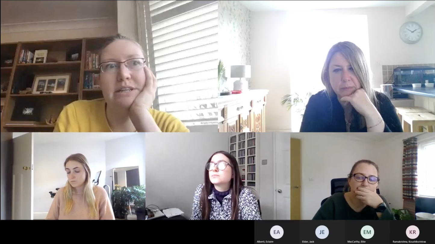
A contextual focus group with M&S suppliers. Running them as a group surfaced the disagreements between suppliers — which is where the useful material was.
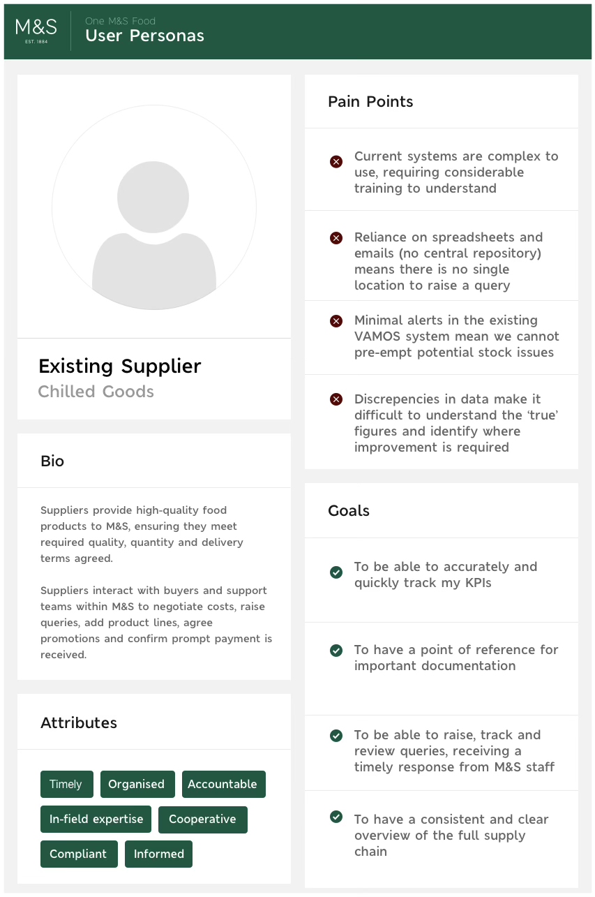
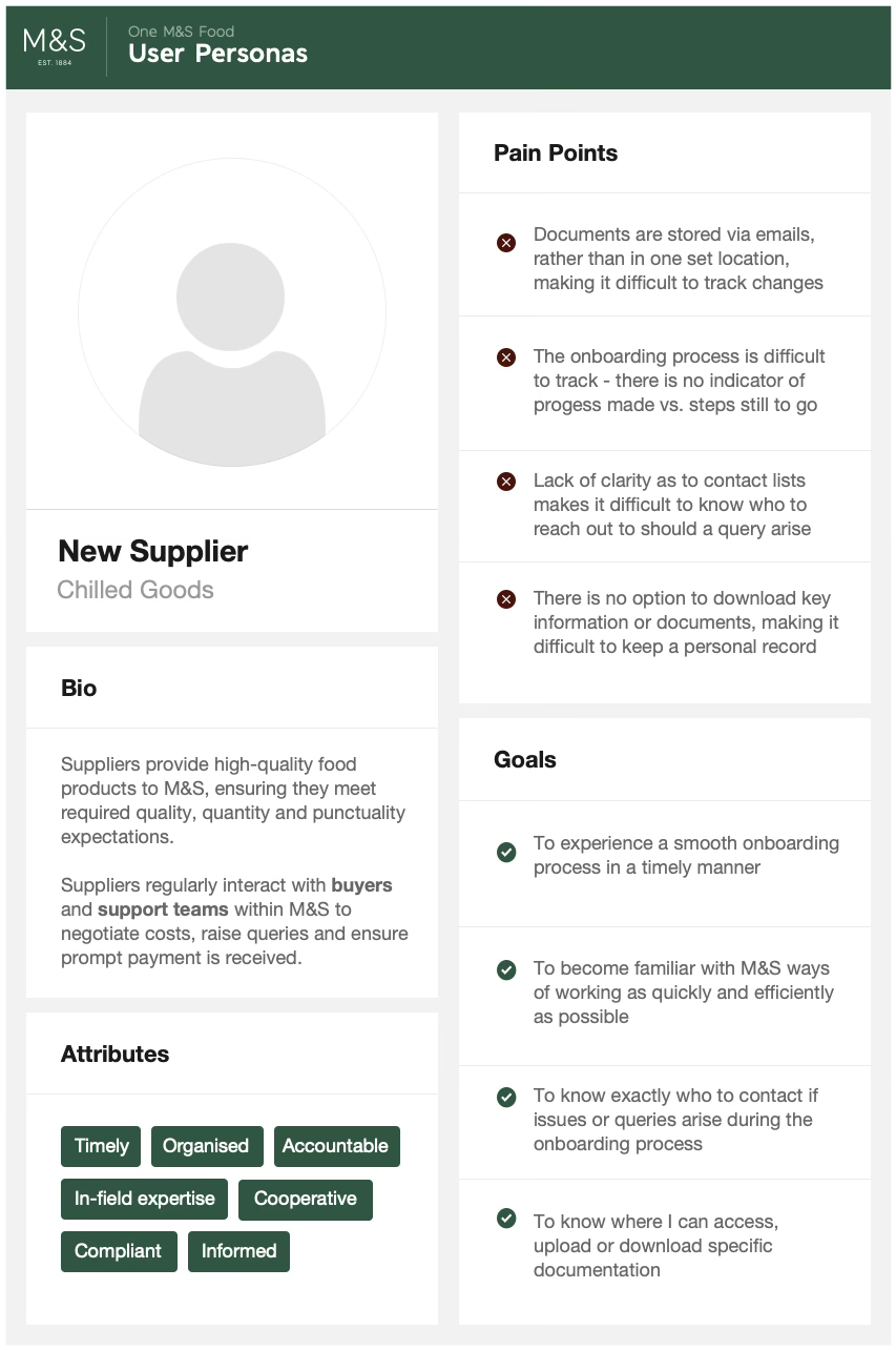
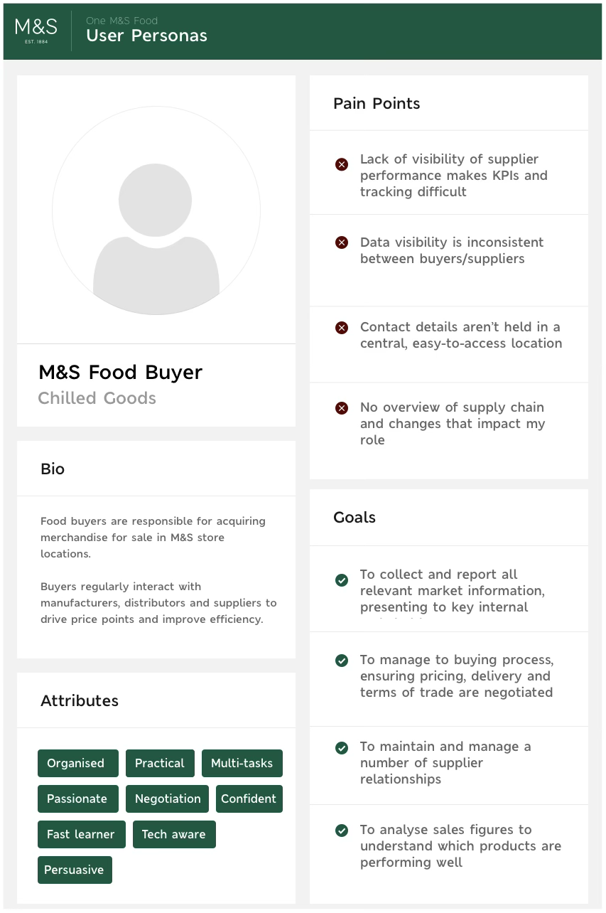
Personas
Six concise profiles, each with a distinct need — enough to argue about a design decision with, and few enough to hold in your head.
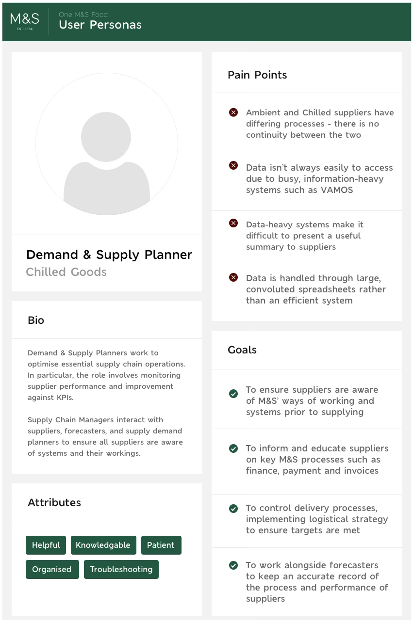
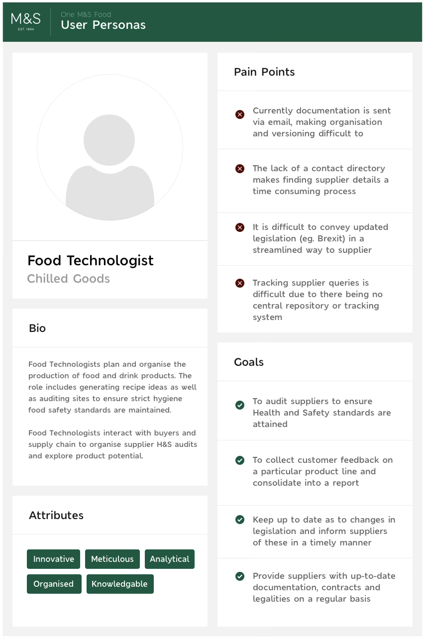
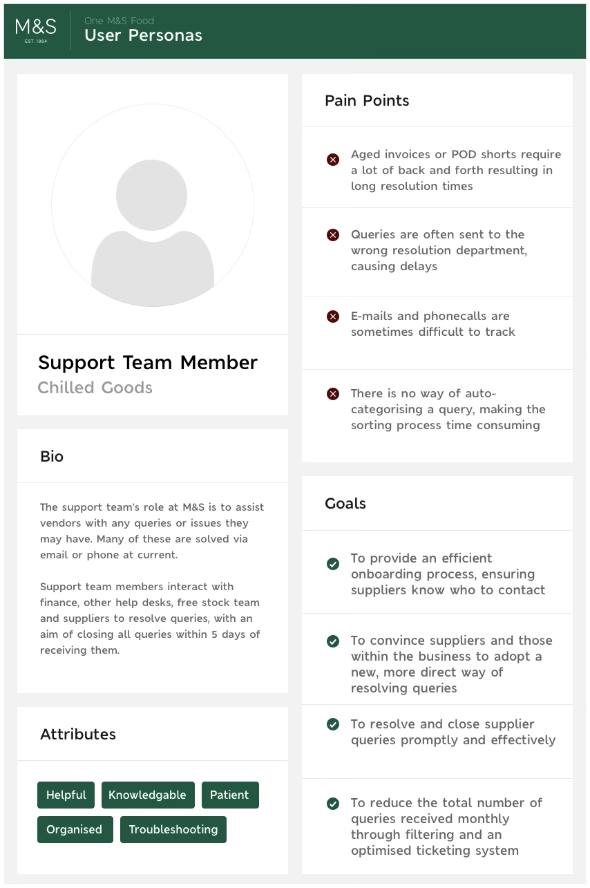
As-is mapping
We charted the existing processes on both sides, role by role, for every role we'd interviewed. Drawing it is what made the bottlenecks arguable instead of anecdotal.
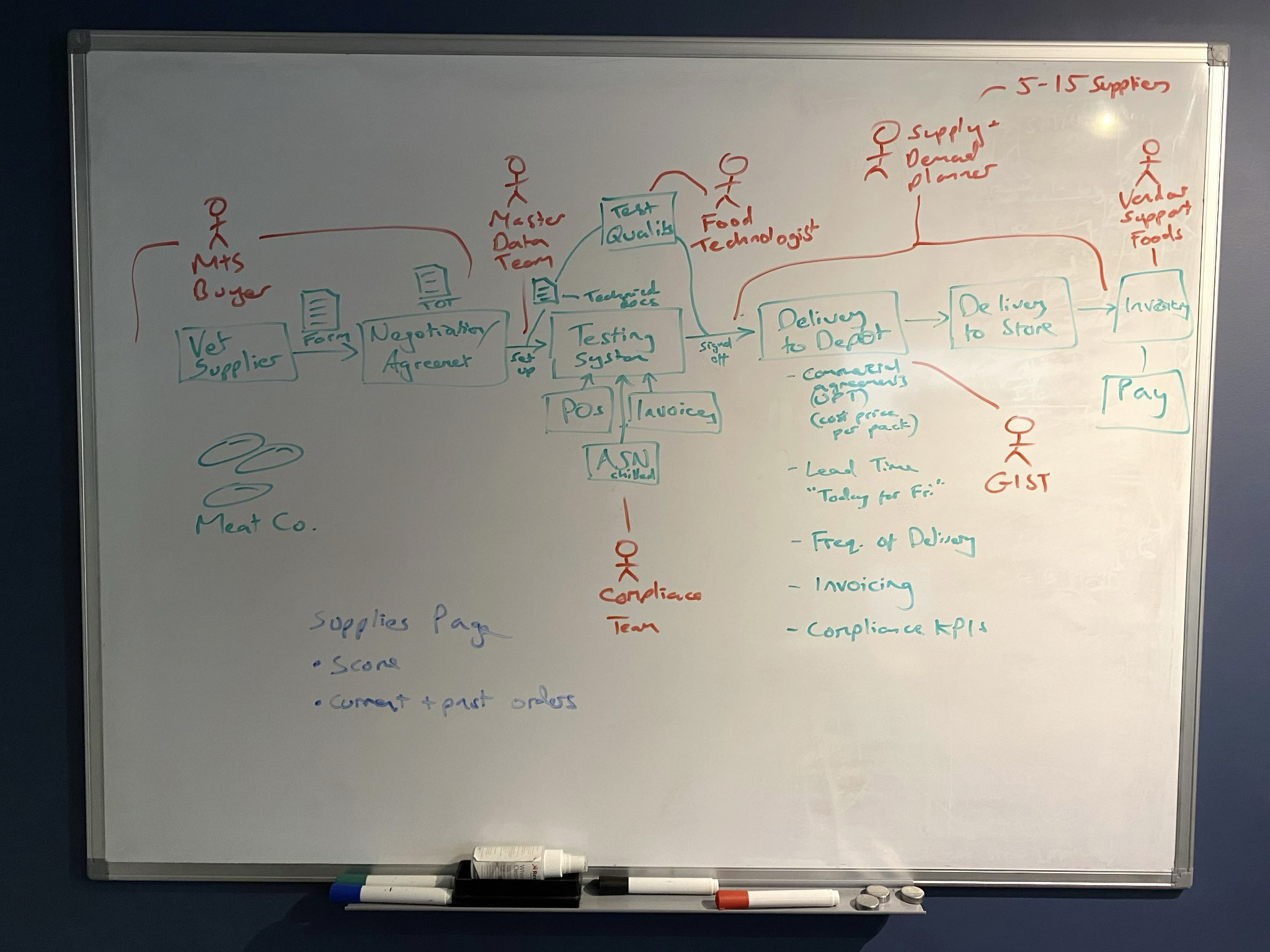
The first pass, on a whiteboard: every step from vetting a supplier to getting them paid, with the role that touches it.
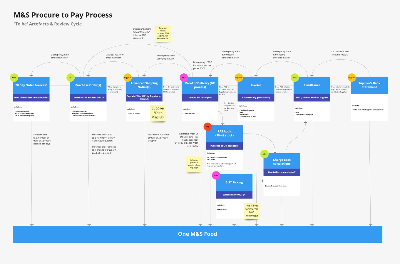
Procure to pay, redrawn: each artefact, who owns it, and every point where a discrepancy can start a dispute — all of it landing on one platform.
To-be workflow
Built with stakeholders and users directly off the as-is pain points, so everyone could see which problem each change was answering — and agree to it before anything was designed.
Information architecture
With the workflow agreed, I mapped the data and actions it implied onto specific pages — every user action against the interface element that carries it.
Doing it at this level is unglamorous and it is the whole job: it is where you find out whether the flow of information is actually intuitive, before a single screen has been drawn.

Page hierarchy with each page blocked out — onboarding into the dashboard, then the eight branches, down to an individual PO, query and product.
Wireframing the solution
Wireframes to turn the proposal into something people could react to — an early solution for M&S staff to control orders quickly, cheap enough to change after the first round of feedback and clear enough to show a non-technical stakeholder.
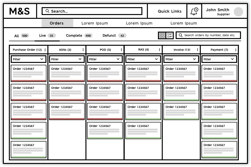
The orders screen, wireframed. Each column is a stage of the procure-to-pay chain — purchase order, ASN, proof of delivery, RAS, invoice, payment — with its own count and filter, and a red or green bar on every card. An order that has stalled shows up as a column that isn't emptying, which is exactly the comparability users asked for.
User testing
I tested the wireframes with real users — rough screens, targeted questions about how important each part of the interface was to their job.
Overview came back as the top priority in answer to several different questions. When users keep giving you the same answer to different questions, that's the design decision.
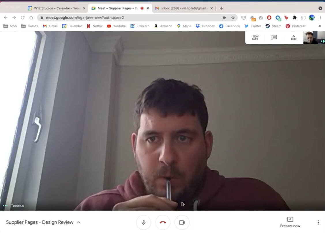
A session in progress: a supplier compliance manager working through version 1 of the order board and rating how important each part of it was to his job. The question underneath was whether columns of tickets is the right way to see orders at different stages at all — or whether a supplier has so many live orders that the layout collapses under them.
A deliberately vanilla UI first
The first interface was intentionally unbranded. With the visual language stripped back, feedback landed on function and flow rather than on colour — and usability problems had nowhere to hide.
It also kept iteration cheap, and left a clean foundation for M&S branding to be layered on once the behaviour was settled.
Injecting the brand
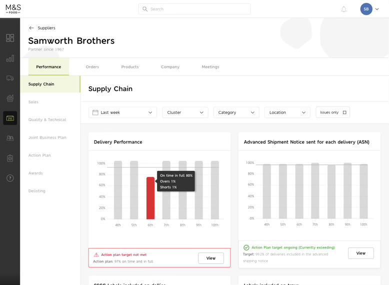
Only once the behaviour was agreed did M&S's identity go on — a dense, data-heavy tool that still reads as M&S.
The landing page carries the most brand — seasonal M&S food photography, the handwritten headings, supplier news in the corner — while the work itself stays sober: what's urgent, what's off track, and how the business is performing.
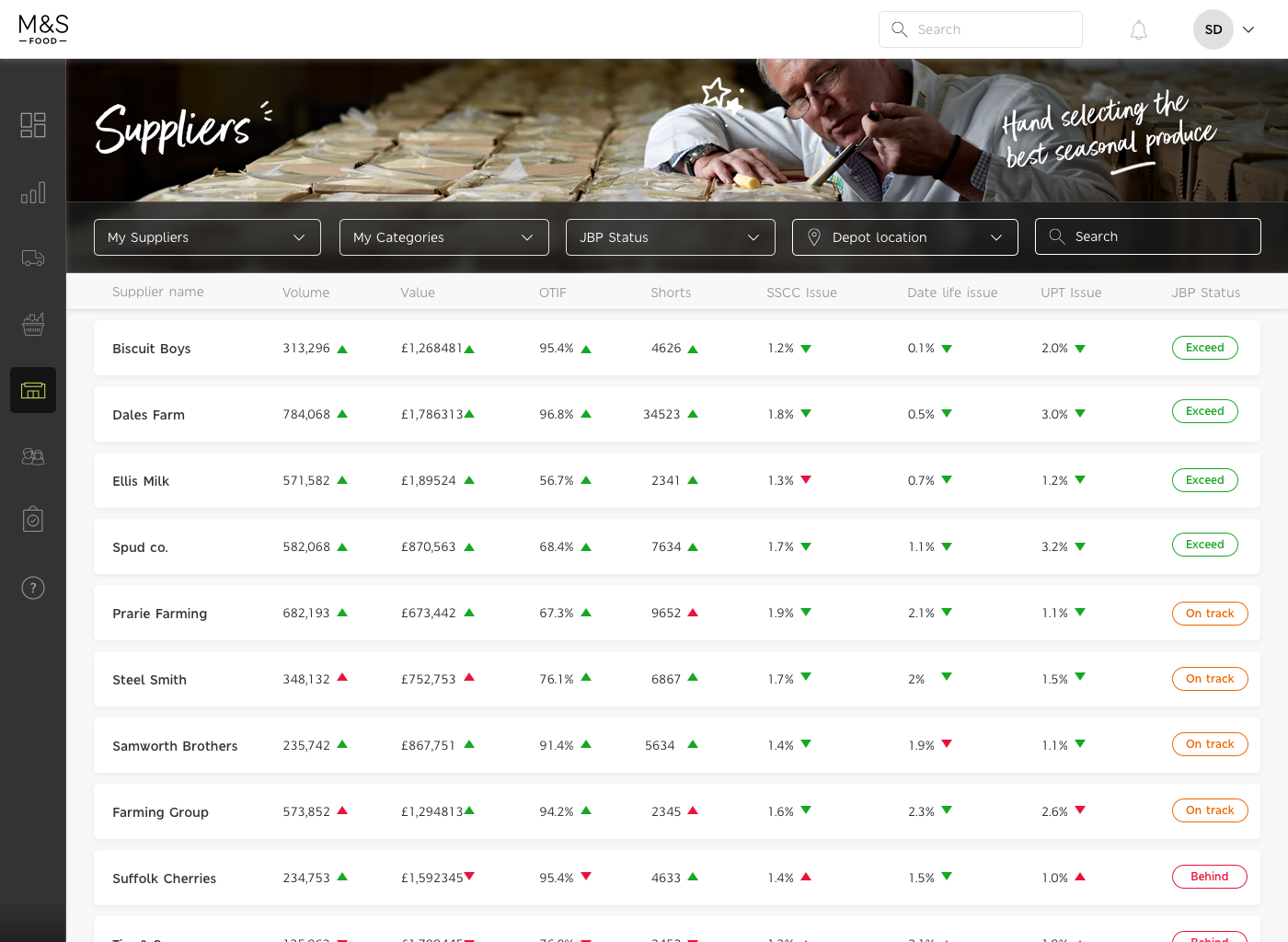
The overview users asked for, in the brand. Every supplier on one screen with volume, value, OTIF, shorts and issue rates side by side — comparable at a glance — and a JBP status that says plainly whether each one is exceeding, on track or behind.
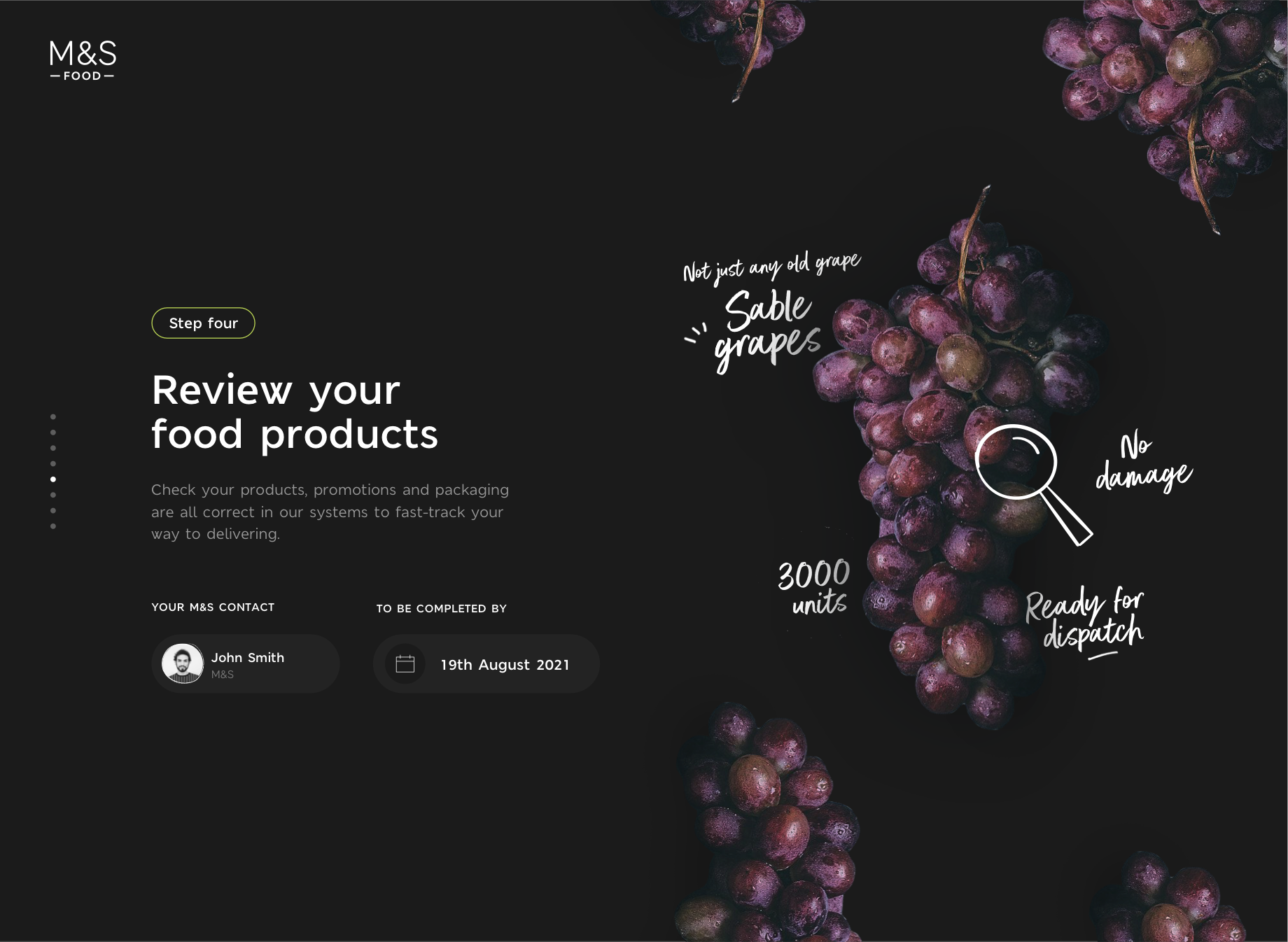
Onboarding a new supplier, one step at a time. M&S food photography carries the page, and the two things a supplier always wants to know — who at M&S owns this, and when it has to be done — sit together at the bottom of every step.
Responsive design
Suppliers range from one-person operations to national businesses, so a purchase order list had to survive being read on a phone in a depot as well as on a desktop. The table becomes a stack of cards; status and amendment type stay visible at both sizes.
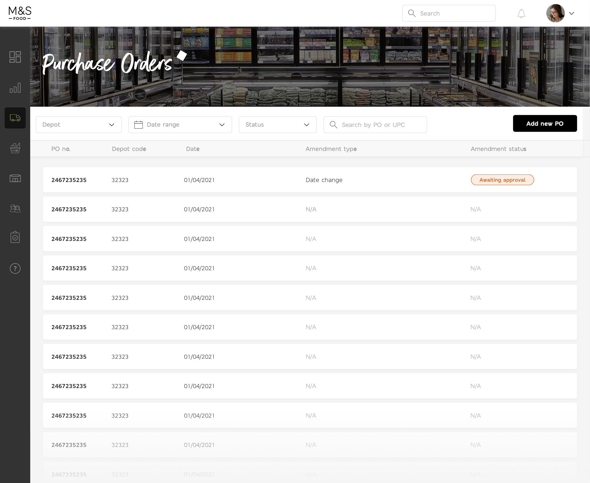
Desktop — the full table, five columns wide.
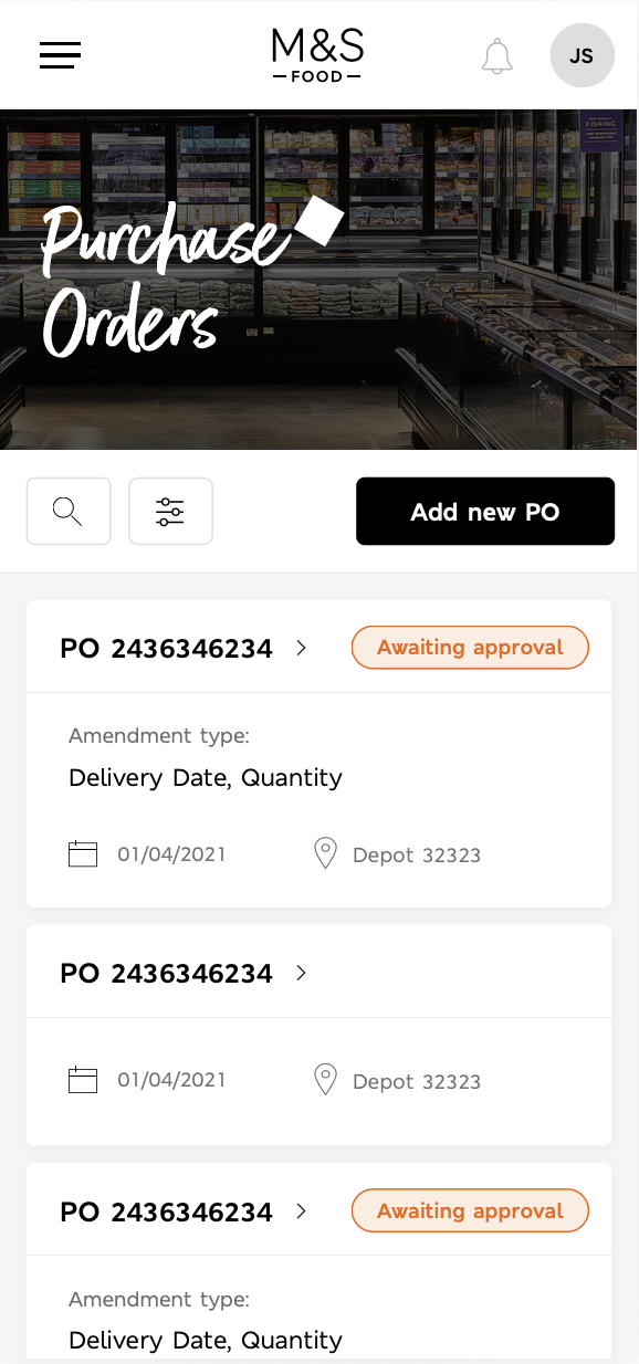
Mobile — the same rows as cards, status still first.
The design system
A platform this size can't be held together by screens alone, so the system was built as its own file: foundations, components, templates, then page designs — with every component drawn in each of its states rather than in the one state a mockup happened to need.
Two navigation sets sit side by side, MVP and vision, so we could ship the smaller one without losing sight of where it was going. Type, colour, effects and a 12-column grid for desktop and mobile are all defined as styles, which is what let a second designer and the developers work from the same source without asking.
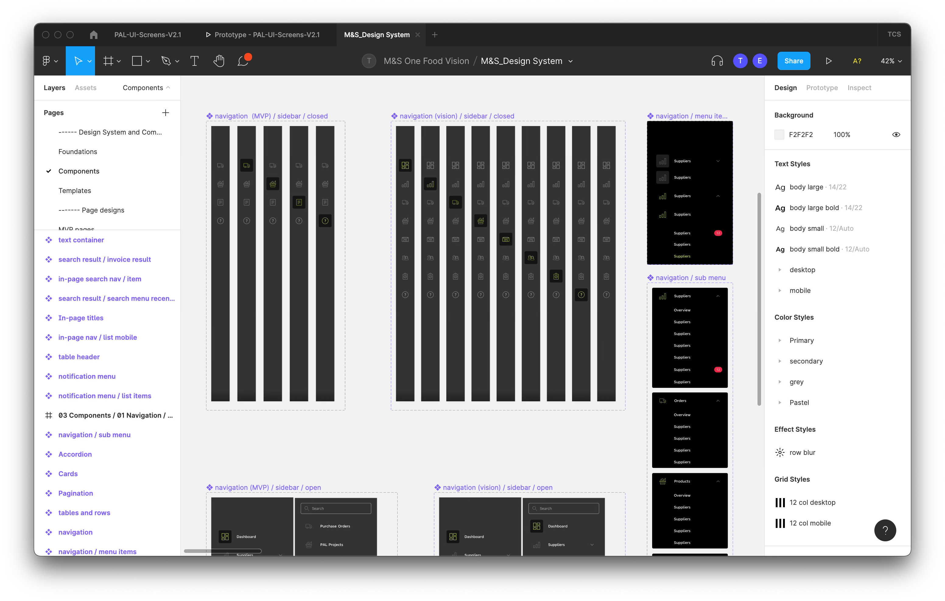
Navigation components in every state — collapsed, open, sub-menu, notification counts — alongside the text, colour, effect and grid styles the whole platform draws from.
Keeping the company with us
We cut a sizzle video and sent it round internally — progress so far, and where the project was heading. On a programme this long, alignment is a thing you have to actively maintain, and a two-minute film did more for it than a status report.
I built it myself in After Effects: the real screens composited into a 3D warehouse environment, with camera moves and cursor animation so the product could be seen being used rather than described.
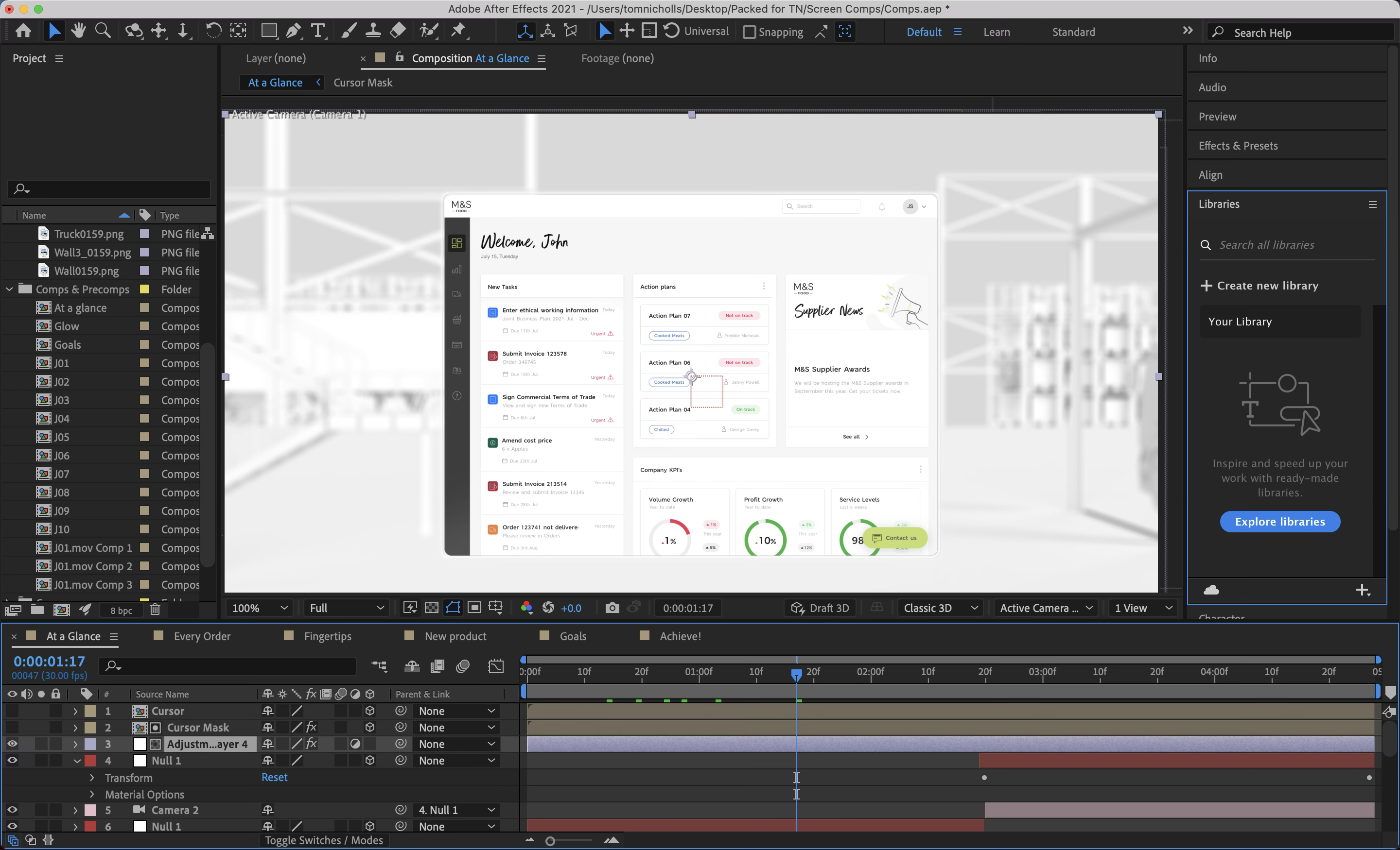
The “At a Glance” comp mid-build — dashboard, camera rig and cursor layers over the warehouse plate.
The film as it went out internally. Watch on YouTube
Results
Streamlined processes, one communication platform and integrated data management — measured on the supply chain, not on the interface.
Automating key steps and removing redundant ones cut average processing time.
Tasks became easier to manage and took less time.
Inventory brought closer into line with real demand.
The downward trend that started the project turned around — the result that actually mattered.
The team won the M&S Remarkable Team Award for this work.
Integrating the data silos also gave M&S teams real-time visibility for the first time, which is what made the forecasting improvements possible.
What I took from it
The problem was a relationship. Interviewing only M&S would have produced a better M&S tool and the same bad scores.
A vanilla UI got us feedback on function. Brand went on last, when it could no longer distort the answers.
Overview kept surfacing across unrelated questions. That insistence earned it the centre of the product.